Executive Overview
It is difficult to overstate the revolutionary impact the native HTML <dialog> element brought to web development. Nearly a decade after its initial introduction and widespread browser implementation, this seemingly compact piece of web architecture continues to offer profound nuance, evolving styling hooks, and critical accessibility advantages. Yet, despite its longevity in the web specifications, developers routinely find themselves referencing documentation to recall its distinct behavioral paradigms, optimal styling practices, and the underlying mechanics that separate a modal from a popover.
In modern web engineering, building custom dialogs historically required complex div soup, intricate JavaScript event listeners for focus management, custom keydown handlers for the Esc key, and fragile implementations to render background content inert. The native <dialog> element delegates these heavy architectural responsibilities directly to the browser’s User Agent (UA) stylesheet and rendering engine.
However, leveraging <dialog> effectively extends far beyond a basic HTML tag and a rudimentary JavaScript showModal() call. Mastery of the element requires a thorough understanding of state management, styling pseudo-classes like :open, :modal, and ::backdrop, the complexities of preventing background scroll, modern entrance animations using @starting-style, and the critical accessibility distinctions separating dialogs from the Popover API. This guide provides an authoritative, deep-dive examination of the <dialog> element, engineered to future-proof your frontend workflows.
Detailed Chronology & Evolution of Native Dialogs
To fully appreciate the current state of the <dialog> element, it is necessary to examine its trajectory through the evolution of web standards.
The Early Days and UA Specifications
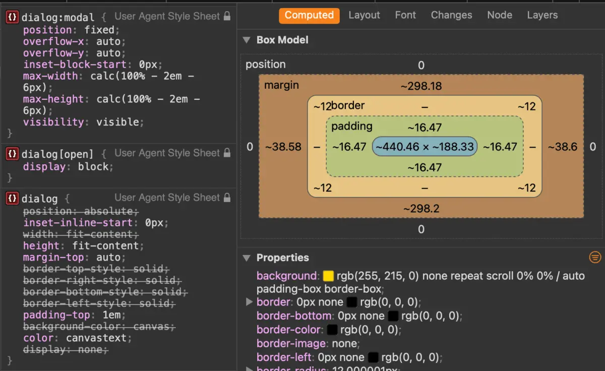
When the <dialog> element was first proposed and subsequently implemented across major rendering engines, its primary goal was to normalize web dialogs—a UI pattern historically reinvented by every JavaScript framework and UI library. Early implementations provided baseline semantics and a default User Agent style: a stark white background, a heavy black border, and basic centering within the viewport.
However, early adoption was met with developer friction. The distinction between opening a dialog as a popup versus a modal was frequently misunderstood. Developers would utilize the basic .show() method, expecting a fully trapped focus state and an automated backdrop, only to find their dialog behaving like an unstyled tooltip.
The Rise of Modern CSS Hooks
As CSS matured, the limitations of styling native UI components began to evaporate. The introduction of the ::backdrop pseudo-element allowed developers to finally style the dead zone behind a modal without resorting to wrapper divs.

More recently, the web platform has seen monumental additions that directly impact how we handle dialogs:
- The
:openand:modalPseudo-Classes: Providing clear structural selectors for styling elements based entirely on their runtime state rather than relying solely on attributes. @starting-style: Solving a decades-old CSS animation conundrum by allowing developers to define initial rendering states for elements transitioning fromdisplay: noneto visible.- Invoker Commands: An emerging, highly anticipated feature set (utilizing
commandandcommandforattributes) designed to enable entirely declarative dialog opening and closing directly in HTML, drastically minimizing the need for boilerplate JavaScript event bindings.
Core Architecture: Marking Up and Controlling Dialogs
At its simplest, the markup for a native dialog is remarkably minimal. However, the methods used to activate it dictate its entire user experience paradigm.
Basic Markup and Activation
<button id="dialog-button">Open Dialog</button>
<dialog id="dialog">
  <p>This is a native dialog element.</p>
</dialog>
By default, this element will not render on the page. While you can technically force it open via the boolean open attribute (<dialog open>), this is rarely useful outside of static documentation or rare server-rendered edge cases. Instead, control is handled via JavaScript.
const dialogButton = document.querySelector('#dialog-button');
const dialog = document.querySelector('#dialog');

dialogButton.addEventListener('click', () =>
  // Caution: This treats the dialog as a popover, not a modal!
  dialog.show();
);
The Critical Difference: show() vs. showModal()
Invoking .show() opens the dialog as a non-modal popup. It does not generate a backdrop, it does not center itself automatically via strict modal rules, and it does not render the underlying page content inert.
For true application modals—interfaces that demand the user’s immediate attention—the .showModal() method must be used:
const dialogButton = document.querySelector('#dialog-button');
const formDialog = document.querySelector('#dialog');

dialogButton.addEventListener('click', () =>
  formDialog.showModal();
);
When .showModal() is executed, the browser automatically places the dialog in the top layer of the rendering stack, generates a clickable/stylable backdrop, centers the element within the viewport, enables Esc key dismissal out of the box, and renders all background elements inert.
Closing Mechanisms: JavaScript and Declarative Forms
Closing a dialog is equally straightforward. While you can programmatically invoke the .close() method via a JavaScript event listener, HTML also supports a powerful, JavaScript-less declarative approach using forms:

<dialog id="dialog">
  <form method="dialog">
    <button type="submit">Close dialog</button>
  </form>
</dialog>
When a <form method="dialog"> contains a submit button, clicking that button automatically closes the dialog, clears its submission state, and requires zero JavaScript to function.
Supporting Context, Metrics, & Accessibility Considerations
Building robust UI components requires strict adherence to accessibility (a11y) standards. The <dialog> element handles much of this heavy lifting natively, but developer oversight can easily break these guarantees.
Button Labeling and Screen Readers
A common pattern in modern UI design is utilizing a close button styled simply with an "X" or an SVG icon.
<!-- Anti-pattern for accessibility -->
<dialog id="dialog">
  <button id="dialog-close">X</button>
</dialog>
Screen readers will struggle to interpret a bare "X" or a raw SVG without explicit labeling. To maintain an uncompromised user experience for assistive technology users, text should be visually hidden while preserving the icon for sighted users:
<dialog id="form-dialog">
<button id="form-close">
<span class="visually-hidden">Close modal</span>
<span aria-hidden="true">×</span>
</button>
</dialog>Focus Management and Innate Inertness
When a modal dialog opens, the browser automatically shifts focus to the first focusable element inside the dialog. In many cases, this is the close button. While functional, this can occasionally lead to unexpected user experiences—for instance, if a user accidentally hits the Space key immediately upon opening, they might inadvertently trigger the close button.
If your dialog contains complex forms or primary call-to-action fields, consider explicitly managing initial focus using the tabindex attribute to guide the user’s attention to the most important interactive element.
Furthermore, the innate inertness of the background content is a massive win for web architecture. When a modal opens, the background becomes completely inert: text selection, pointer events, and keyboard focus are entirely locked out of the underlying DOM tree. This ensures that screen readers and keyboard users cannot accidentally tab outside the modal boundary.

Advanced Styling: Backdrops, Positions, and Animations
Default browser styles for dialogs are notoriously utilitarian. Transforming a native dialog into a polished, production-ready UI component requires targeting specific pseudo-elements and runtime states.
Styling the ::backdrop
The default backdrop applied by user agents is a subtle, semi-transparent tint that is often barely perceptible against complex page backgrounds. Using the ::backdrop pseudo-element, developers can introduce deep colors, blurs, or even rich visual contexts:
dialog
  &::backdrop
    background-color: rgba(0, 0, 0, 0.6);
    backdrop-filter: blur(8px);
Targeting the :open State
When writing custom CSS for a dialog, styling the base dialog element directly can lead to specificity battles or unintended layout shifts when the element is closed. Best practice dictates scoping styles to the :open pseudo-class or the [open] attribute:
dialog
  border: none;
  background: transparent;

  &[open]
    background-color: var(--surface-color);
    border-radius: 16px;
    box-shadow: 0 25px 50px -12px rgba(0, 0, 0, 0.25);
Preventing Page Scroll Without JavaScript Hacks
A persistent pain point in frontend development has been preventing background body scroll when a modal is open. Historically, developers relied on complex JavaScript to toggle overflow: hidden on the <body> element and compensate for layout shift caused by missing scrollbars.
With modern CSS capabilities, this can be handled declaratively. Using the :has() relational pseudo-class:
body:has(dialog[open])
  overflow: hidden;
Alternatively, modern browser implementations supporting overscroll-behavior: contain on the dialog and its backdrop can prevent scroll chaining entirely:
dialog
  overflow: hidden;
  overscroll-behavior: contain;

  &::backdrop
    overscroll-behavior: contain;
Smooth Entrance and Exit Animations with @starting-style
Animating elements that transition from display: none to visible has historically required timeout hacks in JavaScript. The introduction of @starting-style allows CSS transitions to run smoothly on dialog entrance:

@starting-style
  dialog:open
    opacity: 0;
    transform: scale(0.95);


dialog
  opacity: 0;
  transform: scale(0.95);
  transition: opacity 0.3s ease, transform 0.3s ease, overlay 0.3s ease allow-discrete, display 0.3s ease allow-discrete;

  &[open]
    opacity: 1;
    transform: scale(1);
Dialog API vs. Popover API: Strategic Architectural Decisions
A frequent architectural dilemma facing frontend teams is choosing between the HTML <dialog> element and the newer Popover API. While both manage top-layer rendering and transient UI elements, their underlying design philosophies and accessibility profiles are vastly different.
Accessibility and Focus Trapping
As security and accessibility researcher Zell Liew highlights, the primary differentiator lies in accessibility guarantees:
- The Dialog API (Modal): Built specifically for critical user interruptions. It automatically implements focus trapping, generates inert background trees, and listens for the
Esckey natively. - The Popover API: Designed for non-modal floating elements such as tooltips, dropdown menus, and pickers. Popovers do not trap focus, do not make background content inert, and require developers to explicitly assign accessible ARIA roles.
Decision Matrix
- Use a Dialog when: You are building workflows that require explicit user action (confirmation modals, data entry forms, alert dialogs, wizard steps).
- Use a Popover when: You are building contextual auxiliary UI that sits adjacent to a trigger element without demanding exclusive user focus (menus, tooltips, floating action panels).
Future Outlook
The evolution of native web primitives like the <dialog> element signals a broader industry shift away from heavy JavaScript-driven UI frameworks and toward robust, standards-compliant platform features.
As features like Invoker Commands (command="show-modal" and commandfor="my-dialog") transition from experimental flags to baseline browser support, the amount of imperative JavaScript required to wire up basic modal systems will approach zero. Furthermore, ongoing enhancements to CSS animation specifications, discrete property transitions, and top-layer stacking contexts ensure that native dialogs will only become more flexible, performant, and visually stunning.
For web architects and frontend engineers alike, investing time in mastering the native <dialog> element is not merely about writing cleaner code today—it is about building resilient, accessible, and future-proof web applications that leverage the full power of the modern browser.