Executive Overview
For decades, the fundamental architecture of the World Wide Web was tethered to the flatlands of two-dimensional space. Designers and developers manipulated elements strictly along the horizontal ($X$) and vertical ($Y$) axes. While layout engines grew increasingly sophisticated—evolving from floats and tables to CSS Flexbox and Grid—the perception of depth remained largely an illusion crafted through drop shadows, overlapping layers, and opacity tricks.
The introduction of the CSS Transform Module Level 2 changed this paradigm entirely by bringing true 3D spatial manipulation to stylesheets. At the center of this spatial revolution is the translateZ() function. Defined within the official W3C specifications, translateZ() allows developers to shift elements along the $Z$-axis—pushing them deeper into the screen or pulling them forward toward the user.
However, incorporating the third dimension into a browser rendering engine introduces a unique set of complexities. Unlike $X$ and $Y$ translations, a movement along the $Z$-axis is visually imperceptible without a defined perspective. Furthermore, translateZ() is frequently misunderstood as a mere alternative to scaling, or overlooked entirely outside of its secondary application as a hardware-acceleration performance hack.
This deep-dive investigation explores the mechanics of translateZ(), examining how perspective functions, the crucial distinction between the perspective property and the perspective() function, syntax rules, performance optimization techniques, and the broader future of spatial web design.
Detailed Chronology and Technical Evolution of CSS 3D Transforms
To fully appreciate the role of translateZ() in modern web development, it is necessary to trace the historical evolution of how browsers handle spatial rendering.
The Flat Web Era (Late 1990s – Late 2000s)
In the early days of CSS1 and CSS2, the Document Object Model (DOM) was treated as an infinitely thin sheet of paper. Elements occupied a flat plane. Creating the illusion of depth required creative workarounds, such as nested containers with precisely calculated padding, border manipulations, or rasterized background images. Animations were largely dependent on JavaScript loops manipulating positioning properties (left and top), which forced constant layout recalculations and repaints by the browser’s central processing unit (CPU).
The Advent of 2D Transforms (CSS Transforms Module Level 1)
As web applications grew richer, the need for hardware-accelerated animations became apparent. The CSS Transforms Module Level 1 introduced 2D transformations, bringing functions like translate(), scale(), rotate(), and skew(). These functions allowed elements to be shifted, resized, and rotated on the flat plane without triggering expensive layout reflows, as they were handled by the graphics processing unit (GPU). Yet, they remained strictly bound to two dimensions.
Entering the Third Dimension (CSS Transforms Module Level 2)
The formulation of the CSS Transforms Module Level 2 specification by the CSS Working Group marked a watershed moment. Browsers began implementing 3D spatial properties, including transform-style: preserve-3d, backface visibility controls, and the triumvirate of 3D translation functions: translateX(), translateY(), and translateZ() (collectively unified under translate3d()).
translateZ() specifically unlocked the ability to move elements closer to or farther from the user’s viewport. Yet, because computer monitors and mobile screens are inherently flat, 2D surfaces, rendering this spatial shift required the implementation of mathematical projection models—introducing concepts of vanishing points, field of view, and perspective matrices into standard CSS authoring.

Technical Mechanics: How translateZ() Operates
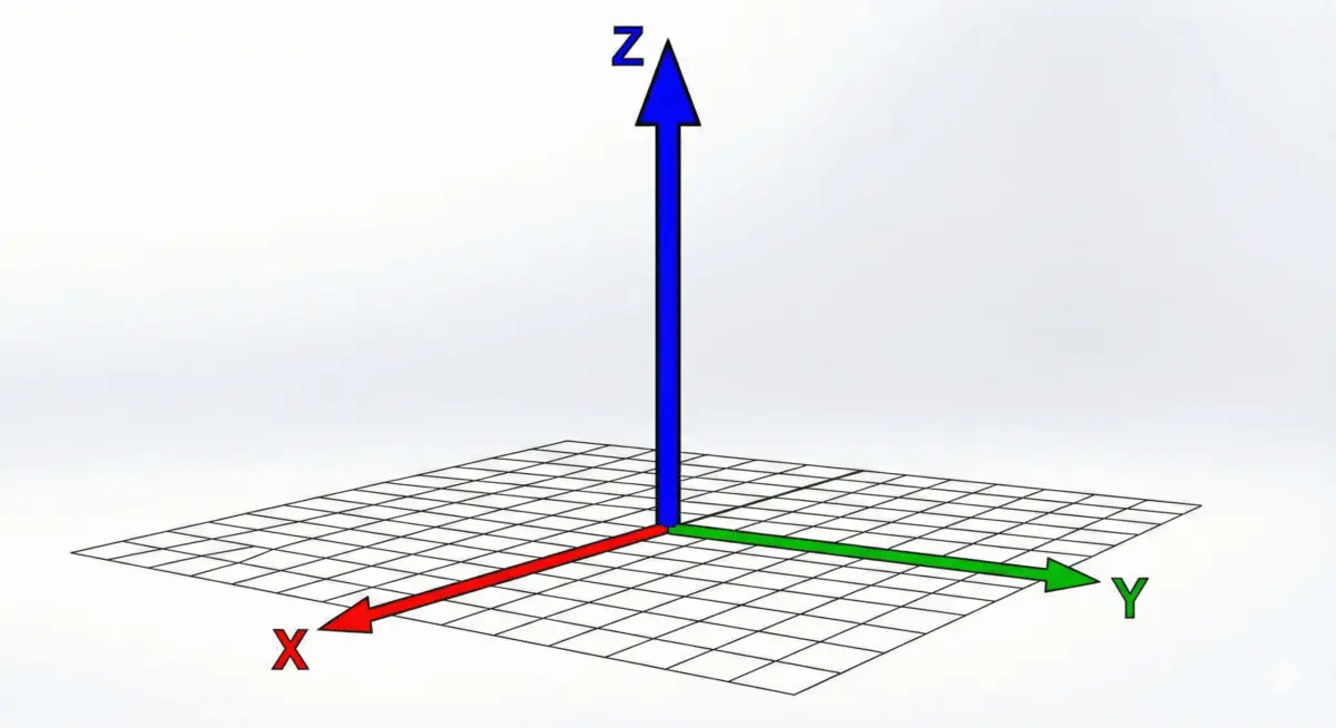
The translateZ() function shifts an element along the Z-axis in a 3D coordinate space. Its syntax is deceptively simple:
translateZ() = translateZ(<length>)It accepts a single <length> argument, which can be expressed in absolute units (such as pixels, px) or relative units (rem, em, vw, etc.). Positive values push the element closer to the viewer (making it appear larger due to perspective projection), while negative values push the element farther away into the background (making it appear smaller).
The Illusion of Size vs. Actual Distance
A common point of confusion for developers encountering translateZ() for the first time is the apparent resizing of elements. Consider the following hover effect:
.box:hover
  transform: perspective(500px) translateZ(100px);
When a user hovers over .box, the element appears to grow. However, unlike the scale() function—which explicitly alters the element’s rendered dimensions by multiplying its bounding box—translateZ(100px) does not change the intrinsic size of the element. Instead, it physically moves the element $100textpx$ closer to the virtual camera (the viewer’s eye).
If a developer rotates the parent container along the $Y$-axis to view the scene from a profile angle, the truth of the transformation becomes immediately obvious: the element’s physical dimensions remain identical, but its spatial coordinate along the $Z$-axis has changed relative to the rest of the document flow.
The Necessity of Perspective
By default, web browsers flatten all rendered content onto a 2D plane. If you apply translateZ(100px) to an element without establishing a perspective context, nothing will happen visually.
Because browsers render pixels based strictly on width and height (X and Y), moving an element along the Z axis without a projection model leaves the final 2D rasterization unchanged. To make depth perceptible, a perspective framework must be established using either the perspective CSS property on a parent container or the perspective() function directly inside the transformation chain.
Supporting Context & Metrics: perspective Property vs. perspective() Function
Understanding how perspective governs depth perception is critical for predictable 3D UI design. While both the perspective property and the perspective() function achieve the same end goal—defining the distance between the user and the z=0 plane—their scope, syntax, and application differ significantly.
1. The perspective Property (Container-Level)
The perspective property is applied to a parent container. It establishes a shared 3D space for all of its children. When multiple child elements have different translateZ() values, they all share a unified vanishing point.

.scene
  perspective: 800px; /* Establishes a shared viewing distance */
  transform-style: preserve-3d;


.child-near
  transform: translateZ(200px); /* Calculated within the 800px perspective */


.child-far
  transform: translateZ(-200px); /* Calculated within the 800px perspective */
2. The perspective() Function (Element-Level)
Conversely, the perspective() function is applied directly to an individual element as part of its transform property value. Crucially, order matters. The perspective() function must be declared before the translateZ() function in the transform stack.
/* Correct Usage */
.element
  transform: perspective(800px) translateZ(100px);


/* Incorrect Usage - Will not render expected depth */
.element
  transform: translateZ(100px) perspective(800px);
If multiple elements use the perspective() function individually rather than sharing a parent container’s perspective property, each element gets its own independent vanishing point. This often results in distorted, unnatural 3D scenes where elements do not appear to inhabit the same physical space.
Performance Optimization: The translateZ(0) Hack
Beyond aesthetic design and spatial UI design, translateZ() plays a vital role in web performance engineering.
For many years, web developers faced persistent issues with animation jank, flickering, and sluggish rendering during complex CSS transitions. These performance bottlenecks occurred because standard DOM rendering and paint operations were handled primarily by the CPU.
Offloading Work to the GPU
When a browser encounters a 3D transform function—such as translateZ(), translate3d(), or rotate3d()—it promotes the target element to its own composite layer and hands off the rendering calculations to the Graphics Processing Unit (GPU).
The GPU is massively parallelized and uniquely structured to handle matrix transformations and rasterization calculations far faster than a CPU. By injecting a seemingly innocuous transformation like transform: translateZ(0); (or the modern property will-change: transform;), developers can force the browser to create a dedicated hardware-accelerated layer for an element.
Benefits and Cautions
- Smoother Animations: Eliminates stuttering and frame drops during CSS transitions.
- Prevents Repaint Glitches: Keeps complex elements from triggering costly repaints of surrounding DOM nodes.
- Memory Caution: Overusing layer promotion (sometimes referred to as "layer explosion") can consume excessive VRAM on mobile devices, potentially degrading overall page performance rather than improving it. Modern developers should use hardware acceleration judiciously on animated or interactive components.
Future Outlook: Spatial Computing and the Next Era of CSS
As the technology landscape shifts toward spatial computing, augmented reality (AR), virtual reality (VR), and immersive web experiences (utilizing APIs like WebXR), the foundational role of CSS 3D transforms will only expand.
Browsers are increasingly optimized for volumetric rendering. Features that once required heavy JavaScript WebGL libraries like Three.js are increasingly achievable using native CSS, making 3D design accessible to front-end developers without specialized graphics programming backgrounds.
As specifications like CSS Transforms Module Level 3 and beyond continue to mature, properties dealing with depth, camera positioning, and lighting models will likely become standardized parts of the web development toolkit. Mastering primitives like translateZ() today ensures that developers are prepared to build the multi-dimensional user interfaces of tomorrow.
References & Specification Documents
- W3C Candidate Recommendation: CSS Transforms Module Level 2. World Wide Web Consortium (W3C).
- MDN Web Docs:
translateZ()– CSS: Cascading Style Sheets. Mozilla Developer Network. - CSS-Tricks Almanac:
translateZ(),perspective, andtransform-style. DigitalOcean. - W3C Working Draft: CSS Transforms Module Level 3 – Spatial and Volumetric Extensions.