Executive Overview
In the evolution of web design and user interface (UI) engineering, the pursuit of fluid, performant, and delightful motion has transitioned from a luxury to an expectation. Modern applications demand micro-interactions, smooth page transitions, and responsive components that react intuitively to user intent. At the heart of this motion design paradigm lies the CSS translateY() function—a foundational transformation tool that allows developers to shift elements vertically along the Y-axis without disrupting the document flow.
Defined within the CSS Transforms Module Level 1 specification, translateY() provides an exceptionally performant alternative to traditional layout-altering properties like margins and top/bottom positioning offsets. By leveraging hardware acceleration and bypassing the browser’s expensive layout reflow phases, this utility function empowers front-end engineers to craft complex UI patterns—ranging from floating dashboard cards and animated floating labels to intricate drop-down menus—with minimal computational overhead.
However, mastering translateY() requires more than a basic understanding of positive and negative pixel values. Developers must navigate the nuances of layout composition, coordinate spaces, composite layers, and interaction pitfalls such as the dreaded hover-flicker loop. This article serves as an authoritative, deep-dive examination of the translateY() function, dissecting its syntax, arguments, real-world UI applications, performance advantages, and best practices for modern web development.
Detailed Chronology and Evolution of CSS Transforms
To truly appreciate the power of translateY(), it is essential to understand how web layouts evolved from static documents to dynamic, animated interfaces.
The Era of Layout Manipulation (Pre-2010)
In the early days of CSS, moving an element vertically meant altering properties that directly impacted the Document Object Model (DOM) layout. Developers relied heavily on:
margin-top/margin-bottom: Adjusting these values pushed or pulled neighboring elements, triggering costly browser reflows.top/bottom: These properties only functioned on positioned elements (position: relative,position: absolute, orposition: fixed), similarly forcing layout recalculations.
Animating these properties resulted in janky, stuttering frame rates because the browser was forced to recalculate geometry, layout, and paint stages for every single frame of the animation.
The Introduction of CSS Transforms (Level 1)
The release of the CSS Transforms Module Level 1 specification revolutionized front-end development by decoupling visual presentation from document geometry. Introduced alongside functions like translateX(), scale(), and rotate(), the translateY() function allowed elements to be painted at a new offset coordinate while maintaining their original footprint in the document flow.
Crucially, this shift enabled browsers to offload rendering tasks to the Graphical Processing Unit (GPU) via composite layers. Animations that once crawled at 20 frames per second suddenly achieved a buttery-smooth 60 FPS (and beyond on high-refresh-rate displays). Today, translateY() enjoys baseline support across all modern web browsers, cementing its status as an indispensable tool in the modern web developer’s toolkit.
Supporting Context, Syntax, and Core Mechanics
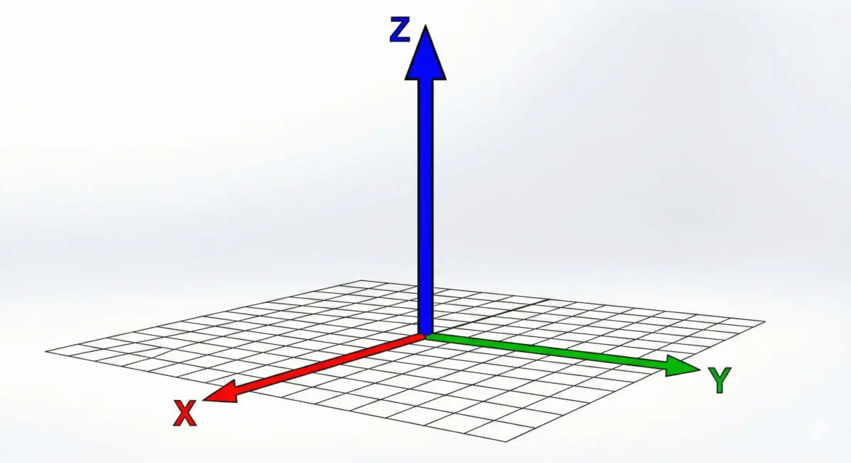
At its core, the translateY() function shifts an element vertically by a specified amount. Positive values move the element downward, while negative values shift it upward.
Syntax Structure
The function is declared within the CSS transform property using the following structural syntax:
<translateY()> = translateY( <length-percentage> )Argument Types
The function accepts a single <length-percentage> argument, which can be defined using various measurement units:
-
Absolute and Relative Lengths (
<length>):- Pixels (
px):transform: translateY(80px);moves the element precisely 80 pixels down. - Font-relative units (
ch,em,rem):transform: translateY(-24ch);shifts the element upward by 24 character widths, offering fluid scalability.
- Pixels (
-
Percentages (
<percentage>):- Unlike percentages applied to properties like
top(which resolve against the parent container’s dimensions), percentages intranslateY()are calculated relative to the element’s own height. transform: translateY(50%);moves the element downward by exactly half of its own height.transform: translateY(-100%);shifts the element upward by its full height—a technique frequently deployed in complex dropdown menus and tooltip positioning.
- Unlike percentages applied to properties like
/* Examples of length and percentage arguments */
.box-down
  transform: translateY(80px); /* Moves 80px down */


.box-up
  transform: translateY(-24ch); /* Moves 24ch up */


.box-half
  transform: translateY(50%); /* Moves down by 50% of element height */


.box-full-up
  transform: translateY(-100%); /* Moves up by 100% of element height */
Flow Preservation vs. Layout Disruption
The single most important architectural advantage of translateY() is its lack of interference with surrounding DOM elements. When an element is translated, its original geometric space remains reserved in the layout.
/* The translated element */
.translated
  position: absolute;
  top: 0;
  left: 0;
  transform: translateY(40px);
Because the browser treats the element as if it never moved regarding layout flow, neighboring elements do not reflow or shift. This isolation prevents the cascading performance bottlenecks typical of margin-based animations.
Practical UI Implementations
To understand how translateY() operates in production environments, let us examine two common user interface patterns: sliding dashboard cards and floating form input labels.
1. Sliding Dashboard Component ("Pop-Up" & Micro-Interactions)
Modern analytics dashboards often utilize entry animations where summary cards slide smoothly into view upon page load or when a parent section becomes active.
Consider a .stat-card component. Initially, the card is displaced 50 pixels downward and rendered completely transparent:
.stat-card
  opacity: 0;
  transform: translateY(50px);
  transition:
    opacity 0.8s ease-in,
    transform 0.8s ease-in,
    box-shadow 0.3s ease;
When the parent container (e.g., .dashboard) receives an .active state, the cards glide gracefully into their natural document positions while fading in:
.dashboard.active .stat-card
  opacity: 1;
  transform: translateY(0);
To elevate the user experience further, we can implement a subtle micro-interaction on hover. By applying a negative translateY() value when a user hovers over an active stat card, the component appears to lift toward the cursor:
.dashboard.active .stat-card:hover
  transform: translateY(-8px);
  box-shadow: 0 10px 20px rgba(0, 0, 0, 0.1);
2. Floating Form Field Labels (Material UI Pattern)
Traditional form placeholders disappear the moment a user begins typing, which can lead to cognitive friction regarding what data is expected in a field. Modern UI libraries (such as MUI) solve this by animating the placeholder text upward to become a persistent floating label when the field is focused or populated.
We can achieve this effect using translateY() combined with scaling:
/* Initial state of the label acting as a placeholder */
label
  position: absolute;
  left: 15px;
  top: 15px;
  pointer-events: none;
  transform-origin: left top;
  transition: transform 0.25s cubic-bezier(0.4, 0, 0.2, 1), color 0.25s ease;
When the user focuses on the input—or when the input is not empty (:not(:placeholder-shown))—the label translates upward by 32 pixels and scales down to occupy the upper border area:
input:focus ~ label,
input:not(:placeholder-shown) ~ label
  transform: translateY(-32px) scale(0.8);
  color: #6200ee;
  font-weight: bold;
This pattern provides a polished, highly professional interaction model that guides user input without requiring complex JavaScript event listeners.
Common Architectural Pitfalls: The Hover-Flicker Loop
While translateY() is robust, developers frequently encounter a baffling bug when applying the function directly to pointer pseudo-classes like :hover.
The Problem
Consider this naive implementation:
/* Problematic implementation */
.bad-element:hover
  transform: translateY(160px);
When the user hovers over .bad-element, it instantly shifts downward by 160 pixels. Because the element moves away from the cursor, the mouse is no longer positioned over the element. Consequently, the :hover state is immediately lost, causing the element to snap back to its original position. Once back at its original position, the cursor is once again hovering over it, triggering another downward shift. This creates an infinite, jarring "flicker loop" that renders the UI broken and unusable.
The Solution
To prevent this interaction breakdown, the translation must be decoupled from the hover trigger. Instead of applying :hover directly to the moving element, apply the pseudo-class to a stable parent container while targeting the child element for the transform:
/* Flawless architectural solution */
.parent-container:hover .good-element
  transform: translateY(160px);
By keeping the bounding box of the parent container stationary (or properly aligned with the translation trajectory), the cursor remains within the interactive hover zone throughout the animation cycle, ensuring smooth, uninterrupted state transitions.
Official Statements and Industry Standards
Industry standards bodies continue to refine how transforms behave in responsive web environments. According to the CSS Transforms Module Level 1 specification managed by the World Wide Web Consortium (W3C) and the CSS Working Group:
"Transform functions like
translateY()provide a coordinate-based mapping mechanism that alters the visual rendering space of an element without modifying the formatting box established by the normal flow. This architectural separation ensures that layout calculations remain isolated from paint and composite operations."
Performance engineers across major browser vendors (Chromium, WebKit, and Gecko) consistently recommend transform-based animations over legacy layout-shifting properties. Because transforms run on the compositor thread, they are largely immune to main-thread jank caused by heavy JavaScript execution or complex DOM structures.
Future Outlook: The Evolution of CSS Motion
As the web platform matures, the capabilities surrounding coordinate translation continue to expand.
- Independent Transform Properties: Modern CSS now supports independent transform properties (
translate,scale, androtate), allowing developers to write cleaner code without wrapping multiple functions inside a singletransform: translate(...)declaration. WhiletranslateY()remains vital for single-axis control, the broadertranslateproperty allows explicit axis declarations (e.g.,translate: 0 50px;). - Scroll-Driven Animations: With the advent of native Scroll-Driven Animations in CSS (
animation-timeline: scroll()),translateY()is experiencing a renaissance. Developers can now bind complex vertical parallax scrolling effects directly to user scroll progress without writing a single line of JavaScript requestAnimationFrame loops. - Subpixel Rendering Enhancements: Future iterations of browser rendering engines continue to optimize subpixel calculations for translated elements, ensuring razor-sharp typography and crisp vector graphics even during rapid animation sequences.
Conclusion
The CSS translateY() function is far more than a simple positioning shorthand; it is a gateway to high-performance, fluid web animation. By understanding its syntax, percentage-based mechanics, layout isolation properties, and common pitfalls like hover flickering, front-end engineers can elevate their user interfaces from static pages to dynamic, responsive digital experiences. As web standards evolve toward native compositor-driven animations, mastering tools like translateY() remains an essential competency for crafting the next generation of web applications.