Executive Overview
The landscape of web development is undergoing a seismic shift. Over the past few weeks, a flurry of innovative CSS features—ranging from low-level API manipulations to high-level architectural changes—has redefined what developers can achieve without relying on heavy JavaScript dependencies. From the long-awaited standardization of the CSS Custom Highlight API to experimental, yet transformative, developments like navigation matching and diagonal scrolling, the browser has become an increasingly sophisticated canvas.
This article investigates the most significant recent advancements in CSS, analyzing how these tools empower developers to build faster, more resilient, and more visually stunning user interfaces. As we move away from "hacks" and toward robust, native browser capabilities, we are witnessing the maturation of the web as an application platform.
Detailed Chronology of Recent CSS Advancements
The CSS Custom Highlight API: Beyond Native Selections
For years, developers were shackled by the browser’s default text selection styling. While ::selection provided a baseline, it lacked the granularity required for complex search-and-replace tools or real-time text analysis. The recent stabilization of the CSS Custom Highlight API marks a pivotal moment in front-end engineering.
As demonstrated by Sunkanmi Fafowora, this API allows developers to define arbitrary ranges of text and apply distinct styles to them. While the styling is handled via the ::highlight() pseudo-element, the engine powering this is a JavaScript-driven range management system. This synergy between the DOM’s range objects and CSS styling pseudo-classes allows for building sophisticated features like multi-word search highlighting, grammatical error markers, and collaborative document editing interfaces that are not only performant but also accessible.
Redefining the <img> Element: The Container Paradigm
Temani Afif recently challenged the industry’s fundamental understanding of the <img> element. By reframing the image element as a "container" rather than a static asset, Afif highlights the often-overlooked fact that the image resource itself can overflow its host element. This architectural insight opens the door to using CSS to manipulate image sources dynamically.
By leveraging the content property, developers can swap image sources or define resolution-switching logic (image-set) directly within the stylesheet. This capability provides a powerful alternative to traditional srcset and sizes attributes, particularly for dynamic, theme-based, or state-driven image updates, effectively decoupling the visual presentation from the underlying HTML markup.
The Evolution of text-stroke and paint-order
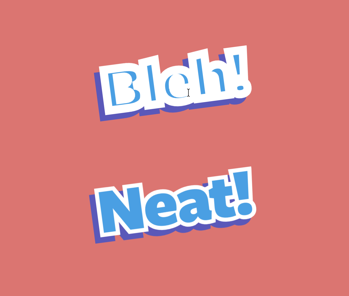
Visual design on the web often hits a wall when attempting to use text strokes. The native text-stroke property has long suffered from a center-aligned rendering issue: half of the stroke bleeds into the text fill, often muddying the typography and rendering it unreadable at smaller sizes.

Tyler Sticka’s recent deep dive into the paint-order property provides the necessary corrective measure. By manipulating the paint order of the fill and the stroke, developers can ensure the text fill is rendered on top of the stroke, preventing the stroke from eroding the glyph’s legibility. While browser vendor prefixes like -webkit-text-stroke remain necessary for compatibility, this approach represents a significant upgrade for design-heavy web applications.
Supporting Context & Metrics: Solving Layout Challenges
Skeleton UIs and the CSS-Only Pursuit
The quest for a "CSS-only" skeleton UI has become a hallmark of modern web performance optimization. Lea Verou’s recent exploration into using text-decoration combined with color: transparent and masking techniques underscores a broader community push to reduce the reliance on JavaScript-heavy skeleton components.
The community discourse, including suggestions like box-decoration-break: clone, highlights the complexity of creating fluid, responsive skeletons that adapt to varying content lengths without "brittle" hardcoding. This shift is not merely aesthetic; it is a performance mandate. By moving these animations into the browser’s compositing layer, developers can achieve smoother, 60fps loading states that do not block the main thread.
The lh Unit: Precision Typography
Ahmad Shadeed’s analysis of the lh unit—which resolves to the computed line-height of an element—has revealed new possibilities for proportional design. Traditionally, developers have relied on em or rem units for vertical spacing, which can be inconsistent when dealing with varying font-line-height ratios.
The lh unit allows for a "line-height-aware" layout. For instance, sizing a container or a floated image precisely to match the vertical height of a specific number of text lines is now a trivial task. This level of precision is essential for grid-based typography, where maintaining vertical rhythm is the difference between a amateurish layout and a professional-grade editorial experience.
Future Outlook: Navigation and Diagonal Scrolling
Unlocking Diagonal Scrolling
For over a decade, scrolling behavior has been largely constrained to single-axis movement (horizontal or vertical) unless explicitly manipulated via complex event listeners. Bramus recently showcased the new scroll-axis-lock property, which facilitates true diagonal scrolling. This change is monumental for interactive maps, data-dense dashboards, and creative portfolios where the user experience demands fluid, multi-directional navigation. By moving this control into the CSS layer, browsers can optimize the scroll-handling mechanics, reducing the "jank" often associated with JavaScript-based scroll-locking.
Declarative Navigation Matching
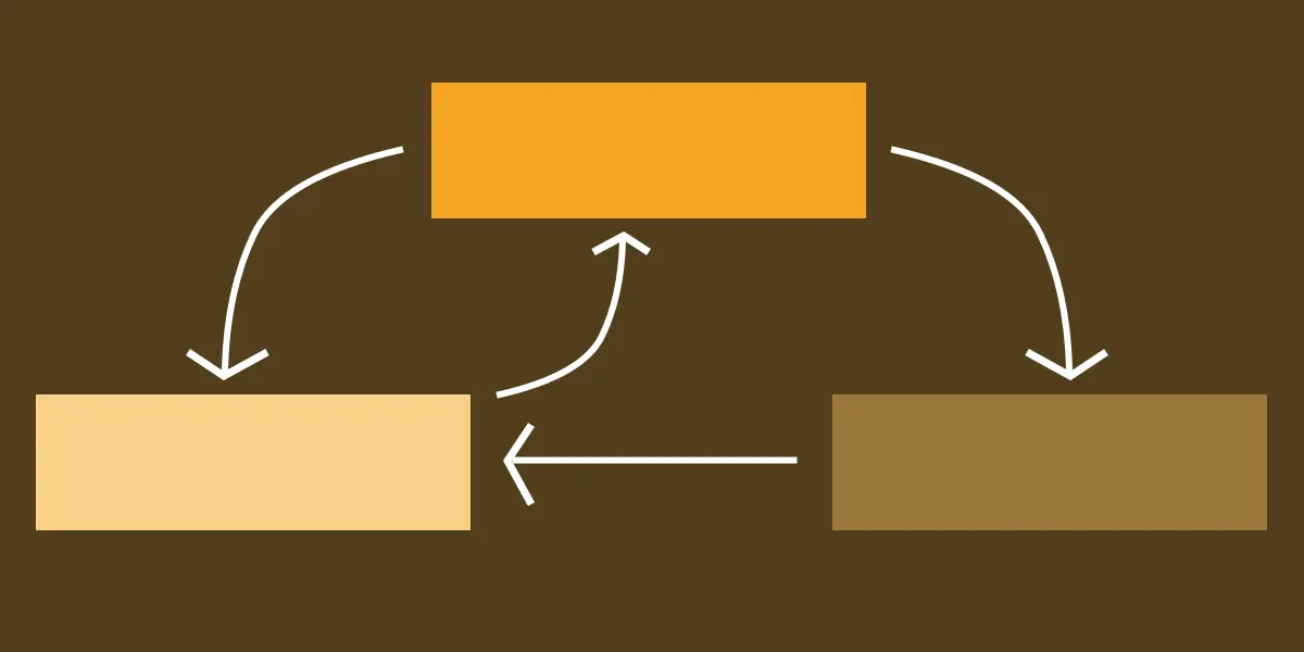
Perhaps the most ambitious development is the introduction of CSS Navigation Matching. This experimental feature allows developers to write CSS rules that respond to the user’s navigational state—essentially styling elements based on their relationship to the current route or navigation history.
This brings a level of "state awareness" to CSS that was previously the exclusive domain of client-side routers like React Router or Vue Router. If implemented broadly, this could simplify the creation of active-state navigation, transition effects, and route-aware styling, significantly reducing the amount of JavaScript logic required to maintain the visual state of a Single Page Application (SPA).
Industry Commentary and Critical Analysis
The current trajectory of CSS suggests that the "JavaScript-ification" of the web is beginning to reverse. For years, the industry was forced to use JavaScript for tasks—such as scroll-locking, route-matching, and complex element-to-element interaction—that were simply too complex for the CSS engine of the time.
However, as browser vendors standardize these APIs, we are seeing a return to declarative programming. This is an objectively positive trend. Declarative CSS is easier to debug, more performant, and inherently more accessible than imperative JavaScript.
The Question of "Worst HTML Element"
Amidst these high-level architectural changes, a humorous but poignant debate has emerged regarding the "worst" HTML element. While this may seem like a lighthearted industry meme, it touches upon the core of web standards: the accumulation of technical debt. Elements that encourage poor semantic structure or rely on outdated browser behavior are the "bottlenecks" that modern CSS, such as the content property or the ::highlight() API, seeks to bypass.
As we look toward the future, the goal remains clear: to build a web that is natively capable, semantically sound, and performant by default. Whether it is through the precision of the lh unit or the raw power of navigation matching, the modern web developer has more tools than ever before to craft a truly seamless digital experience.
As we move into the next quarter, the focus will undoubtedly shift toward the cross-browser implementation of these experimental features. For now, the takeaway is simple: keep your stylesheets clean, stay informed on the latest specs, and never stop questioning the limitations of the elements we use every day. The browser is evolving—and it is doing so at a pace we haven’t seen in a decade.