
Executive Overview: A Paradigm Shift in Web Interactivity
As we transition into the autumn season, the landscape of front-end development is undergoing a period of intense, accelerated evolution. This eighteenth edition of What’s !important captures a pivotal moment in CSS history, where the lines between declarative styling and functional logic are blurring. From the refinement of user experience patterns like tooltips to the introduction of powerful new selectors and layout capabilities, the past two weeks have proven that the web platform is maturing faster than ever.
We are moving away from hacky workarounds and toward native browser implementations of complex behaviors. Whether it is the standardization of syntax highlighting through the Custom Highlight API or the experimental but revolutionary class-prefix selectors, the tools at our disposal are becoming more expressive and performant. This report synthesizes the latest breakthroughs, offering a deep dive into the technical nuances that define the current frontier of web development.
Detailed Chronology: Recent Developments in CSS
The last fourteen days have been defined by a mix of immediate practical solutions and long-term architectural proposals. Here is a breakdown of the most significant shifts in the CSS ecosystem.
The Evolution of Tooltip UX
Interaction design is currently undergoing a "polishing" phase. Abhishek Jakhar recently ignited a conversation on the necessity of "delayed-then-instant" tooltips. The logic is sound: by introducing a slight delay before triggering, we prevent accidental activations during cursor transit, while an immediate exit ensures the UI feels responsive and clean.
However, as the conversation evolved, Chris Coyier introduced a more forward-thinking approach using "interest invokers." By leveraging interest-delay-start and interest-delay-end, developers can now offload the timing logic to the browser engine. While currently limited to Chrome, this represents a major step toward standardizing micro-interactions that were previously reliant on bloated JavaScript libraries.
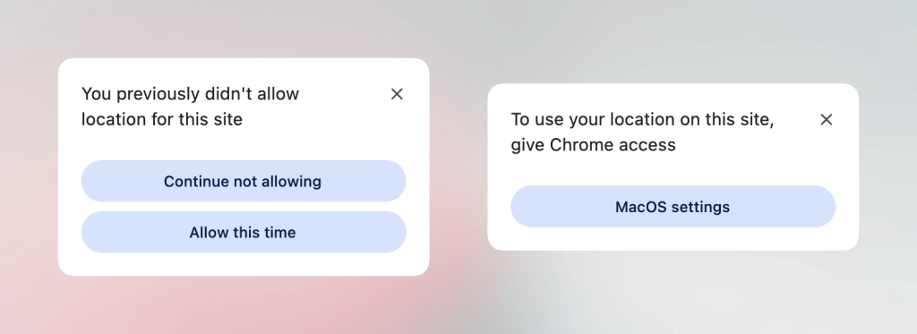
The <geolocation> Element
The Geolocation API has historically been a source of developer frustration, primarily due to the complexities of external hardware permissions and inconsistent state management. The introduction of the <geolocation> element attempts to streamline this, though it brings a new set of CSS styling restrictions that developers must navigate. As we currently reside in a period of partial browser support, the current consensus involves a progressive enhancement strategy—wrapping the new element in a fallback that preserves functionality for legacy browser engines.
MicroLighter and the Custom Highlight API
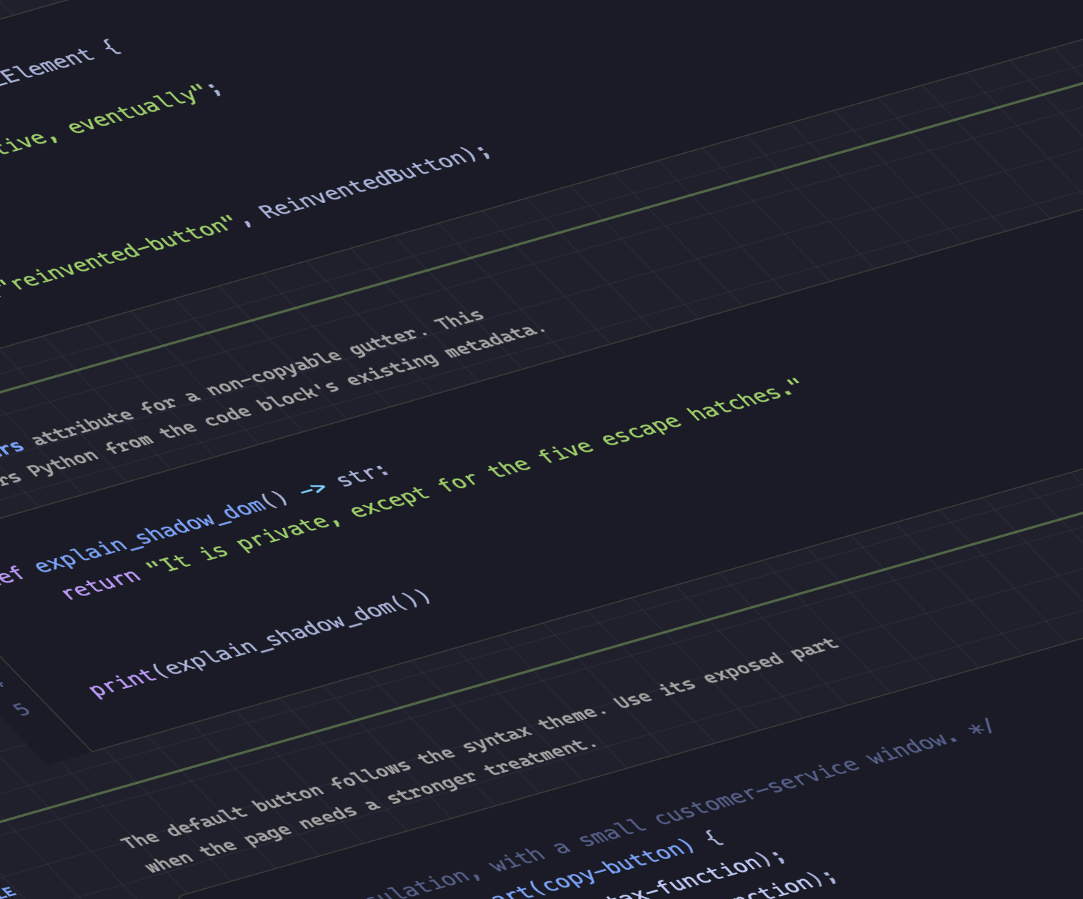
Dave Rupert has pushed the boundaries of the Custom Highlight API with the release of MicroLighter. By moving syntax highlighting away from complex DOM-node manipulation and into the ::highlight() pseudo-element space, the performance overhead is drastically reduced. Geoff Graham’s analysis of this tool suggests that we are entering an era where high-performance text rendering and styling are handled entirely by the browser’s internal painting cycles rather than expensive JavaScript-driven DOM updates.
Supporting Context & Metrics: Grid, Logic, and State
A significant portion of recent discourse centers on how we extract data from the layout engine and how we handle global UI states.
Unlocking CSS Grid Metadata
Temani Afif has provided a breakthrough in how developers interface with CSS Grid. By mapping grid information—such as row/column counts and cell coordinates—into CSS Custom Properties, developers can now create reactive layouts that respond to the grid’s structural metadata. While this currently assumes columns of equal width, the underlying technique provides a blueprint for a future where CSS can "talk back" to the developer, allowing for proximity-based interactions that were previously impossible without calculating coordinates in the main thread.
The Tri-State Dark Mode Debate
The industry is currently divided on the implementation of dark mode. Lea Verou advocates for a two-state system, while Bramus makes a compelling case for a tri-state approach (Light, Dark, and System Default). The consensus, echoed by Vale.Rocks, suggests that an "auto-until-overridden" strategy offers the best user experience. This methodology respects the system preference until a user explicitly opts for a manual override, creating a seamless bridge between OS-level settings and personal preference.
Official Proposals: Future-Proofing the Web
The most exciting developments are those that exist on the horizon, promising to replace legacy "hacks" with clean, performant native syntax.
The Class Prefix Selector
Bramus has introduced a proposal for the class-prefix selector, which promises to simplify CSS targeting significantly. The syntax .something-* is not just a cleaner alternative to attribute selectors like [class^="something-"]; it is a performance optimization. Attribute selectors force the browser to perform string matching on class strings, whereas a dedicated prefix selector allows the browser’s CSS engine to optimize lookups more efficiently. Given the simplicity of the implementation, industry experts expect rapid adoption once the specification clears the initial review process.
The named-feature() Function
Perhaps the most powerful addition to the @supports arsenal is the named-feature() function. Currently supported in Chrome, this allows developers to query for specific capabilities that were previously "undetectable." Whether it is checking for transform support within anchor-positioned elements or specific rendering quirks, named-feature() transforms the way we write defensive CSS, allowing for granular control that prevents the "feature-detection bloat" we often see in modern codebases.
Future Outlook: Trends for the Coming Season
As we look toward the remainder of the year, several trends have become clear:
- Layout Balancing: With the arrival of
flex-wrap: balancein Chrome, we are seeing a move toward "intelligent" layouts. Much liketext-wrap: balanceimproved typography, this feature allows flex containers to distribute their children across rows or columns in a visually balanced way, reducing the need for hardcoded media query breakpoints. - Native Micro-Interactions: The push toward browser-native interest management, syntax highlighting, and feature detection indicates that the "JavaScript-all-the-things" era is waning. Developers are increasingly relying on the browser to handle logic that was once the sole domain of third-party scripts.
- The Rise of Declarative Logic: The ability to move grid data into custom properties is the first step toward a truly reactive CSS. In the coming months, we anticipate further developments that will allow CSS to perform basic arithmetic and logic without requiring a preprocessor or a runtime JavaScript layer.
Conclusion
The web platform is not merely a document delivery system; it is becoming a highly sophisticated application engine. For the CSS developer, this means a constant requirement for upskilling. The tools mentioned in this edition—from named-feature() to the proposed class-prefix selectors—are not just syntactic sugar; they are fundamental shifts in how we architect, style, and maintain the modern web.
As we move deeper into autumn, the priority for developers should be clear: adopt progressive enhancement, lean into native browser features, and keep a close eye on the evolving specifications. The gap between what we want to build and what the browser allows us to build is closing, and the result is a faster, more robust, and significantly more beautiful web.
Stay tuned for our next edition, where we will continue to track these changes and analyze their impact on the global developer community. In the meantime, keep your selectors specific, your variables semantic, and your layout logic native.