
Executive Overview
The landscape of front-end development is in a constant state of flux, and few platforms have navigated this evolution as gracefully as CSS-Tricks. Today, the publication marks a significant milestone in its history: the final edition of the long-running What’s !important column to appear directly on the CSS-Tricks.com domain.
This transition is not a closure, but a strategic pivot. After a four-year hiatus, the iconic CSS-Tricks newsletter is returning to its roots, serving as the new exclusive home for the deep dives, editorial insights, and curation that have defined the site for over a decade. By migrating this content to a newsletter format, the team aims to foster a more intimate, direct connection with the developer community, moving away from the ephemeral nature of web feeds toward a curated, "hand-delivered" experience. As we look toward the November 10th launch, this transition represents a broader shift in how technical information is consumed in an era of information saturation.
Detailed Chronology: From Blog to Newsletter
The journey of CSS-Tricks has been defined by its ability to adapt to the shifting tides of web standards. Since its inception, the platform has functioned as a compass for front-end engineers. The What’s !important column became a signature feature, acting as a digest for the chaotic, fast-paced world of CSS, HTML, and browser updates.
The decision to sunset this column on the website coincides with a revitalized energy surrounding the brand following the site’s recent ownership transition. The "final" issue—the 20th in this series—serves as a bridge between the legacy of the blog and the future of the newsletter. By opting for a direct-to-inbox model, the editorial team is reclaiming the reader’s attention span, offering a "no-noise" environment where quality is prioritized over search engine optimization.
The hiatus of the newsletter, lasting four long years, has created a pent-up demand. The return on November 10th is framed as a "party," a celebration of the community that has kept the site relevant through the rise of frameworks, the death of jQuery, and the emergence of the "Modern CSS" era.
Supporting Context: Innovations in the Web Stack
The final on-site column is packed with technical milestones that illustrate just how far the web platform has matured. These developments are not merely cosmetic; they represent a fundamental rethinking of how we structure, animate, and style the web.
The Rise of Modern CSS
The current state of CSS is characterized by a "playful" approach to layout and interaction. Recent demonstrations by developers like Brecht De Ruyte, who explored the random() function, highlight a move toward non-deterministic design. By embracing inherent unpredictability in code, developers are moving away from rigid, static layouts toward organic, reactive interfaces.
Simultaneously, the industry is witnessing a "cleanup" of legacy patterns. Kilian Valkhof’s proposal for a universal pseudo-selector (::*) addresses a growing technical debt issue: the need to apply box-sizing and other properties to an ever-expanding list of pseudo-elements (like ::backdrop and ::details-content). This is emblematic of a broader trend: as browsers add more capabilities, the CSS language itself must evolve to become more ergonomic and less repetitive.
Functional Design Systems
For teams managing massive design systems, new features are providing much-needed relief. Declan Chidlow’s recent breakdown of new HTML and CSS capabilities—specifically text-box, sibling-index(), and sibling-count()—signals a future where design systems are less reliant on JavaScript-heavy logic. By moving these calculations into the browser’s engine, we gain significant performance wins and cleaner, more maintainable codebases.
The "Fancy" Web: GTA 6 and Beyond
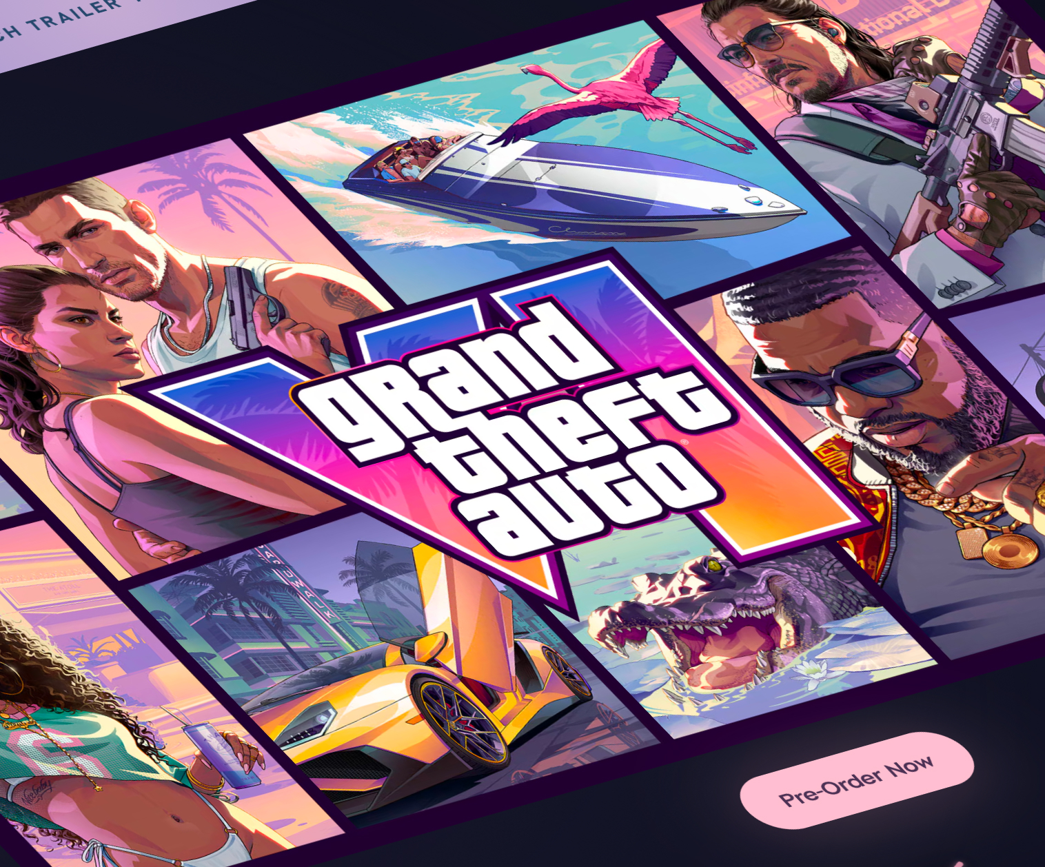
The intersection of high-fidelity gaming aesthetics and the web continues to intrigue. The recent Rockstar Games website for GTA 6 has set a high bar for scroll-triggered interactivity. When analyzed through the lens of performance and accessibility, these effects serve as a reminder that the web is no longer just a document repository; it is a creative canvas. Kevin Powell’s technical walkthrough of these effects proves that even complex, frame-perfect animations can be achieved with modern tools, provided developers are willing to push the boundaries of current browser APIs.
Technical Analysis: Advanced Visuals and Accessibility
One of the most exciting aspects of this transition is the emphasis on new, high-performance visual tools. The industry is currently moving toward "Visual-First" development.
- Gradient Innovation: The introduction of
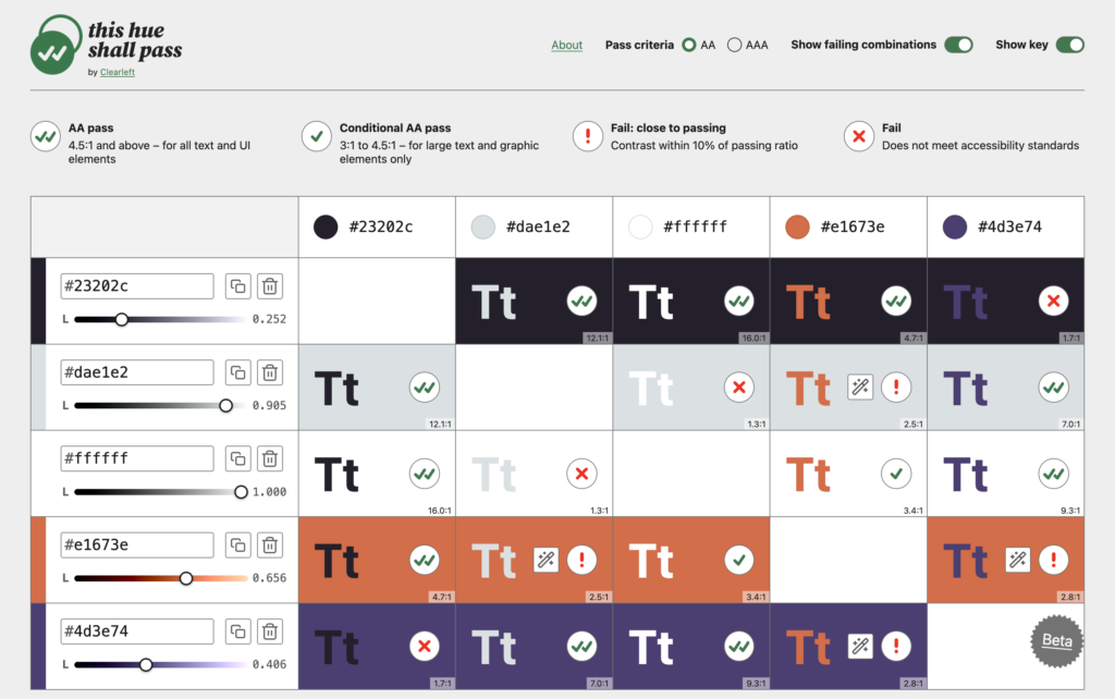
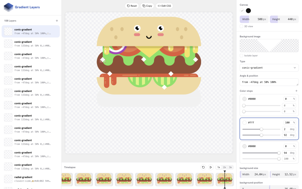
mesh-gradientandfreeform-gradientis a game-changer. These tools allow for complex, multi-layered color transitions that were previously only possible through raster images or bloated SVG assets. With these upcoming CSS features, developers can define gradients as mathematical models, resulting in infinite scalability and reduced file sizes. - Accessibility as a Priority: The release of the "This hue shall pass" contrast checker by Clearleft signals a maturing industry. It is no longer enough to reach a "Pass" rating; developers are now focused on fine-tuning colors to ensure they are visually coherent even when they technically meet AA/AAA standards. This reflects a shift in the developer mindset: accessibility is moving from a "compliance checkbox" to a core tenet of professional, high-quality design.
Future Outlook: The Newsletter Era
As CSS-Tricks pivots to its newsletter-first strategy, several key themes emerge for the future of the front-end community:

1. The Death of the "Algorithm-First" Web
By moving to a newsletter, the publication is opting out of the social media and search engine algorithms that dictate content visibility. This allows for long-form, thoughtful content that doesn’t need to be "clicked" in milliseconds to remain relevant. It is a return to the "slow web" movement, where value is measured in reader engagement and learning outcomes, not click-through rates.
2. A New Era for Design Systems
As we look toward 2026 and beyond, we can expect the web to become more modular. With tools like ::* and anchor positioning, the CSS we write today will be significantly more resilient than the CSS we wrote five years ago. Design systems will increasingly rely on these native capabilities rather than third-party utility libraries.
3. The Professionalization of Curation
The return of the CSS-Tricks newsletter is an acknowledgment that in a world of AI-generated content and infinite blog spam, human curation is the ultimate premium service. Subscribers are not just paying for information; they are paying for a vetted, high-signal filter that cuts through the noise of thousands of daily technical updates.

Conclusion
The final issue of What’s !important on the CSS-Tricks website is not a mourning of the past, but a rallying cry for the future. As the industry faces a period of rapid change, the need for a central, trusted, and human-curated hub has never been higher. By moving to a newsletter format, the publication ensures its own longevity, promising a deeper, more intentional relationship with its audience.
For developers, designers, and engineers, the message is clear: keep your browser tabs open, but prepare your inbox for a revival of the highest order. The party starts on November 10th, and for those who have been waiting four years for a seat at the table, the wait is almost over.