Executive Overview: A New Dimension for Android
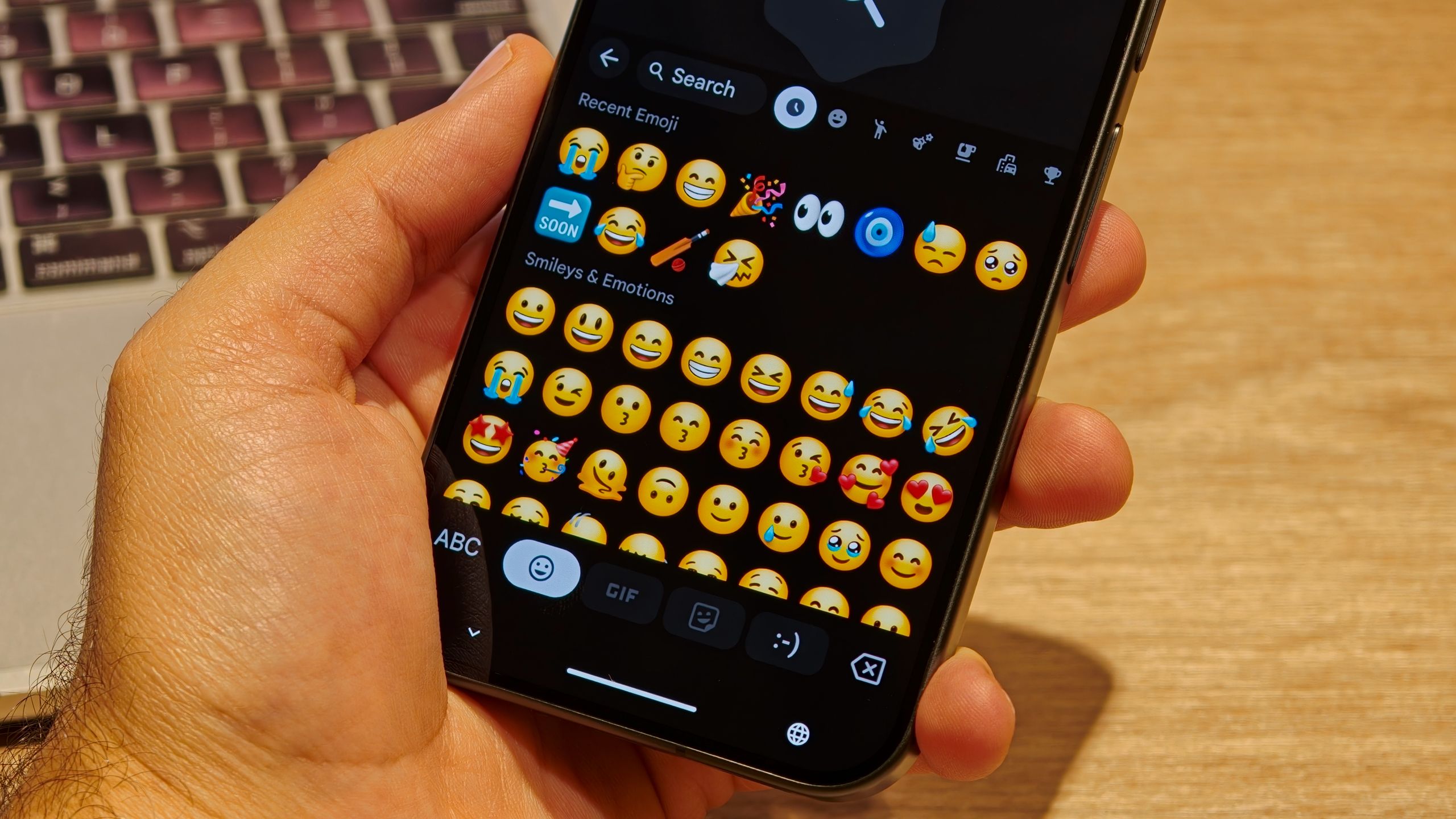
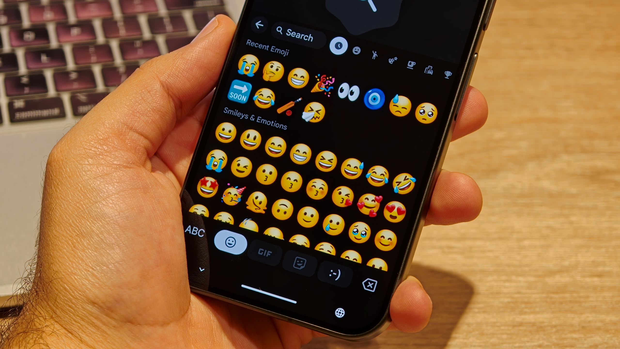
For years, the Android ecosystem has faced persistent criticism regarding its visual design language, particularly when compared to the vibrant, high-fidelity emoji sets found on competing platforms like iOS. Google has finally addressed this aesthetic gap with the introduction of its "Noto 3D" emoji suite, a design language that emphasizes depth, lighting, and a palpable sense of dimension.
Initially launched as a headline feature of the Android 17 operating system and the flagship Pixel 11 series, these emojis were designed to modernize the way users communicate. However, the exclusivity of these assets to the latest hardware left a significant portion of the Android user base feeling left behind. Recent reports from the field indicate that this exclusivity is beginning to thaw. Evidence suggests that Google has initiated a quiet, staggered rollout of the Noto 3D emoji set to older hardware, starting with the Pixel 6a. This move represents a broader strategic shift by Google to unify the Android experience across its hardware portfolio, moving away from fragmented visual standards.
Detailed Chronology: The Path to 3D Integration
The journey of the Noto 3D emojis began as a response to the long-standing complaints from the community that Android’s "flat" emojis lacked the nuance and personality required for modern digital expression.
The Android 17 Catalyst
With the official unveiling of Android 17, Google prioritized a visual overhaul of its core UI elements. The Noto 3D set was not merely an incremental update; it was a total reimagining of the Unicode library. By utilizing advanced rendering techniques, these emojis provide a sense of weight and tactile reality that their predecessors lacked. When Android 17 debuted alongside the Pixel 11 series, these emojis were positioned as a key differentiator, a "premium" software experience reserved for the newest devices.
The First Signs of Expansion
The shift from exclusive feature to broader deployment was first identified by observant users on platforms like Reddit. A user report confirmed that a Pixel 6a—a device several generations removed from the current flagship—had suddenly received the updated emoji library. Unlike typical feature drops that rely on a specific Gboard update, this transformation appears to be deeply integrated into the system-level font and rendering engine, suggesting that it was delivered via a silent system update.
This discovery, subsequently verified by industry trackers like 9to5Google, confirms that the "exclusivity period" for the Pixel 11 series was indeed a temporary phase. However, the rollout is proving to be highly unpredictable, as users running the same software on newer devices like the Pixel 9 Pro and Pixel 9a have yet to receive the update, indicating a server-side "phased release" approach.
Supporting Context & Metrics: Why Aesthetics Matter
To understand the significance of this update, one must look at the psychological and functional role that emojis play in modern digital communication.
The Psychology of Depth
Human communication is heavily reliant on non-verbal cues. In the digital realm, emojis serve as the surrogate for facial expressions and tone. Flat, two-dimensional emojis are often perceived as sterile or purely functional. The Noto 3D design language utilizes "pseudo-lighting" and shadow casting, which tricks the brain into perceiving depth. This adds a layer of "humanity" to the text, making the digital symbols feel more expressive and emotive.
Fragmentation vs. Uniformity
Historically, Android has suffered from "visual fragmentation." Because different manufacturers often applied their own skins and design languages, an emoji sent from a Samsung device might look fundamentally different when rendered on a Pixel. By pushing the Noto 3D standard, Google is attempting to create a "Google-standard" aesthetic that is consistent across its own hardware, and potentially across the wider Android ecosystem. The commitment to bring these to third-party manufacturers—including Nothing, Lenovo, Xiaomi, Oppo, OnePlus, Vivo, Honor, and Motorola—is a major step toward establishing a baseline visual identity for the Android platform.
Official Statements and Industry Impact
While Google has been relatively tight-lipped regarding the specific timeline for this rollout, their broader communication strategy has been clear: Android 17 is a vehicle for unification.
Industry analysts suggest that this strategy is a response to the "iMessage effect," where the consistent, high-quality visual experience of Apple’s ecosystem keeps users tethered to the platform. By bringing high-fidelity 3D emojis to older, mid-range, and budget devices, Google is effectively raising the "floor" of the Android experience. It signals to the consumer that an older phone is not necessarily an obsolete phone, provided it is still receiving core software updates.
Furthermore, the integration of these emojis into the system level—rather than just the keyboard app—ensures that the emojis will render correctly across the entire OS, including in third-party messaging apps, social media feeds, and system notifications.
Future Outlook: What Users Can Expect
As the rollout progresses, we can expect a few key developments in the coming weeks and months:
1. The End of "Emoji Incompatibility"
As more Android devices receive the Noto 3D update, the discrepancies between different Android versions will shrink. This reduces the frustration of "box" characters or outdated emoji designs appearing when users communicate across different generations of hardware.
2. A Broader Ecosystem Push
Google’s stated plan to bring these designs to third-party manufacturers is the most ambitious part of this initiative. If successful, it would mean that the majority of Android devices—regardless of whether they are a high-end gaming phone or a budget-friendly handset—will share the same visual language. This will solidify the Android brand identity in a way that has been difficult to achieve in the past.
3. Potential Performance Considerations
One of the technical hurdles Google must overcome is the rendering overhead. 3D assets, even when they are simple emojis, are more resource-intensive than their 2D counterparts. We will be monitoring how these updates affect battery life and performance on entry-level devices. If the optimization is handled correctly, this could be a benchmark for how Google manages "software-heavy" features on legacy hardware.
Final Thoughts
The transition to Noto 3D emojis is more than just a superficial design change; it is a signal of Google’s increasing maturity in managing the Android user experience. By acknowledging that visual delight is a key component of user satisfaction, Google is taking a necessary step toward closing the design gap with its primary competitors.
For owners of older Pixel devices, the wait for this update may be frustratingly inconsistent, but the direction is clear: the 3D revolution is coming to the entire Android family. As the rollout accelerates, users should keep their system software updated and monitor their Gboard settings, as Google continues to push the boundaries of what a "standard" software update can achieve for the longevity and desirability of their devices.
While we wait for the final, global deployment, the early signs are promising. The era of the "bland" Android emoji is officially drawing to a close, replaced by a more vibrant, dimensional, and expressive visual language that bridges the gap between the latest flagships and the faithful devices that have powered our digital lives for years.