Executive Overview: The Homogenization of the Web
For three decades, the evolution of web design has been defined by a desperate search for order. From the rudimentary HTML tables and spacer GIFs of the late 1990s to the sophisticated, fluid capabilities of modern CSS Grid, our industry has prioritized the "how" of layout over the "why." Today, a vast majority of the web is built upon a rigid, invisible architecture: the twelve-column grid.
While frameworks like Bootstrap and Foundation democratized responsive design, they also ushered in an era of aesthetic homogenization. When every site starts with the same twelve-column foundation, the resulting designs often feel like variations on a theme rather than unique expressions of brand identity. This article examines the stagnation of modern web layout, proposes a shift toward content-first design, and explores how modular and compound grids can restore personality to the digital landscape.
A Detailed Chronology: From Tables to Templates
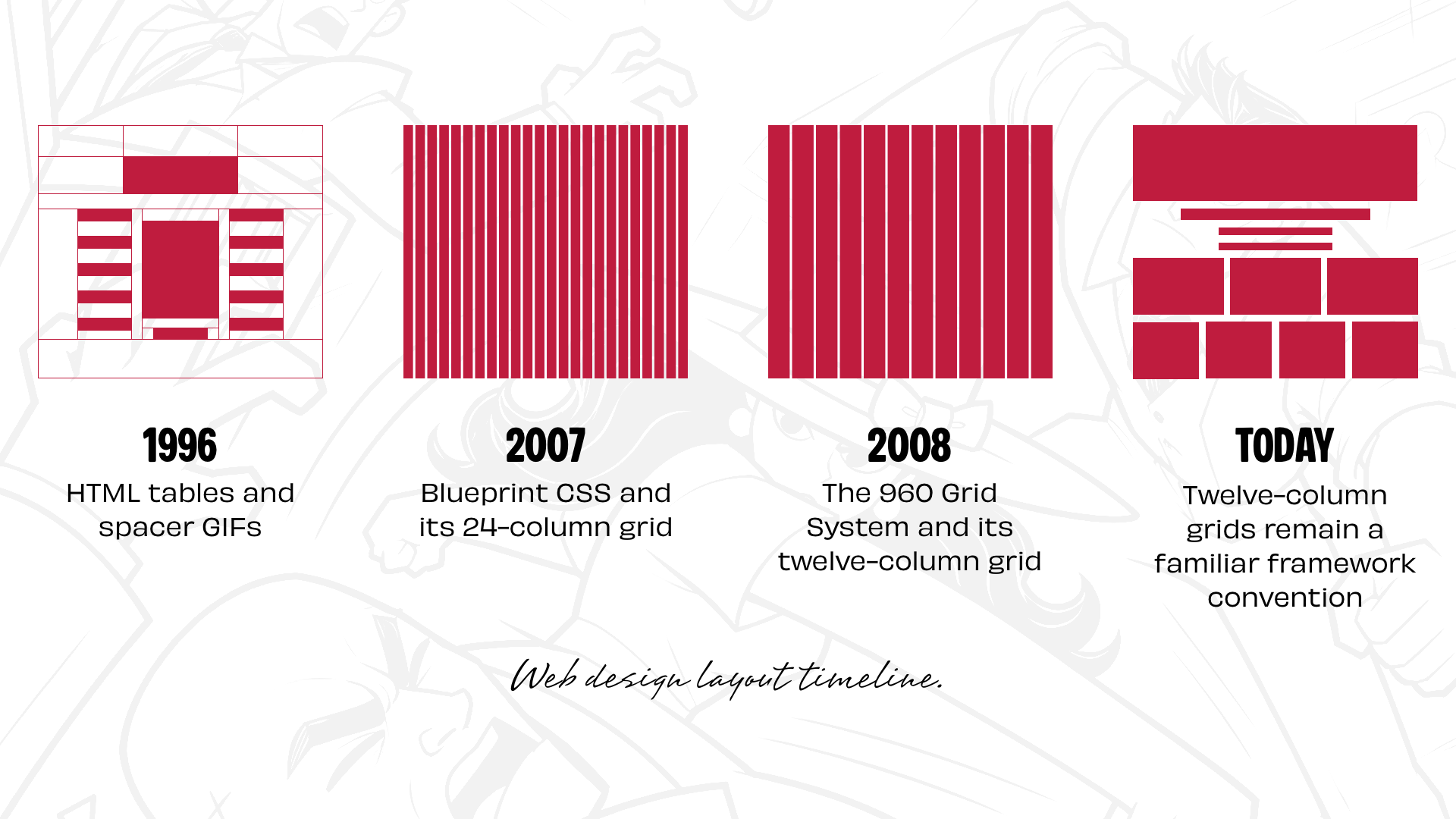
The history of web layout is a history of fighting the browser. In the mid-90s, David Siegel’s seminal work, Creating Killer Web Sites, introduced the design community to the potential of HTML tables and spacer GIFs. It was a clumsy, hacky workaround, but it provided the first semblance of page control.
As CSS evolved, developers pivoted to "float-based" layouts. While this provided more semantic flexibility, it was fraught with the infamous "clear-fix" hacks and browser-specific quirks that defined the frustration of early 2000s web development. The breakthrough finally arrived with the introduction of CSS frameworks.
The Rise of the Grid Framework
Blueprint CSS (2007) and Nathan Smith’s 960 Grid System were revolutionary. They provided a shared language for developers and designers, turning the chaotic world of CSS floats into a manageable grid of 12 or 16 columns. The logic was simple: 12 is a "magic" number because it is highly divisible, allowing for easy 2-up, 3-up, and 4-up layouts.
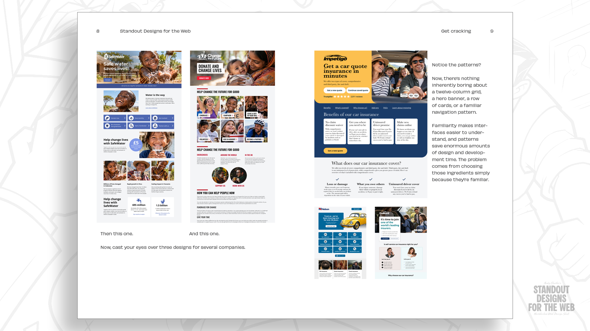
However, what began as a tool for efficiency eventually morphed into a default setting. By the time frameworks like Bootstrap and Foundation became industry standards, the twelve-column grid had become the de facto architecture of the internet. It ceased to be a choice and became an assumption.
Supporting Context: The Danger of "Design by Default"
The problem is not that twelve-column grids are "bad." They are, in fact, highly effective for certain types of data-dense applications. The issue lies in the creative atrophy that occurs when a designer reaches for a grid before they have even considered the specific narrative of the client.
The Wheelman Case Study
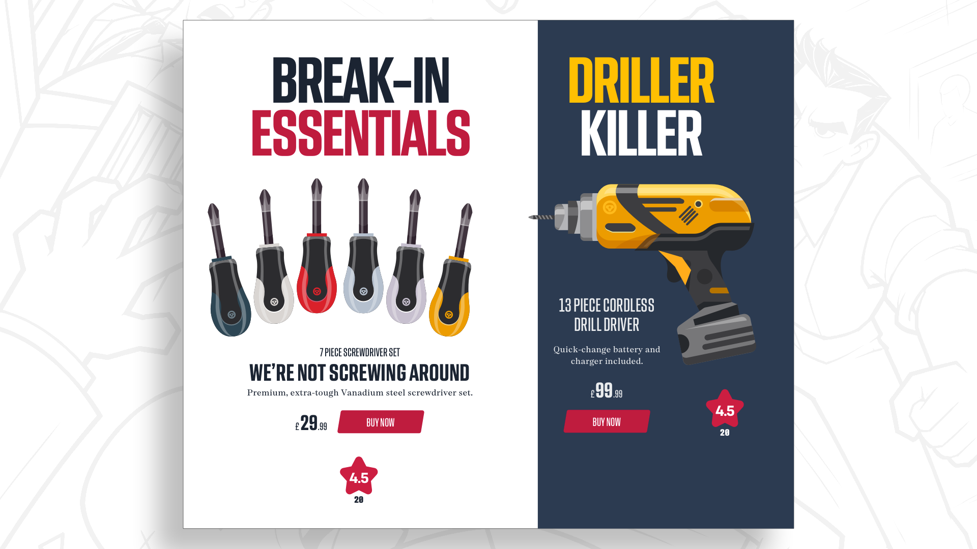
To illustrate the necessity of breaking this mold, consider "Wheelman," a fictional entity designed for the book Standout Designs for the Web. Wheelman is not a corporate utility; it is a service provider for getaway drivers, offering everything from legal advice to break-in essentials.
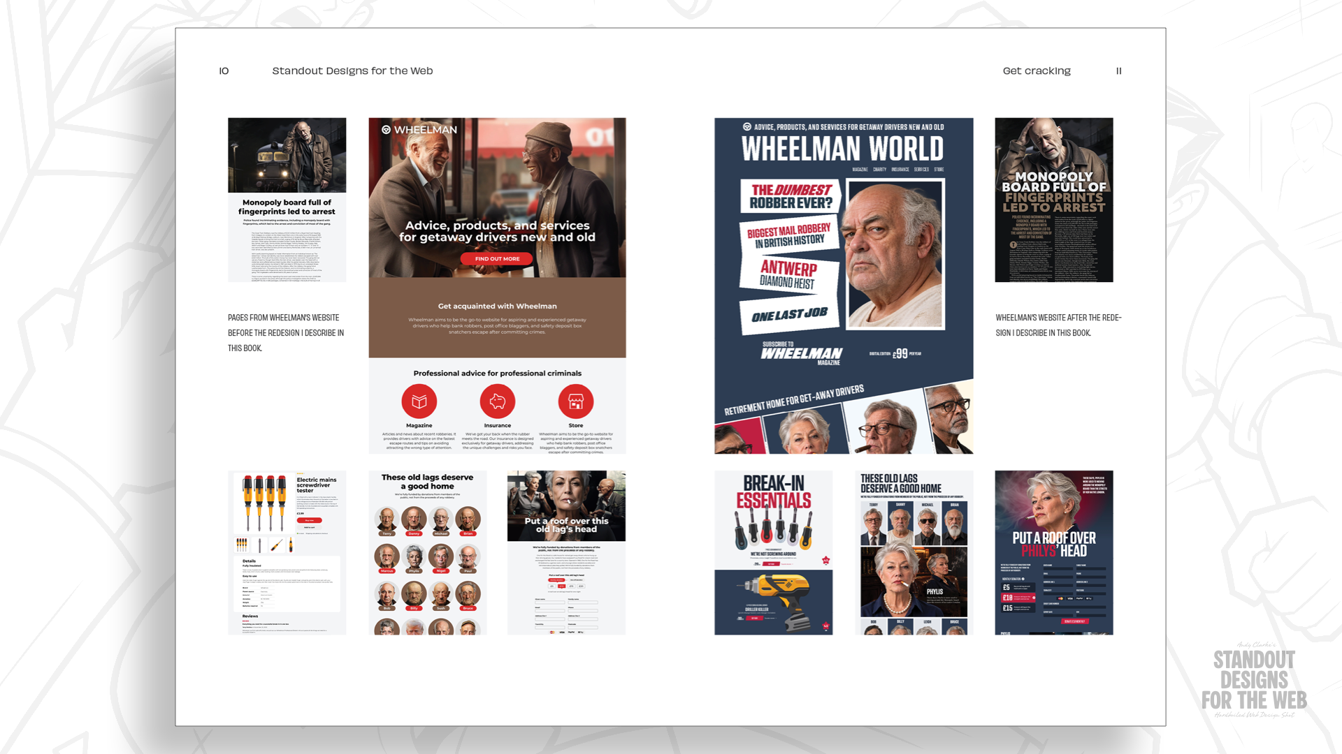
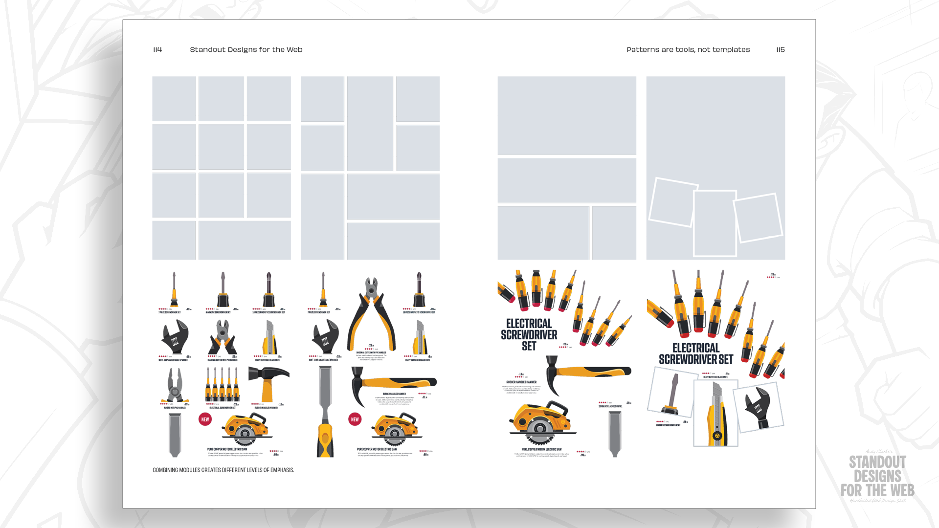
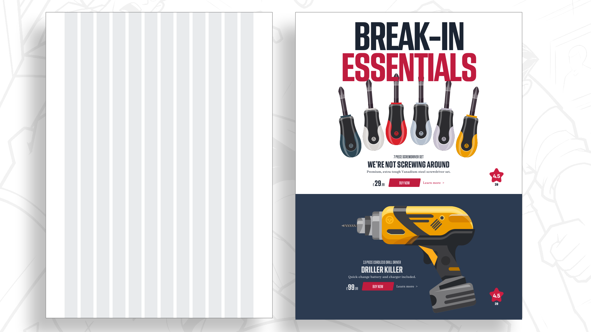
If we treat the Wheelman shop as a standard e-commerce site, we might default to a 12-column grid, dropping products into neat, predictable squares. But in doing so, we strip the brand of its rebellious, professional-criminal edge. The layout becomes a neutral vessel, failing to communicate the personality of the business.
True design, by contrast, starts with questions:
- What makes this company distinctive?
- How can we use space to evoke emotion?
- Does the hierarchy of the content demand a break from traditional symmetry?
By prioritizing the "story" over the "column," we move from mere decoration to meaningful visual communication.
Modular Grids: Adding the Second Dimension
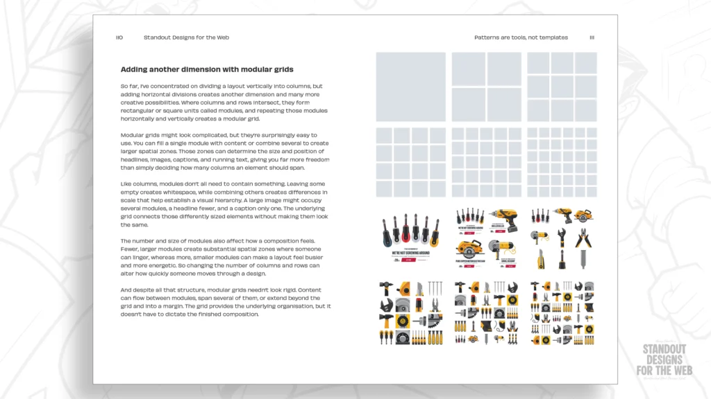
If columns provide the vertical structure of a page, rows provide the horizontal. The intersection of these two creates "modules." A modular grid moves beyond the flat, single-direction thinking of the 12-column system, allowing designers to create a spatial language that is both organized and dynamic.
Establishing Hierarchy Through Scale
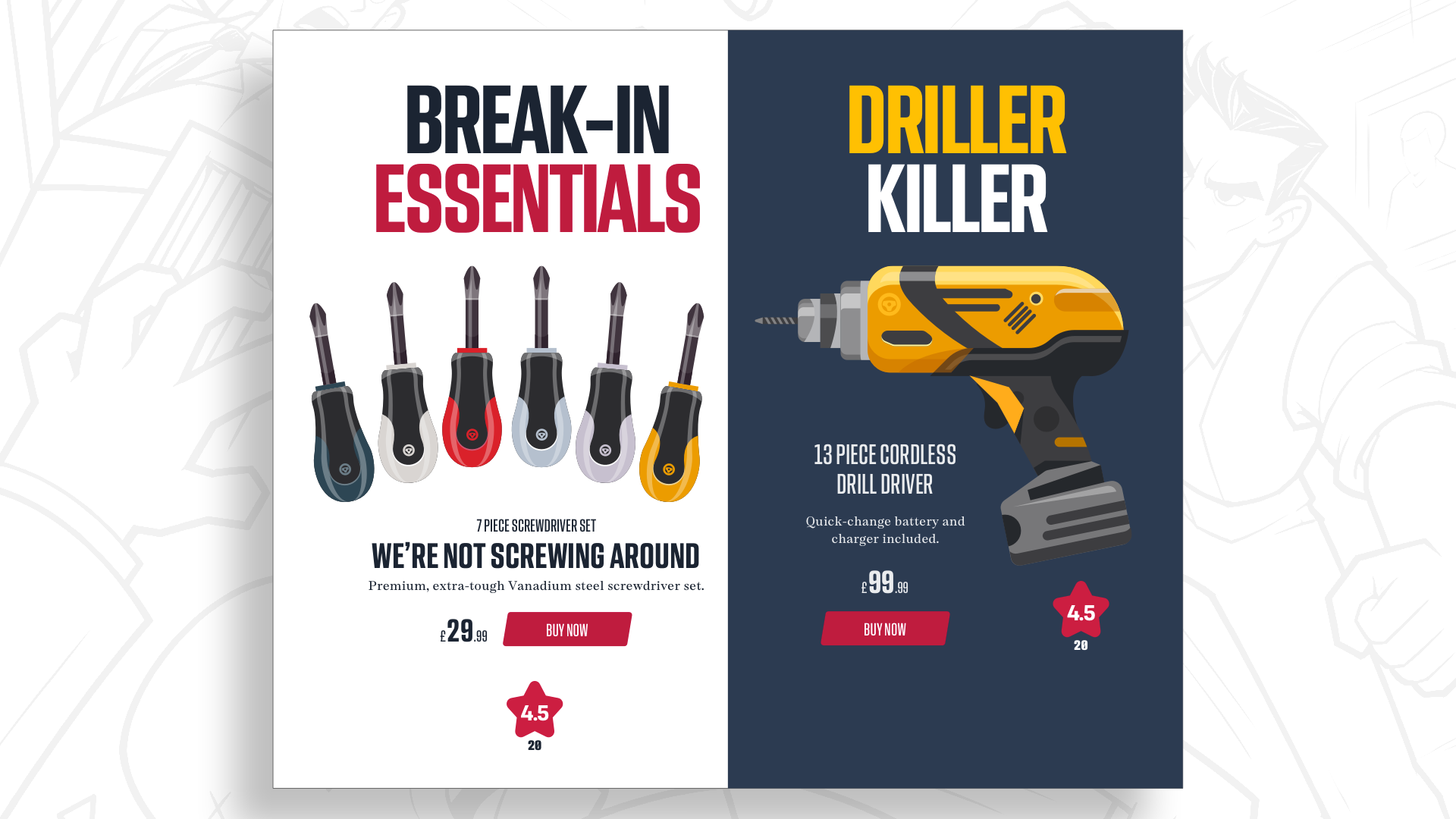
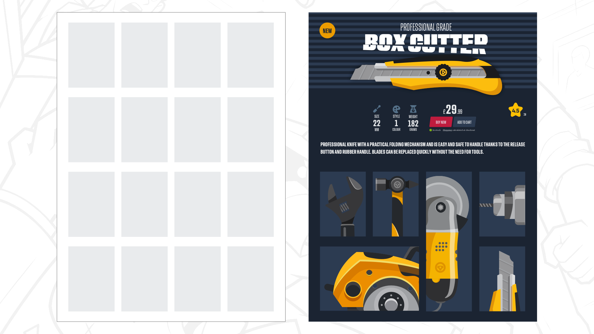
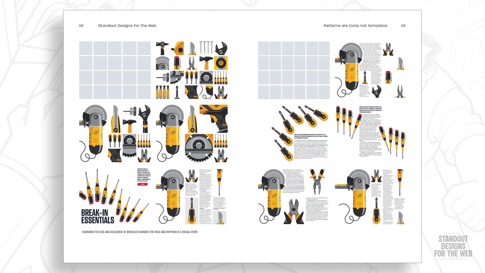
In a modular grid, the designer gains the ability to control whitespace with mathematical precision. By assigning elements to specific modules, one can create a layout that feels intentional rather than accidental. For instance, a headline might span four modules to command authority, while auxiliary product information occupies a single, isolated module to force the viewer to slow down and process the detail.
This is not about being different for the sake of novelty; it is about establishing a visual hierarchy that reflects the specific importance of content elements. When the layout is custom-tailored to the content, the user experience becomes more memorable because the structure itself guides the eye in a non-linear, engaging way.
Compound Grids: The Frontier of Complex Layouts
The most sophisticated web designs often utilize "compound grids"—the layering of multiple grid systems on a single page. By overlaying a two-column grid with a three-column grid, or merging a modular grid with a column-based one, designers can achieve a level of complexity that is impossible with standard framework defaults.
Breaking the Template Trap
The objective of using compound grids is to ensure that while a website remains cohesive, it avoids the monotony of a repetitive template. Imagine a magazine section that needs to feel spacious and literary, contrasted with a shop section that needs to be efficient and transactional.
By utilizing different underlying grid structures for different page types, a brand can maintain a unified visual identity—through color, typography, and image treatment—while allowing the layout to breathe and adapt to the specific needs of the page content. This is the hallmark of high-end editorial design, finally coming to the web.
Future Outlook: The Return of Intentionality
The future of web design will not be defined by better frameworks, but by a deeper understanding of visual composition. As we move further away from the constraints of early browser limitations, we must shed the habits formed during those restrictive times.
A Call for Deliberate Decision-Making
Designers are encouraged to look beyond the "12-column" instinct. The goal is to create sites that feel as though they could only belong to the company they represent. When we make deliberate, informed choices about how to arrange elements—when we use space to create tension, or modules to create rhythm—we elevate the web from a collection of documents to a digital experience.
This shift requires a fundamental change in the design process:
- Understand the Entity: Define the brand’s voice, purpose, and audience before opening a design tool.
- Content-First Mapping: Map out the hierarchy of information based on its narrative value, not its dimensions.
- Choose the Tool, Don’t Be Ruled by It: Select a grid system (or build a custom one) that supports the specific needs of that narrative.
As we look toward the end of the decade, the websites that stand out will be those that feel handcrafted and purpose-built. By moving beyond the default, we do not just improve our layouts; we improve the very fabric of the internet, making it a place where character and personality can thrive alongside efficiency.
Standout Designs for the Web is currently available for pre-order. It serves as a comprehensive guide for those looking to move past the limitations of standard grid frameworks and toward a more deliberate, expressive era of web design. Everyone who pre-orders will receive the Hardboiled Client Interview Guide, a practical resource designed to help practitioners uncover the unique stories behind the companies they serve. The era of the "one-size-fits-all" web is drawing to a close; it is time for a more intentional, design-forward future.