Executive Overview
In the contemporary landscape of web design, "Dark Mode" has transitioned from a niche power-user feature to a near-universal expectation. However, as developers strive to offer users granular control over their visual environment, they often fall into the trap of over-engineering the interface. A recent discourse, spearheaded by prominent web developer and researcher Lea Verou, has challenged the industry-standard implementation of tri-state color scheme toggles.
Verou argues that the ubiquitous "Light/Dark/System" selection menu is an unnecessary exercise in cognitive load. Instead, she posits that a simple two-state toggle—coupled with intelligent browser-level system detection—provides a more elegant, efficient, and user-friendly experience. This article examines the core of this debate, the psychological impact of UI clutter, and why the future of site personalization may lie in doing less, not more.
Detailed Chronology: The Evolution of the Toggle
The implementation of color scheme toggles has followed a predictable, if arguably bloated, trajectory. When dark mode first gained mainstream popularity, developers were desperate to ensure users felt "in control." This led to the adoption of the tri-state selector: a dropdown or set of buttons explicitly labeled "Light," "Dark," and "System."
The Rise of the Tri-State Standard
For several years, this tri-state model became the gold standard. It was seen as inclusive and transparent, providing the user with an explicit way to "opt-out" of their OS settings. Yet, as the web matured, this design pattern began to show cracks. It forces the user to make a conscious decision about their preference every time they interact with the setting, regardless of whether that setting aligns with their OS-level configuration.
The Verou Intervention
In August 2026, Lea Verou published a comprehensive critique of this pattern, arguing that it creates unnecessary friction. Her central premise is that the "System" state is a default, not a third option on par with Light or Dark. By utilizing a simple two-state toggle—where the UI reflects the currently active state and allows for a single-click override—developers can achieve the same functionality with significantly less screen real estate and lower cognitive demand.
The Community Reaction
The proposal ignited a firestorm of "nerdy" debate across platforms like Bluesky and personal tech blogs. Designers and developers began to question why we have been training users to navigate three-option menus when a binary toggle serves the same psychological and technical purpose. The discussion revealed a broader fatigue regarding the "dashboard-ification" of simple web components.
Supporting Context & Metrics: Why Simplicity Matters
The argument for a two-state system is rooted in principles of human-computer interaction (HCI) and the reduction of cognitive load. When a user lands on a website, their primary goal is rarely to configure the site’s color scheme. It is to consume content, complete a transaction, or find information.
The Cost of Cognitive Dissonance
Every UI element on a page competes for the user’s attention. By adding a three-option toggle to a header or navigation bar, developers are asking the user to parse information that is, in many cases, redundant. If a user’s browser is already set to dark mode, the "System" option in a menu is essentially a state of "do nothing." Representing "doing nothing" as an active, clickable button introduces unnecessary complexity.
The "Persistent Override" Paradigm
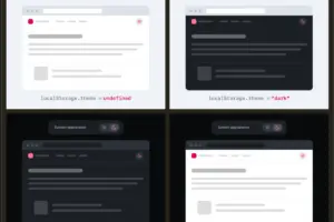
The logic behind the two-state system is as follows:
- Initial Load: The site respects the
prefers-color-schememedia query. - First Interaction: If the user dislikes the system default, they toggle the switch. This action is recorded in
localStorage. - Future Sessions: The site checks
localStoragefirst; if an override exists, it is applied. If not, it reverts to the system default.
This approach acknowledges the "tangential" nature of color schemes. If the user’s preference diverges from the system, it is usually a minor, infrequent adjustment. As Verou notes, if the user ever feels the need to revert to the system setting, a simple toggle is sufficient. There is no need for a dedicated "System" button to facilitate this.

Official Perspectives and Expert Analysis
The industry response to this shift has been largely supportive, particularly among those who prioritize performance and minimalist design.
The Browser-Level Argument
A compelling point raised during the debate—notably by users like Chris Coleman—is the disconnect between OS-level preferences and specific website aesthetics. Many users desire a dark OS environment for file management and system tools, but prefer light-mode websites for readability.
This suggests that the "System" preference is a blunt instrument. By moving toward a two-state override model, we allow the web to function as a separate layer of preference, rather than an extension of the operating system. This respects the user’s intent to customize the web experience specifically, rather than being forced into an all-or-nothing system sync.
The Edge Cases
While Verou advocates for the two-state model, she acknowledges that there are specific scenarios where a tri-state control is warranted. These include:
- Complex Accessibility Needs: Users who require specific high-contrast modes that differ significantly from standard light or dark themes.
- Context-Specific Environments: Web applications that serve as specialized tools where the "System" mode might not actually map to a functional equivalent in the app’s internal theme library.
However, for 95% of websites—blogs, news sites, marketing pages, and standard SaaS products—these edge cases do not justify the clutter of a tri-state selector.
Future Outlook: The Death of the Toggle?
The logical conclusion of this debate leads us to an even more provocative question: Do we need a toggle at all?
The Rise of Intelligent Defaults
As CSS capabilities advance, specifically with the light-dark() function and improved media query support, we are approaching a future where the website automatically adapts to the user’s preference with near-perfect accuracy. If a site is designed with a strong, accessible base theme, the need for a manual toggle may eventually evaporate.
Strategic Recommendations for Developers
For those currently maintaining web projects, the transition to a simplified UI is straightforward:
- Audit your current toggles: Are you using a dropdown? A three-button set?
- Measure engagement: Do your analytics show that users frequently switch between "System" and manual modes? If not, the UI is likely providing false choices.
- Implement the two-state pattern: Use a single button that indicates the current state and acts as a toggle.
- Prioritize the User Goal: Remember that the toggle is a secondary interaction. It should be discoverable but never intrusive.
Conclusion: The Elegance of Less
The discussion initiated by Lea Verou serves as a vital reminder that "good design" is not about adding features, but about removing the barriers that prevent users from achieving their goals. By rethinking the color scheme toggle, we aren’t just cleaning up a header; we are refining our philosophy of user agency. In an era where digital noise is at an all-time high, the most sophisticated design choice is often the one that demands the least of the user.
Moving forward, the industry should look to standardize this two-state pattern, moving away from the bloat of the tri-state menu and toward a more streamlined, intent-focused web. The "nerdy" debate has provided a clear path forward: keep the functionality, lose the clutter, and let the system do the heavy lifting.