Executive Overview
For decades, crafting organic shapes, asymmetric borders, and sophisticated geometrical layouts on the web has been an exercise in geometric gymnastics. Front-end developers have long relied on an intricate web of hacks—combining pseudo-elements, intricate SVG overlay wrappers, raster images, and the restrictive clip-path property. While clip-path revolutionized our ability to carve out custom silhouettes from rectangular boxes, it carried a frustrating fatal flaw: it clipped everything, including the element’s borders, box-shadows, and outlines. If you wanted a styled, stroked border along a custom shape, you were forced to abandon native CSS borders and construct brittle workaround overlays.
The web platform is finally solving this layout bottleneck. Following the rapid stabilization of the shape() function and the corner-shape property, a new powerhouse feature has arrived in the specification: the border-shape property.

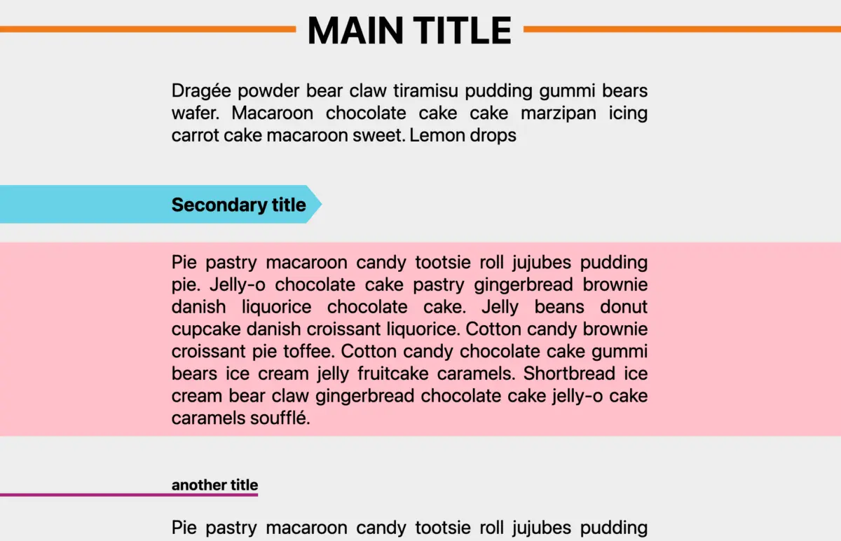
Currently making waves in Chromium-based development environments, border-shape represents a fundamental paradigm shift. Instead of brutally clipping an element post-render, this property actively shapes the element at its structural level. It allows native borders, box shadows, and outlines to gracefully trace complex paths, opening up unprecedented creative territory for web designers and developers. From pristine border-only geometric vectors and complex cutout shapes to dynamic breakout backgrounds and fluid micro-animations, border-shape bridges the historical gap between SVG graphics and native CSS styling.
Detailed Chronology: The Evolution of CSS Geometry
To truly appreciate the engineering leap that border-shape represents, we must examine the chronological progression of layout geometry on the modern web.

Phase 1: The Box Model Era and Structural Hacks
In the early days of CSS, every element was strictly confined to a rigid rectangular box model. Introducing curves required the introduction of the groundbreaking border-radius property, which finally softened the web’s harsh 90-degree corners. However, creating triangles, trapezoids, or complex polygons meant leaning into legacy hacks—such as manipulating zero-width block dimensions with transparent and colored borders. These techniques were fragile, inaccessible to responsive resizing, and entirely unsuited for modern design systems.
Phase 2: The clip-path and Masking Revolution
The introduction of clip-path and CSS masking functions (mask-image) allowed developers to define vector coordinate pathways using polygon(), circle(), ellipse(), and legacy SVG path() values. While powerful, clip-path acted as a pair of digital scissors, slicing through the rendering tree after layout calculations. Any border or box-shadow applied to a clipped element was unceremoniously hacked off along with the background, leaving developers without a native way to outline customized components cleanly.

Phase 3: Modern Primitives – shape() and corner-shape
Recently, the CSS Working Group standardized the shape() function for clip-path and offset-path. By utilizing a simplified, human-readable variant of SVG path syntax, shape() dramatically simplified the generation of complex paths without forcing developers to lean heavily on external SVG files.
Simultaneously, the corner-shape property emerged to work in tandem with border-radius. Rather than just rounding a corner circularly, developers gained access to semantic keywords such as round, scoop, bevel, notch, and squircle. While corner-shape successfully allowed borders to wrap around these specific corner adjustments, its scope remained limited to corner modification.

Phase 4: The Arrival of border-shape
The culmination of this evolutionary timeline is border-shape. By decoupling the concept of shaping from destructive clipping, border-shape allows developers to define structural pathways that native decorations can respect, interact with, and animate. It marks the transition of CSS from a document-formatting language into a fully realized vector layout engine.
Supporting Context & Metrics: How border-shape Works
At its technical core, border-shape accepts standard CSS basic-shape functions—including polygon(), inset(), circle(), and the newly standardized shape() function. According to the current W3C CSS Borders Module Level 4 specification, the property operates under two distinct operational modes determined by the number of shape arguments provided.

1. Stroke Mode (Single Basic-Shape)
When a developer passes a single basic shape to border-shape, the browser enters Stroke Mode:
.shape
  border: 8px solid #ff4757;
  border-shape: shape(M 0 0 L 100 0 L 50 100 Z);
In this mode, the border is rendered as a clean stroke running directly along the specified path. The thickness of this stroke is determined by the element’s computed border-width properties. This completely eliminates legacy workarounds, making crisp, vector-outlined stars, hearts, and custom polygons natively possible in pure CSS.

2. Fill Mode (Two Basic-Shapes)
When developers provide two basic shapes, the engine enters Fill Mode:
.shape
  border: 12px solid #2ed573;
  border-shape: inset(0) circle(40px);
Here, the first shape defines the outer boundary, while the second shape defines the inner boundary. The resulting border is rendered precisely within the geometric area between these two distinct paths. This dual-shape syntax unlocks complex "cutout" layouts, framing effects, and layered visual masks without requiring nested DOM elements.

+-------------------------------------------------+
|  [Outer Shape: inset(0)]                        |
|   +-----------------------------------------+   |
|   |  [Inner Shape: circle(40px)]            |   |
|   |  (Content / Cutout Area)                |   |
|   +-----------------------------------------+   |
+-------------------------------------------------+
Compatibility and Standards Status
As of mid-2026, implementation of border-shape is rapidly progressing within the Chromium engine, with experimental feature flags available for developer testing. While cross-browser Baseline status is still pending, the predictability of its fallback patterns—combined with its structural similarity to clip-path syntax—makes it an ideal candidate for progressive enhancement strategies. Developers can safely wrap experimental blocks within @supports (border-shape: shape()) queries today, preparing their production applications for tomorrow’s visual standards.
Official Statements and Architectural Insights
Industry standards architects and CSS specification authors have long recognized the friction points inherent in legacy layout tooling. In technical discussions surrounding the CSS Borders and Box Decoration modules, working group members have repeatedly emphasized the need for a non-destructive geometry model.

"For years, styling custom shapes meant choosing between semantic markup and visual fidelity. Developers were forced to embed inline SVGs or rely on brittle clipping wrappers just to place a colored outline around a non-rectangular component. The
border-shapeproperty represents our commitment to unifying vector geometry with the traditional CSS box model, ensuring that borders, shadows, and outlines treat custom paths as first-class citizens."
— CSS Working Group Architectural Notes
Furthermore, lead CSS educators and specification advocates highlight how seamlessly border-shape integrates into existing workflows:

"If you already know how to write a
clip-path, you effectively already know how to write aborder-shape. You simply swap the property name, and suddenly your strokes, drop-shadows, and box decorations come alive, wrapping perfectly around your custom paths rather than getting sliced away by scissors."
Future Outlook: Creative Horizons and Advanced Use Cases
The introduction of border-shape opens up architectural possibilities that were previously difficult, performance-heavy, or entirely impossible to achieve natively.

1. Dynamic Breakout Decorations and Full-Width Backgrounds
Creating a container that remains structurally centered within a standard grid column while its background color or border spans the absolute edge of the viewport has historically required complex negative margin calculations or viewport-unit layout tricks.
By leveraging border-shape with dual-shape configurations (inset(0 -100vw) circle(0)), developers can orchestrate breakout background and border effects effortlessly. The structural content respects its parent layout container, while the border-driven background decoration bleeds smoothly across the screen.

2. Fluid Shape and State Animations
Because border-shape handles paths natively within the layout and styling engine, these shapes can be animated smoothly using standard CSS transitions and keyframes.
- Reveal Effects: Animating the
border-widthor inner coordinate offsets on hover can produce stunning, fluid expansion and contraction sequences. - Morphing Blobs: By transitioning between complex
shape()coordinate arrays, developers can build organic, liquid-like UI components—such as interactive buttons, squishy loaders, and animated card frames—without relying on heavy JavaScript morphing libraries.
3. Hand-Drawn Interfaces and Organic Design Systems
Modern design trends increasingly favor organic, hand-drawn vector aesthetics over rigid, corporate minimalism. With border-shape, design systems can incorporate wiggly underlines, dynamic hand-sketched form inputs, and imperfect geometric borders that respond fluidly to user interactions, focus states, and responsive viewports.

Conclusion
The web is transforming from a medium of rigid boxes into a canvas of fluid, dynamic geometry. The arrival of the border-shape property—acting in concert with the shape() function and corner-shape properties—marks the end of an era defined by frustrating CSS shape hacks and destructive clipping limitations.
By enabling native borders, box shadows, and outlines to trace complex vectors accurately, border-shape empowers front-end engineers to build richer, more expressive user interfaces with cleaner codebases. While broad cross-browser support continues to mature, now is the ideal time to experiment with these cutting-edge primitives, audit your design systems, and prepare your front-end architecture for the next generation of web design.