Executive Overview: The Tyranny of the Standardized Layout
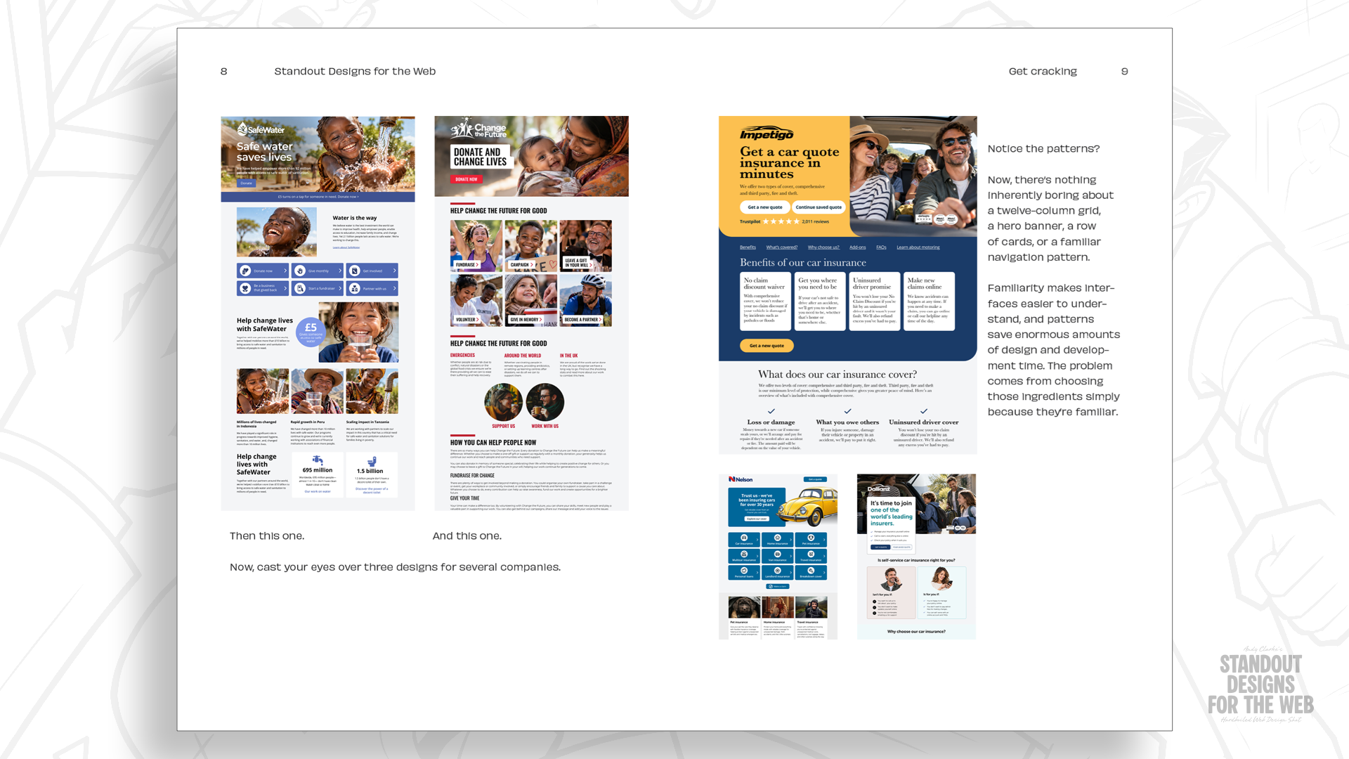
For three decades, the web has been engaged in a constant struggle between creative expression and technical constraints. In the early days, designers relied on the "hacky" foundations of HTML tables and spacer GIFs—methods never intended for page layout but adopted out of necessity. As we transitioned into the era of CSS, floats, and eventually modern CSS Grid, the technical hurdles diminished, yet a new, subtle problem emerged: the homogenization of the web.
Today, the twelve-column grid system—popularized by frameworks like Blueprint, 960 Grid System, Bootstrap, and Foundation—has become the de facto standard for the internet. While these frameworks provided a necessary shared language for developers and designers to build responsive sites, they have inadvertently created a "default" aesthetic. When every landing page, portfolio, and corporate site starts with the same twelve-column blueprint, the result is a web that looks remarkably uniform. This article explores why we reached this point, why the reliance on standardized grids is stifling brand identity, and how designers can break free from the mold to create truly distinctive digital experiences.
A Detailed Chronology: From Tables to Templates
The history of web design is a cycle of overcoming technical limitations. In the mid-1990s, when David Siegel published Creating Killer Web Sites, the industry was in its infancy. Designers were forced to treat HTML tables as a design tool, manually calculating pixel-perfect spacers to force content into position. It was a brittle, frustrating process, but it laid the groundwork for the structural obsession that defines the industry today.
As browsers evolved, the introduction of CSS offered more control through positioning and floats. However, the inconsistency of browser rendering engines meant that "layout" remained a high-stress activity. The industry craved stability, and the arrival of grid frameworks in the late 2000s—most notably the 960 Grid System—felt like a revelation. By providing a fixed set of columns, these tools allowed teams to communicate effectively; a "three-column layout" became a universally understood instruction.
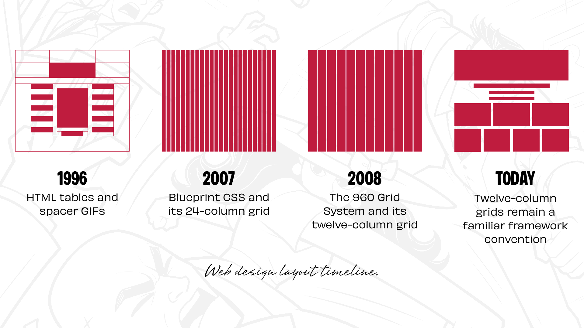
By the time Bootstrap and Foundation cemented their place as industry standards, the twelve-column system had become the bedrock of web development. Twelve is a mathematically convenient number, easily divisible into halves, thirds, and quarters. It made the creation of 2-up, 3-up, and 4-up component patterns trivial. But as the tooling became more sophisticated, the creative process began to stagnate. We stopped asking "How should this content be presented?" and started asking "Which column should this go into?"
Supporting Context: The Danger of the "Default" Starting Point
The issue is not the grid itself; the issue is the habitual use of the grid as a starting point. When a designer opens a design tool and immediately draws twelve vertical lines, they have already restricted their creative vision before the brand’s story has even been considered.
The Role of Brand Personality
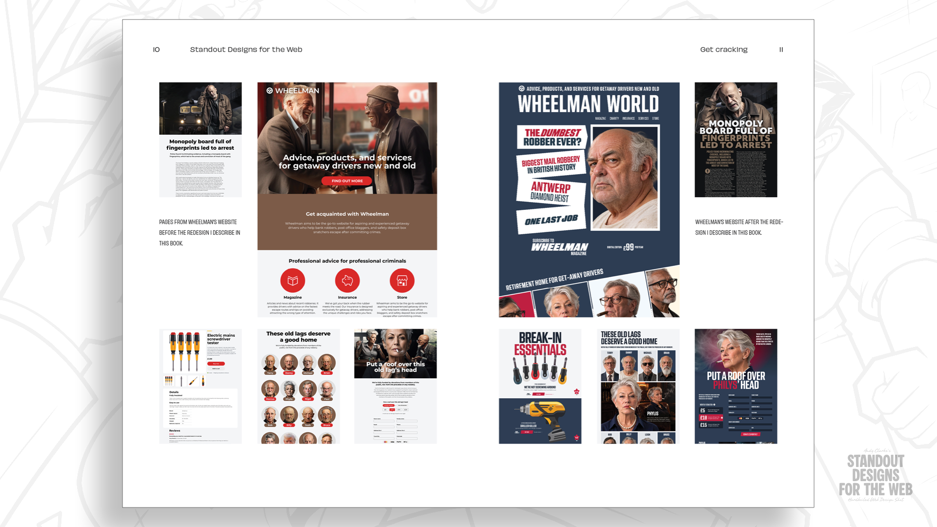
Every company, whether it is a global tech giant or a boutique agency, has a story that deserves a unique visual voice. If a company is bold, disruptive, and rebellious, why should its website share the same rigid, corporate-friendly geometry as a local insurance firm?
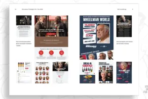
Consider the fictional case of "Wheelman," a company specializing in services for getaway drivers. A business that handles robbery insurance and break-in essentials requires a brand identity that is professional yet undeniably edgy. If you force the Wheelman website into a standard twelve-column grid, you lose the opportunity to convey its personality. A layout is not just a container for content; it is a communication tool. The arrangement of elements—the use of negative space, the interplay between large typography and imagery, and the hierarchy of information—tells the user how to feel about the brand before they read a single word.
Content-First Design Philosophy
The solution lies in a "Content-First" approach. Before any grid is drawn, designers should interrogate the project:
- What makes this company distinct from its competitors?
- What is the specific mood or atmosphere of the content?
- What is the most important element for the user to see, and how does it relate to the secondary elements?
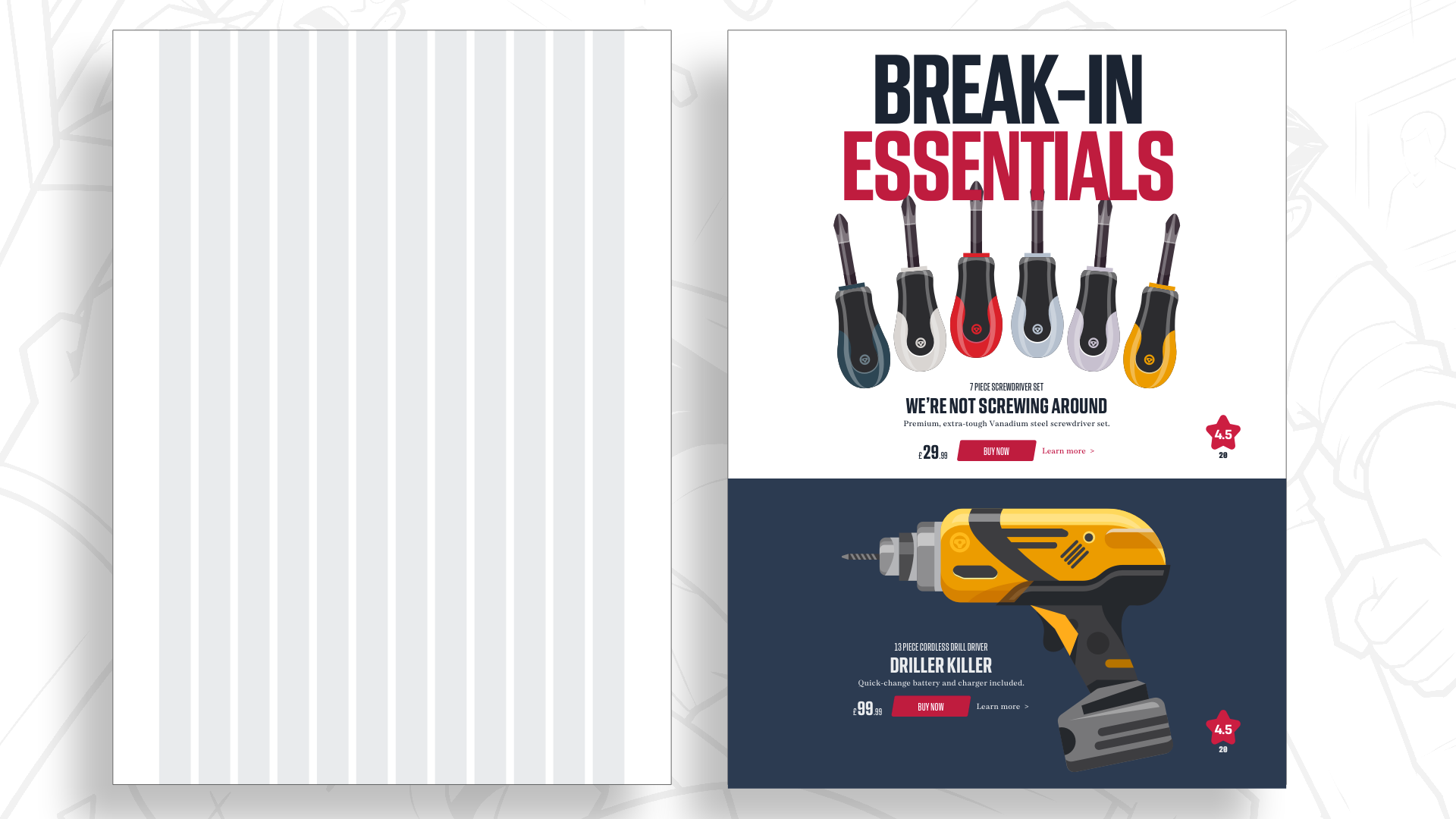
By answering these questions, the layout begins to dictate the grid, rather than the grid dictating the layout. This shift transforms the grid from a cage into a flexible, supportive framework that can be adapted to serve the content.
Expanding the Toolbox: Modular and Compound Grids
To escape the monotony of twelve columns, designers must embrace more nuanced structural tools.
Modular Grids: Adding the Second Dimension
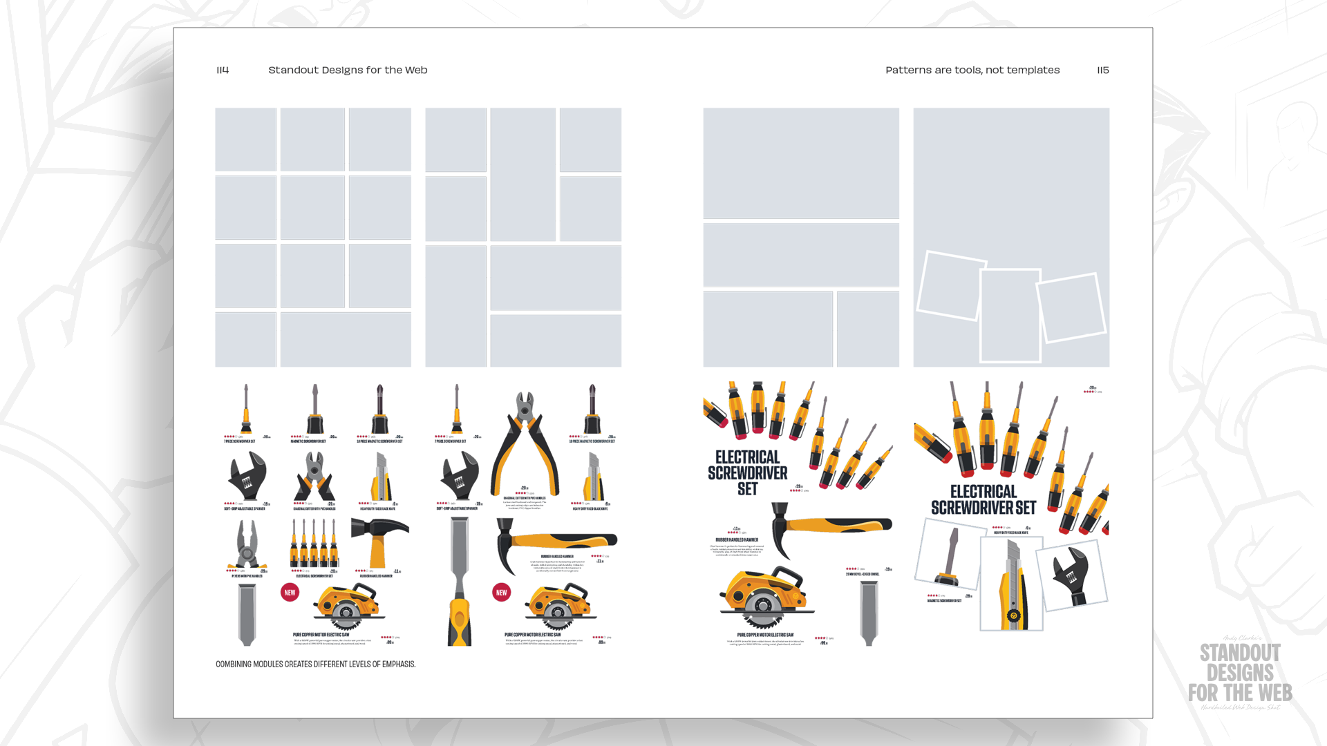
Where column-based grids focus on vertical alignment, modular grids introduce horizontal rows. The intersection of these lines creates "modules." By treating these modules as building blocks, designers can create a sense of rhythm and drama that is impossible with simple columns.
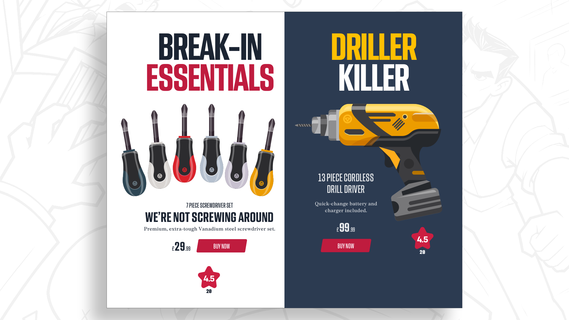
For example, a 4×4 modular grid offers sixteen distinct units. A designer might spread a hero image across four modules to create visual impact, while tucking product information into a single module to create a sharp contrast in scale. This creates a "hierarchy of interest" that leads the user’s eye naturally through the page, making the interface feel crafted rather than assembled.
Compound Grids: The Ultimate Flexibility
For more complex sites that host diverse types of content—magazines, shops, and service portals—a single grid is rarely enough. This is where compound grids come into play. By overlaying two different grids (e.g., a two-column grid atop a three-column grid), designers create a hybrid structure that provides both organization and asymmetry.
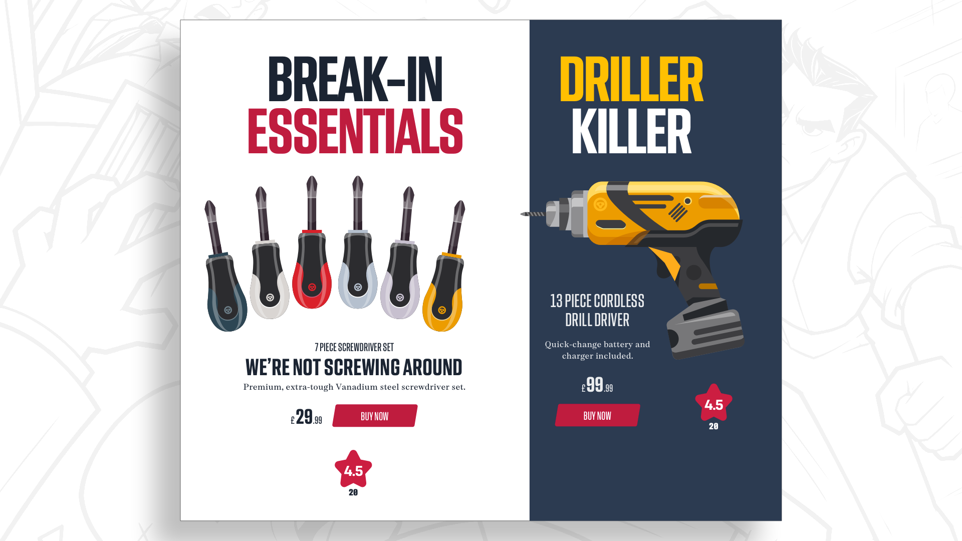
This approach allows for a dynamic layout where certain sections can breathe while others remain tightly controlled. It prevents the "poured into a template" feeling that plagues so many modern websites, ensuring that while the site remains cohesive, every section feels tailored to its specific purpose.
Future Outlook: A More Diverse Digital Landscape
The goal of moving beyond the twelve-column default is not to be different for the sake of novelty; it is to create digital environments that are truly representative of the organizations they serve. We are entering an era where users are increasingly sensitive to the "cookie-cutter" web. As AI and automated design tools make it easier than ever to churn out generic, grid-locked websites, the value of bespoke, human-centered design will only increase.
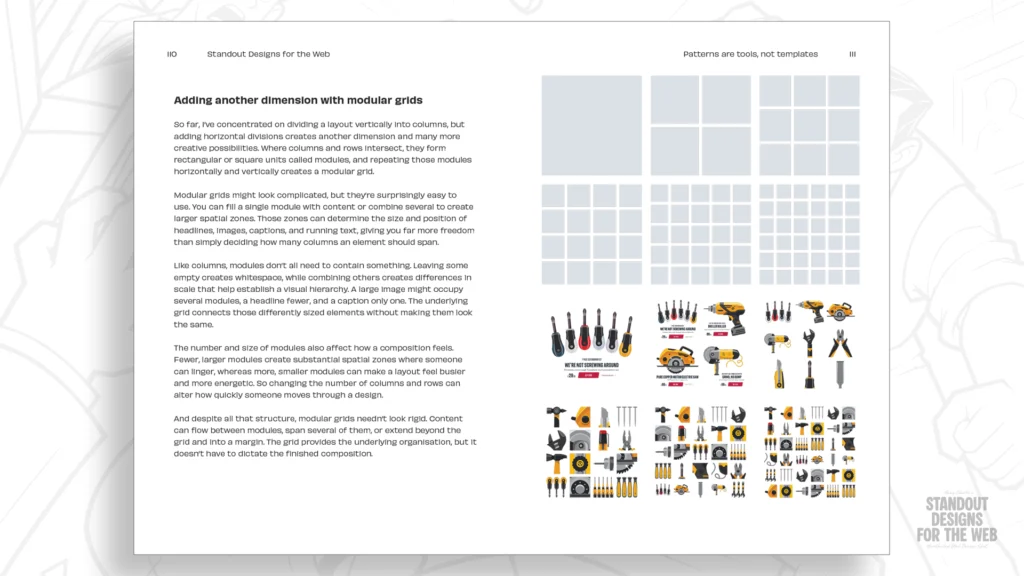
Designers who master the art of grid-mixing and modular composition will be the ones who define the next generation of web experiences. They will be the ones who prove that consistency does not mean uniformity. By prioritizing the story, the brand personality, and the unique needs of the content, we can move toward a future where the web is a vibrant, varied, and visually interesting place.
The tools of our craft are powerful, but they are only as good as the intention behind them. It is time to look beyond the default, challenge our reliance on familiar patterns, and start designing with intent. Whether you are building a landing page for a fictional getaway driver service or a high-traffic e-commerce site, the structure should always be the servant of the story, not the master.
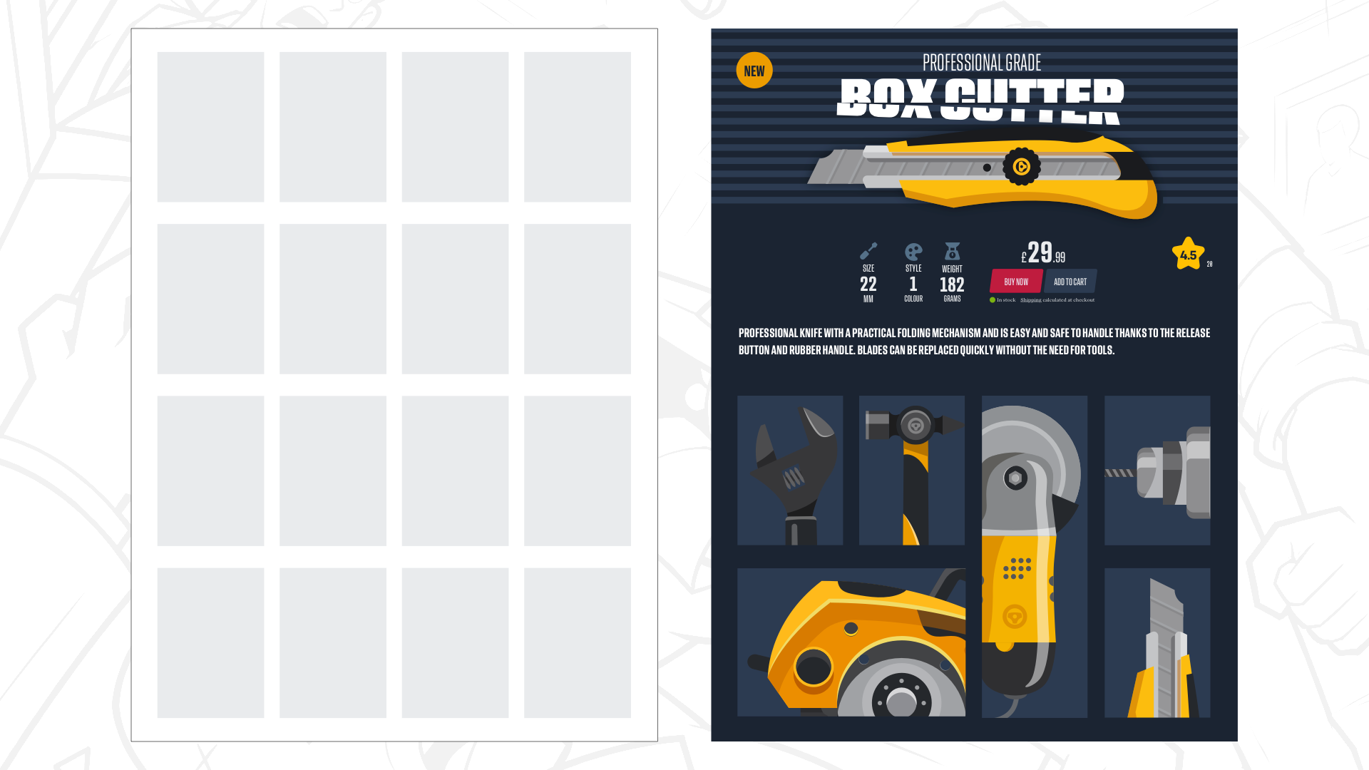
For those interested in exploring these concepts further, "Standout Designs for the Web" provides a deep dive into these methodologies. Moving beyond the grid is not just about changing how we align pixels—it is about changing how we think about the purpose of design in a digital-first world.