Executive Overview
Nearly a decade after its initial introduction to the web development landscape, the native HTML <dialog> element remains one of the most powerful yet nuanced components in modern web architecture. While developers frequently rely on custom JavaScript solutions, component libraries, or bloated third-party plugins for user interaction overlays, the browser’s built-in dialog capability offers robust performance, native accessibility features, and declarative ergonomics.
However, beneath its seemingly straightforward API lies a complex web of user-agent (UA) styles, states (:open, :modal), accessibility considerations, scroll-trapping mechanics, and state-transition requirements. This comprehensive guide explores the structural implementation, advanced styling techniques, accessibility nuances, and the architectural differences between native dialogs and popovers. Designed as an authoritative reference for modern front-end engineers, this article examines how to leverage the full power of native HTML and CSS to build performant, accessible, and delightful user interfaces.
Detailed Chronology & Structural Implementation
To understand the evolution of the <dialog> element, one must trace its path from basic markup to sophisticated, declarative workflows. While the element has enjoyed broad implementation across modern browsers, developers routinely look up configuration patterns because of the distinct paradigms separating simple pop-ups from true modals.
Marking up and Opening the Dialog
The foundational markup for a native dialog requires an invoking element and the <dialog> container itself:
<button id="dialog-button">Open Dialog</button>
<dialog id="dialog">...</dialog>
By default, the element is closed. While setting the open attribute (<dialog open>) will force it open upon initial DOM rendering, this is rarely desired outside of specific edge cases. Instead, developers programmatically control visibility via JavaScript methods.
Using the basic .show() method treats the dialog more like a traditional pop-up than a modal:
const dialogButton = document.querySelector('#dialog-button');
const dialog = document.querySelector('#dialog');

dialogButton.addEventListener('click', () =>
  dialog.show();
);
Crucially, .show() opens the element without a backdrop, leaves background content interactive, and does not automatically center the element in the viewport or bind the Esc key to closure. For most application scenarios—such as confirmation prompts, forms, and critical alerts—developers should utilize .showModal():

const dialogButton = document.querySelector('#dialog-button');
const formDialog = document.querySelector('#dialog');

dialogButton.addEventListener('click', () =>
  formDialog.showModal();
);
Invoking .showModal() places the element in the browser’s top layer, generates a backdrop, automatically centers the element, restricts user interaction to the dialog container (innate inertness), and enables keyboard-driven dismissal via the Esc key.
Closing Mechanics: Imperative and Declarative Approaches
When a modal dialog is active, pressing the Esc key automatically closes it and returns focus to the triggering element. To implement a custom close button within the UI, developers can attach a .close() method via JavaScript:
<button id="dialog-button">Open Dialog</button>
<dialog id="dialog">
  <button id="dialog-close">Close</button>
</dialog>
const formButton = document.querySelector('#dialog-button');
const formDialog = document.querySelector('#dialog');
const formClose = document.querySelector('#dialog-close');
formButton.addEventListener('click', () =>
formDialog.showModal();
);
formClose.addEventListener('click', () =>
formDialog.close();
);Interestingly, while the API features .showModal(), it lacks a corresponding .closeModal() method; the standard .close() method handles both modal and non-modal states seamlessly.
For developers seeking a zero-JavaScript approach, HTML forms provide a declarative mechanism out of the box:
<dialog id="dialog">
  <form method="dialog">
    <button type="submit">Close dialog</button>
  </form>
</dialog>
Submitting a form with method="dialog" inside a <dialog> element automatically closes the dialog without requiring custom script bindings.
The Rise of Invoker Commands
As web standards evolve, declarative approaches are expanding into new frontiers. Invoker commands represent an emerging, highly anticipated feature designed to eliminate JavaScript boilerplate for opening and closing dialogs and popovers directly in markup.
Using the command and commandfor attributes, developers can bind buttons directly to dialog targets:

<!-- Opening a modal declaratively -->
<button command="show-modal" commandfor="my-dialog">Show Dialog</button>

<dialog id="my-dialog">
  <p>This dialog is controlled via invoker commands.</p>
  <!-- Closing declaratively -->
  <button command="close" commandfor="my-dialog">Close Dialog</button>
</dialog>
When custom event handling is required alongside these commands, developers can listen for native command events via JavaScript:
const dialogs = document.querySelectorAll("dialog");

dialogs.forEach(dialog =>
  dialog.addEventListener("close", () =>
    // Handle dialog closure
  );

  dialog.addEventListener("command", event =>
    if (event.command === "show-modal")
      // Handle modal display event
     else if (event.command === "close")
      // Handle dialog close event

  );
);
Supporting Context & Metrics: Accessibility and Innate Inertness
Building production-ready user interfaces requires rigorous attention to accessibility and document ergonomics. The native <dialog> element introduces powerful built-in accessibility features, but careless implementation can degrade screen reader compatibility and user experience.
Button Labeling and Screen Readers
A common design pattern for modal close buttons is a minimal "X" icon or an SVG glyph. However, presenting an unlabelled "X" to a screen reader fails accessibility best practices. Developers must ensure that assistive technologies announce a descriptive action, such as "Close modal," while visually hiding the text and hiding the raw icon:
<button id="form-button">Open Dialog</button>
<dialog id="form-dialog">
<button id="form-close">
<span class="visually-hidden">Close modal</span>
<span aria-hidden="true">×</span>
</button>
</dialog>Furthermore, developers must consider initial focus behavior. When a modal opens, browser heuristics typically shift focus to the first focusable element inside the dialog—frequently the close button. While functional, this can occasionally lead to accidental closures if the user strikes the Space bar immediately upon activation. If a dialog contains primary interactive elements such as form inputs or key call-to-action links, developers should explicitly assign initial focus using the tabindex attribute.
Innate Inertness and the Top Layer
One of the most significant architectural advantages of a modal dialog is its innate inertness. When .showModal() is invoked, the underlying document tree is automatically rendered inert. This means all text selection, button clicks, focus traversal, and input interactions outside the modal are disabled by the browser engine without requiring manual aria-hidden or inert attribute manipulation on container wrappers.
This behavior is strictly reserved for modal instances created via .showModal(). Non-modal dialogs opened via .show() act similarly to popovers or tooltips, residing outside the browser’s top layer and leaving background content fully interactive.
Advanced Styling Architecture
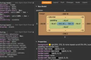
Out of the box, user-agent stylesheets apply a stark white background and a prominent black border to the <dialog> element, alongside a subtle default backdrop tint. Modern CSS empowers developers to thoroughly override these defaults, transform positioning, and orchestrate smooth animations.

Styling the Backdrop and Scrollbars
The background overlay managed by a modal can be targeted using the ::backdrop pseudo-element. By default, browsers apply a minimal opacity tint, which can be customized with solid colors, transparencies, or even background filters:
dialog
  background-color: #1a1a1a;
  color: #ffffff;
  border: none;
  border-radius: 16px;
  overflow: hidden;
  overscroll-behavior: contain;

  &::backdrop
    background-color: rgba(0, 0, 0, 0.6);
    backdrop-filter: blur(8px);
    overscroll-behavior: contain;
When styling dialogs, engineers must also account for scrollbar layout shifts. Removing scrollbars from the background document when a modal opens can alter page widths. Developers can prevent these unintended layout shifts by reserving scrollbar tracks using scrollbar-gutter:
dialog
  &[open]
    scrollbar-gutter: stable;
Managing Viewport Scroll Behavior
A persistent challenge with overlays is preventing background content from scrolling while a modal is active. Because a dialog is not inherently a scroll container, locking background scroll traditionally required manipulating body overflow via JavaScript or CSS state checks.
Modern CSS provides clean declarative solutions. In modern browser environments supporting overscroll-behavior, scroll containment can be applied directly to the dialog and its backdrop:
dialog
  overflow: hidden;
  overscroll-behavior: contain;

  &::backdrop
    overscroll-behavior: contain;
Alternatively, developers with broad browser support requirements can utilize the :has() relational pseudo-class to lock body scrolling whenever an open dialog is present in the DOM:
body:has(dialog[open])
  overflow: hidden;
Animating Entrance and Exit States
Because dialogs transition from display: none to an active state, animating their appearance requires careful handling of browser rendering lifecycles. A standard CSS transition applied to opacity alone will fail if the browser cannot compute a starting frame.
To achieve smooth fade-in and fade-out animations, developers must leverage the @starting-style at-rule alongside standard transition properties:

@starting-style
  dialog:open
    opacity: 0;
    transform: scale(0.95);


dialog
  opacity: 0;
  transform: scale(0.95);
  transition: opacity 0.3s ease-in-out, transform 0.3s ease-in-out, overlay 0.3s ease-in-out allow-discrete, display 0.3s ease-in-out allow-discrete;
  overflow: hidden;
  overscroll-behavior: contain;

  &[open]
    opacity: 1;
    transform: scale(1);
By pairing @starting-style with discrete property transitions (allow-discrete), browsers can successfully interpolate values from initial non-rendered states into fully visible view layers.
Dialog vs. Popover: Architectural Comparison
As the web platform expands, developers frequently debate whether to implement the Dialog API or the Popover API. While their syntax and DOM positioning can appear deceptively similar, their underlying use cases and accessibility semantics diverge significantly.
| Feature / Behavior | HTML <dialog> (Modal) |
Popover API (popover) |
|---|---|---|
| Top Layer Rendering | Yes | Yes |
| Backdrop Generation | Automatic (::backdrop) |
Manual / Optional styling |
| Innate Inertness | Automatic (background is inert) | None (background remains active) |
| Focus Trapping | Automatic | Manual implementation required |
| Dismissal Mechanism | Esc key, programmatic close |
Light dismiss (Esc or clicking outside) |
| Primary Use Case | Critical user prompts, forms, workflows | Tooltips, menus, contextual dropdowns |
As noted by accessibility researchers and front-end architects, selecting the correct API is critical. Popovers lack built-in focus trapping and do not render background content inert. Consequently, implementing a popover for a critical confirmation dialog requires extensive custom JavaScript to manage keyboard accessibility, focus rings, and screen reader announcements. Conversely, utilizing a modal dialog for a lightweight, non-blocking tooltip introduces unnecessary interaction friction for the user.
Future Outlook
The native HTML <dialog> element has matured into a foundational pillar of modern web development. As browser vendors continue to optimize top-layer rendering, standardize invoker commands, and refine discrete property animations, the need for heavy JavaScript modal libraries diminishes rapidly.
Front-end engineers adopting native dialogs benefit from superior performance, minimal maintenance overhead, and out-of-the-box accessibility compliance. By mastering state management, backdrop customization, scroll containment, and smooth entry/exit transitions, developers can build interfaces that are both technically bulletproof and visually exceptional. Future web standards will undoubtedly continue to build upon these primitives, ensuring that native HTML components remain the gold standard for robust web architecture.