
Executive Overview
In the modern digital ecosystem, user interface (UI) and user experience (UX) design are often dominated by established conventions. Among these, the implementation of light and dark mode toggles has become nearly ubiquitous. Almost every content platform, documentation hub, and personal portfolio now features a persistent switch in its navigation header allowing visitors to toggle between light, dark, and system-default color schemes.
For years, this tri-state model—typically represented by a sun, a moon, and a computer monitor or a "System" dropdown—has been accepted as the gold standard of inclusive web design. However, a recent, provocative critique by prominent web standards expert and developer Lea Verou challenges this long-held assumption. Verou argues that the standard three-state color scheme toggle introduces unnecessary visual clutter, cognitive friction, and design overhead. Instead, she advocates for a streamlined, two-state UI pattern that gracefully handles system preferences and user overrides without demanding explicit real estate for a "System" option.
This article examines the core arguments behind Verou’s thesis, breaking down the mechanics of modern color scheme implementation, the psychology of persistent navigation controls, and the rare edge cases where traditional tri-state controls still hold value. By stripping away redundant UI elements, web developers can achieve a cleaner aesthetic that respects user intent while reducing cognitive load.
Detailed Chronology: The Evolution of Web Color Schemes
To understand the current debate surrounding light and dark mode toggles, it is necessary to examine how web platforms transitioned from static color palettes to dynamic, context-aware styling.
The Dawn of Hardcoded Themes
In the early days of widespread web publishing, websites dictated the visual experience. Backgrounds were predominantly white or off-white, paired with dark text to mimic traditional print. If a developer wanted to offer a dark mode, it required maintaining entirely separate stylesheets, manually swapping out assets, or building clunky JavaScript-based theme switchers that frequently suffered from flash-of-unstyled-content (FOUC) issues.
The Rise of Native Operating System Preferences
The paradigm shifted dramatically with the introduction of system-level dark modes across major operating systems—pioneered heavily by macOS, Windows, iOS, and Android throughout the late 2010s. Browsers quickly followed suit by adopting the prefers-color-scheme CSS media query. Suddenly, web developers could write a few lines of CSS (@media (prefers-color-scheme: dark)) that automatically adapted a website’s appearance to match the user’s global operating system settings.
This technological leap eliminated the immediate need for manual website toggles in many scenarios. A user browsing at night with their operating system set to dark mode would naturally experience the web in dark mode.
The Tri-State Proliferation
Despite the elegance of automated system matching, web developers and designers quickly realized that users often desired granular control. A user might prefer a dark operating system interface for coding or system management, but prefer a bright, high-contrast reading environment when browsing text-heavy articles during the day.
To accommodate this, the web industry standardized the tri-state toggle:
- Light Mode: Forces the website to render with a light background and dark text, regardless of system settings.
- Dark Mode: Forces the website to render with a dark background and light text, regardless of system settings.
- System/Auto Mode: Defers to the operating system’s
prefers-color-schemevalue.
While functional, this approach introduced a new problem: persistent visual clutter in the primary navigation header of millions of websites.
The Verou Critique and Current Discourse
Entering this mature design landscape, Lea Verou published a comprehensive analysis titled Dark Mode Toggles, arguing that the industry had over-engineered the problem. Verou’s thesis asserts that a well-designed two-state control can effectively manage all three behavioral states (light, dark, and system) without ever needing to explicitly display a "System" option to the end user. This perspective has ignited passionate debates across developer communities, UI/UX forums, and design-focused social platforms regarding minimalism, user control, and interface psychology.
Supporting Context & Metrics: The Mechanics of the Two-State Paradigm
To appreciate Verou’s argument, one must analyze how a two-state toggle interacts with browser storage and operating system defaults.
How the Two-State Model Operates
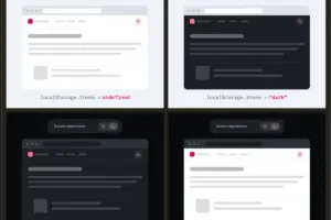
Under Verou’s proposed framework, the website’s initial state is completely passive. It respects the user’s system preference (prefers-color-scheme) by default, requiring zero user interaction to look correct.
When a user decides they want to override this behavior, they interact with a simple two-state control (typically toggling between a sun and a moon icon).
- If the user is currently viewing the site in the system-default light mode and clicks the toggle to switch to dark mode, two things happen:
- The UI instantly updates to dark mode.
- This preference is explicitly saved to the browser’s
localStorage.
In all subsequent sessions, the website checks localStorage first. If an override exists, it honors that choice. If no override exists, it safely falls back to the system preference.
Eliminating Cognitive Dissonance and Visual Noise
From a UI/UX perspective, every element placed in a website’s header demands a cognitive tax from the visitor. Users scan headers rapidly to find navigation links, search bars, and account settings. Introducing a multi-option dropdown or a complex three-icon segmented control forces the user to pause, process the options, and figure out what "System" means in the context of a specific web page.
Verou’s core insight is that theme switching is entirely tangential to the primary intent of visiting a website. Whether a user is reading an article, purchasing a product, or checking documentation, their goal is rarely to fiddle with color schemes. By reducing the control to a binary state when an override is active—or hiding the control entirely when the system state is aligned—the interface gets out of the way.
The Edge Case: What Happens When States Diverge?
A common counter-argument raised by UI purists involves state divergence. For example:
- A user visits a site with a light system preference. The site renders in light mode.
- The user manually toggles the site to dark mode (saving an override to
localStorage). - Weeks later, the user changes their operating system preference to dark mode.
Because an explicit override (dark) is stored in localStorage, the website continues to respect that override. If the user eventually wants to return to matching their system settings, what happens?
Verou dismisses this concern as practically negligible. As she notes in her analysis, even if the user’s manual override and their system preference diverge, discovering this divergence only happens when the OS switches states—at which point fixing it is a single click away. Because theme switching is secondary to the user’s primary journey, building complex UI structures to handle rare edge cases introduces more friction than it resolves.
Official Perspectives & Developer Community Reactions
The release of Verou’s analysis has generated diverse reactions across the web development and design communities, ranging from enthusiastic endorsement to cautious skepticism.
The Minimalist Consensus
Many front-end engineers and accessibility advocates have rallied behind the two-state approach. The prevailing sentiment among proponents is that minimalism in UI should always be favored unless complexity provides undeniable utility.
"Less UI that accomplishes the same as more UI is generally a good thing. Lea’s point goes way beyond that, getting into well-considered reasons that go beyond simplicity." — UI/UX Community Commentary
Proponents argue that modern web design has suffered from feature bloat, where developers add controls simply because they can, rather than because the user benefits from them. By removing the explicit "System" button, interfaces become cleaner, more accessible on mobile screens with limited viewport width, and less distracting.
When Are Three States Actually Appropriate?
Crucially, Verou does not argue that tri-state controls should be universally banned. In her detailed exploration, she outlines specific scenarios where a three-state control remains valid and necessary:
- Dedicated Settings or Preferences Dashboards: Inside a comprehensive user account settings page or application preferences panel (such as VS Code, GitHub, or Twitter/X settings), explicit radio buttons or dropdowns for Light, Dark, and System are entirely appropriate. In a dedicated settings menu, the user’s primary intent is configuration, making clarity paramount.
- Complex Multi-Theme Environments: Platforms that support more than just light and dark modes—such as high-contrast themes, sepia modes, or brand-specific color palettes—may require more robust selection mechanisms where a binary toggle falls short.
However, for persistent header controls—the small icons permanently pinned to the top navigation bar of a content site—Verou maintains that a tri-state approach is overkill.
Future Outlook: The Direction of Web Interface Design
As the web continues to mature, the pendulum of design philosophy swings continually between feature richness and radical minimalism. The discourse sparked by Verou’s work on dark mode toggles signals a broader industry movement toward intentional, context-aware design.
Moving Beyond Persistent Toggles Entirely
Looking further into the future, some advanced UX theorists suggest that even a two-state persistent toggle may eventually become obsolete. As operating systems and browsers become increasingly sophisticated at predicting user context—factoring in ambient room lighting, time of day, circadian rhythms, and user behavioral patterns—the need for manual overrides may diminish significantly.
Until then, web designers face a clear choice. They can continue to clutter navigation bars with redundant tri-state controls that force users to manage settings their browsers are already capable of handling automatically, or they can adopt the streamlined, resilient two-state paradigm.
Key Takeaways for Developers and Designers
For teams looking to audit their current UI implementations, the path forward involves several actionable considerations:
- Audit Header Real Estate: Evaluate whether your site’s header navigation truly benefits from a dedicated color scheme switcher, or if it contributes to visual noise.
- Leverage Native Defaults: Ensure your CSS relies heavily on
prefers-color-schemeas the foundational source of truth, minimizing the reliance on JavaScript execution for initial paint rendering. - Simplify the Override: If a toggle is necessary, implement a clean two-state mechanism that stores user intent in
localStoragewithout cluttering the interface with redundant status indicators.
By prioritizing user intent and removing unnecessary cognitive friction, developers can create cleaner, faster, and more respectful web experiences.