Executive Overview
In an era defined by hyper-targeted digital advertising, programmatic saturation, and explicit product-benefit callouts, the physical billboard remains a high-stakes arena for bold brand positioning. Yet, few campaigns in recent memory have generated as much immediate discourse, division, and viral fascination as a recent outdoor installation by workspace and AI software company Notion.
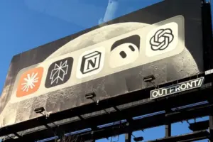
Deploying a strategy of radical minimalism and supreme confidence, Notion unveiled a billboard that ditches traditional copywriting, explicit value propositions, and even the traditional sponsor identifier. Instead, the oversized public display features a straightforward, neatly aligned row of major artificial intelligence and productivity app icons: Claude, Perplexity, Grok Bot, ChatGPT, and—front and center—Notion.
By placing its own logo shoulder-to-shoulder with its most formidable rivals on a neutral canvas, Notion sparked an immediate, polarizing debate across social media channels like X (formerly Twitter). Industry critics and everyday commuters alike questioned the basic mechanics of the ad: Who paid for this? Is it an industry round-up or a targeted brand play? Why give free visual real estate to direct competitors?
This comprehensive report examines the anatomy of Notion’s high-risk billboard campaign. We will explore the chronology of its viral ascent, analyze the design psychology behind modern AI branding, evaluate public and expert reactions, and assess whether this calculated ambiguity marks a new paradigm for tech industry marketing.
Detailed Chronology: From Urban Asphalt to Viral Phenomenon
The trajectory of Notion’s audacious campaign follows a modern marketing blueprint: physical disruption followed by immediate digital amplification.
Phase 1: The Silent Installation
The billboard first appeared quietly in a high-traffic urban corridor, deliberately deployed without accompanying press releases, media advisories, or pre-campaign social media teasers. Stripped of context, the creative featured a pristine, uncluttered background displaying a lineup of contemporary AI and productivity brand marks.
For the average commuter passing by at highway speeds or city walking paces, the ad offered no immediate narrative hand-holding. There was no bold headline declaring "Choose Notion," nor was there a QR code demanding an immediate digital conversion. The visual composition relied entirely on recognition: the distinctive typography and iconography of the tools currently defining the generative AI and digital productivity landscape.
Phase 2: The Spark on X (October 2026)
The campaign’s transition from a physical piece of urban architecture to a global digital talking point occurred organically. Users began photographing the display, posting images with captions expressing bewilderment and reluctant admiration.
One early viral post, shared by user @olisnoddy, captured the initial wave of attention, quickly followed by commentary from accounts such as @cantworkitout, who noted, "i can’t even tell who the billboard is for."
This confusion was not a design flaw; it was the foundational hook. Within hours, the image circulated across design subreddits, LinkedIn marketing circles, and tech Twitter. Observers began dissecting the visual hierarchy, realizing that while multiple logos were present, Notion’s placement occupied the primary visual anchor point.
Phase 3: The Peak of Industry Discourse
As the week progressed, the discourse matured from amused confusion to strategic analysis. Marketing professionals weighed in on the sheer financial and brand equity risk of subsidizing the visual awareness of competitors like OpenAI’s ChatGPT and Anthropic’s Claude.
Tech journalists and branding experts picked up the story, positioning the stunt not merely as an ad, but as a cultural Rorschach test for the state of the software industry. By refusing to spell out its market dominance, Notion forced the consumer to connect the dots themselves—transforming passive viewers into active participants in the brand’s narrative.
Supporting Context & Metrics: The Sea of Sameness in AI Branding
To understand why Notion’s billboard works, one must first examine the visual landscape of the modern artificial intelligence industry. Over the past several years, the tech sector has witnessed an unprecedented homogenization of brand identity.
The Monoculture of AI Logos
Critics and design historians have frequently pointed out a pervasive issue in contemporary tech design: why do all AI company logos look the same?
From vector-based abstract stars and geometric gradients to minimalist monochromatic lettering, the visual language of artificial intelligence has settled into a predictable comfort zone. Companies rush to signal "innovation," "neural networks," and "futurism," often resulting in a blur of interchangeable visual assets.
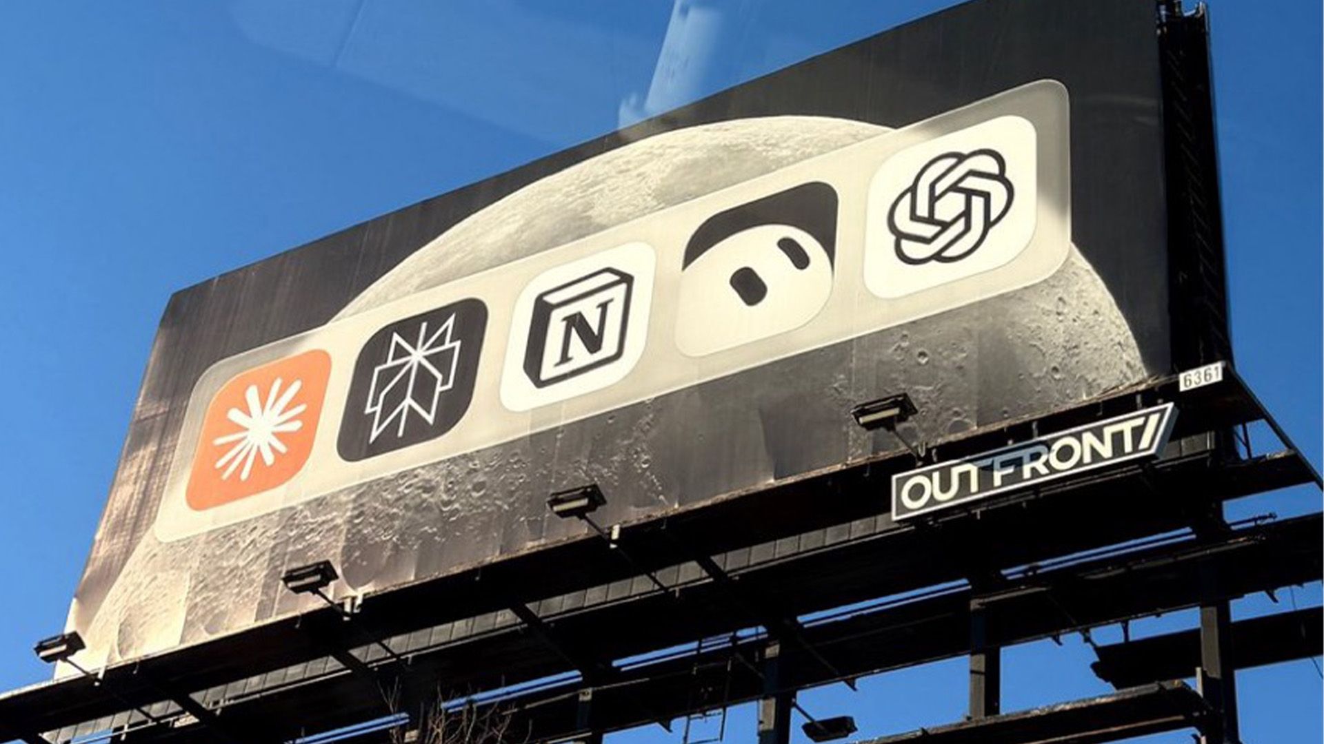
In this crowded ecosystem, brand differentiation is notoriously difficult. When consumers scroll through app stores or search engine results pages, distinguishing one LLM interface or productivity wrapper from another can feel like navigating a hall of mirrors.
Notion’s Distinctive Edge
Amidst this sea of abstract gradients and futuristic curves, Notion has maintained a steadfast commitment to its classic, high-contrast, typographic identity. Its simple letterblock logo—grounded in stark black-and-white minimalism—operates on an entirely different visual frequency than its AI-native competitors.
When placed in a uniform lineup on the billboard, this typographic simplicity becomes its greatest asset. While other logos fight for attention with complex iconography, Notion’s understated design reads with absolute clarity. The neutral ground of the shared lineup acts as a visual palette cleanser, allowing Notion to subtly assert category leadership without shouting about it.
[ Claude ]  [ Perplexity ]  [ NOTION ]  [ ChatGPT ]  [ Grok Bot ]
                               ^
                        (Visual Anchor)
By voluntarily sharing the marquee with its rivals, Notion reframes the conversation: it stops positioning itself as just another isolated tool and instead frames itself as the central hub—the foundational workspace—that unifies or stands supreme among the entire AI ecosystem.
Official Statements & Industry Perspectives
The reception to Notion’s billboard has been sharply divided, highlighting a generational or philosophical split in how marketing effectiveness is measured.
The Skeptics: "Super Dumb or Super Cool?"
Detractors of the campaign point to the fundamental rule of traditional advertising: clarity drives conversion. From this orthodox perspective, an ad that leaves viewers guessing who paid for it risks squandering valuable media spend.
As one observer succinctly summarized on social media: "Super cool and smart, or super dumb?"
The critique rests on the idea of attribution leakage. If a commuter looks at the billboard, recognizes ChatGPT or Claude, and subsequently downloads a competitor’s app instead of Notion, the campaign has actively worked against its own commercial interests. In traditional direct-response marketing metrics, ambiguity is treated as a cardinal sin.
The Advocates: The Power of Cultural Currency
Conversely, modern brand architects and creative directors have lauded the campaign as a masterclass in guerrilla confidence.
Another prominent commentator on X noted the brilliance of the execution:
"As much as I hate to admit it, this is a really great ad. No words, just app icons. There’s mystery over who paid for it. There’s controversy over why certain apps should be there. It’s bold and makes a statement."
In an attention economy saturated with banner blindness and ad-blockers, traditional metrics of clarity are increasingly secondary to cultural resonance. Consumers do not share boring ads. They do not debate clear, corporate value propositions on internet forums. By sacrificing explanatory text, Notion traded transactional clarity for high-value brand equity and organic digital reach.
Future Outlook: The Evolution of Tech Advertising
Notion’s high-stakes billboard experiment arrives at a critical juncture for software marketing. As generative AI features become commoditized and native integrations saturate operating systems, software brands can no longer rely solely on feature-list marketing. When every tool claims to make you "10x more productive" using "cutting-edge AI," feature claims wash out into white noise.
The Shift Toward Brand Authority
As the software market matures, survival depends increasingly on cultural positioning and brand affinity. Campaigns like Notion’s signal a broader evolution in how B2B and consumer tech brands speak to their audiences:
- Post-Advertising Literacy: Consumers, particularly digital natives, are deeply cynical of traditional advertising tropes. They prefer clever insinuation over heavy-handed sales pitches.
- Category Ownership: By placing itself in the same breath as foundational AI giants, Notion implicitly elevates its status from a mere note-taking app to an indispensable layer of the modern digital stack.
- The Death of Copy: Expect to see more brands stripping away dense text in favor of iconic, provocative visual shorthand designed explicitly to trigger social media sharing.
Conclusion
Whether Notion’s billboard is viewed as a stroke of marketing genius or an exercise in reckless ambiguity, it has undeniably achieved its primary objective: it cannot be ignored. In a media landscape where being forgotten is far more dangerous than being misunderstood, Notion has proven that sometimes the loudest statement a brand can make is to say nothing at all—and let the competition share the frame.