
Executive Overview
In the hyper-competitive landscape of modern e-commerce, brands are increasingly prioritizing aesthetic cohesion over functional utility. A burgeoning design trend—the "monochromatic product page"—has emerged, where retailers coat their entire digital storefronts in a single, product-matching color scheme. While this approach aims to create an immersive, high-end "editorial" feel, it inadvertently creates a hostile environment for the average shopper. By stripping away visual contrast, these brands are effectively sabotaging their own conversion funnels. This article investigates the psychological friction caused by this design trend and explains why the "student-underlining-everything" effect is a critical barrier to modern consumer experience.
Detailed Chronology: The Rise of the "Color-Matched" Aesthetic
For years, the e-commerce standard was rooted in clarity: neutral backgrounds, high-contrast text, and a distinct "call-to-action" (CTA) button that popped against the page. However, with the rise of "Direct-to-Consumer" (DTC) brands that treat their websites as an extension of their social media feeds, the priority has shifted toward brand identity and visual "vibes."
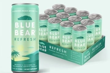
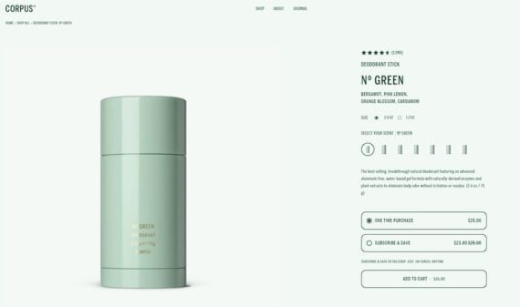
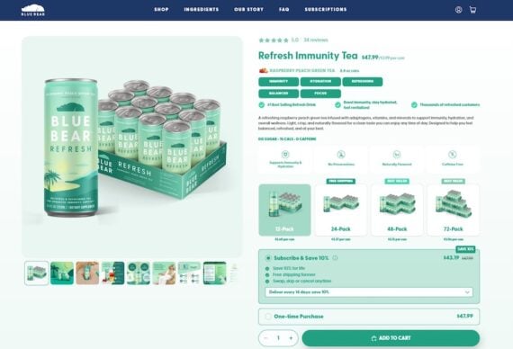
The trend began subtly—perhaps a colored border or a specific header tint—but has rapidly evolved into a full-page takeover. Take, for example, the recent design shifts in the natural deodorant and wellness tea sectors. Brands like Corpus Naturals and Blue Bear have embraced a design philosophy where the page background, text accents, and navigation elements are all tinted to match the specific product variant being viewed.
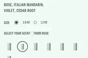
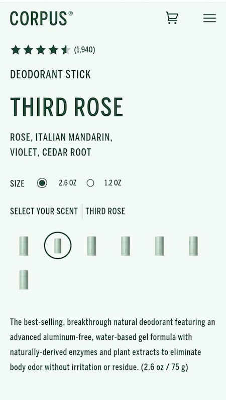
When a user lands on a product page for a specific deodorant scent, they are no longer met with a neutral shopping environment. Instead, they are submerged in a sea of green (or rose, or navy) that consumes every pixel. The intended effect is a cohesive "unboxing" experience. The actual effect, however, is a loss of navigational intuition. Consumers are forced to work twice as hard to identify scent variations, pricing, and the final checkout button, transforming a seamless purchase journey into a cognitive obstacle course.
Supporting Context & Metrics: The Science of Visual Hierarchy
To understand why this design trend is failing, one must look at the cognitive psychology of the digital shopper. Human beings are programmed to seek efficiency. When browsing a website, our eyes engage in a process known as "visual scanning," where we look for patterns, contrast, and familiar landmarks to guide our path from Point A (the product landing) to Point B (the purchase).
The Cognitive Cost of Monotony
Psychologists often refer to the "Cognitive Load Theory," which posits that our brain has a finite amount of processing power for any given task. When a website design is uniform in color, the brain is forced to spend extra energy deciphering what is clickable and what is merely decorative.
Consider the analogy of a student studying a textbook: if a student highlights every single sentence on the page, they have effectively highlighted nothing. The purpose of the highlighter is to provide contrast—to signal importance. When a website designer applies the same shade of green to the product name, the benefit icons, the subscription toggle, and the "Add to Cart" button, they have removed the signal from the noise. The shopper’s eye finds no "anchor" to rest on, leading to frustration, eye fatigue, and, ultimately, site abandonment.
The Contrast Deficit
Accessibility standards, such as the Web Content Accessibility Guidelines (WCAG), emphasize the necessity of color contrast for a reason. While these standards were designed to assist users with visual impairments, they are fundamentally rooted in human biology. We detect "things" by their edges and their contrast against a background. When the background is a saturated version of the button color, the "edges" of the CTA become blurry to the human eye. This is not just a design preference; it is a fundamental flaw in usability that leads to lower conversion rates.
Official Analysis: Why Brands Choose Form Over Function
Why would any company choose a design that statistically hinders the user? The answer lies in the conflict between the "Creative Director" and the "UX Researcher."
In many modern DTC companies, the brand’s visual identity is treated as sacred. Creative teams argue that a neutral white-background page is "boring" or "corporate," and that a color-saturated page feels more "premium" and "artistic." They are building a brand experience that looks stunning in a portfolio or on an Instagram feed.
However, a website is not a print magazine. It is a tool. When the tool is designed to be looked at rather than used, the conversion funnel collapses. Interviews with e-commerce consultants suggest that these brands often fall into the trap of "designing for the founder" rather than "designing for the user." The founder loves the way the green page looks because it feels "on-brand," failing to realize that the customer just wants to know if they are buying the "Third Rose" scent or the "No Green" scent without having to click through five identical-looking thumbnails to find out.
The Path Forward: Balancing Brand Identity and Conversion
The future of e-commerce design does not have to be a choice between "boring" and "useless." Brands can achieve a premium aesthetic while maintaining high-conversion usability by adhering to a few core principles:
1. The 60-30-10 Rule
Instead of drowning the page in one color, brands should use the 60-30-10 rule. Use the primary brand color for 60% of the space (backgrounds or headers), a secondary color for 30% (secondary information), and save a high-contrast, neutral or complementary color for the final 10%—specifically for the CTA.
2. Micro-Contrast and Hierarchy
If a brand insists on a color-matched aesthetic, they must utilize other methods to establish hierarchy. This includes varying font weights, sizes, and white space. If the background is green, the button should not be a different shade of green; it should be a high-contrast white or black, or a bold color that breaks the visual pattern entirely to demand attention.
3. User Testing as a Non-Negotiable
Before rolling out a "full-page color" redesign, brands should conduct A/B testing. Does the immersive design increase time on site, or does it increase the bounce rate? Does it increase add-to-cart clicks, or does it simply make the buttons harder to find? Data, not design trends, should dictate the final interface.
Future Outlook: The Return to Clarity
As the market matures, we are likely to see a "correction" in e-commerce design. The initial excitement over "aesthetic-first" web design is already beginning to face backlash from data-driven retailers who see their cart abandonment rates climbing.
The next generation of e-commerce design will likely lean into "functional minimalism." This approach treats the brand’s color palette as a subtle accent rather than a suffocating layer. We will see a shift back to designs that respect the user’s cognitive energy, providing them with clear paths to purchase.
In conclusion, while a monochromatic page might win design awards for its artistic unity, it is a losing strategy for long-term growth. The most successful brands will be those that understand a simple, uncomfortable truth: your website is not an art gallery. It is a store. And in a store, the most beautiful thing you can provide to a customer is an easy way to find what they want and complete their purchase without a struggle. If your design makes the customer think, you have already lost.