
Executive Overview: A New Chapter in Frontend Development
The velocity at which the web platform is evolving has reached a fever pitch. Over the past few weeks, the CSS ecosystem—long considered a static language of design—has undergone a transformation that bridges the gap between traditional styling and robust application logic. From the introduction of specialized browser-native syntax highlighters to the potential arrival of class-prefix selectors, developers are finding themselves equipped with a more powerful toolkit than ever before.
This edition of our technical deep dive examines the most significant developments in the CSS landscape. We are moving away from the era of "hacks and workarounds" and entering a period of "native capability," where browser vendors are increasingly codifying common developer patterns into the web platform itself. Whether it is refining user interaction patterns through interest invokers or managing complex layout data via CSS variables, the following developments represent the cutting edge of web architecture.
Detailed Chronology: Recent Breakthroughs in CSS
The Evolution of Interaction: Tooltips and Interest Invokers
User experience design often hinges on the subtle nuances of interaction. Abhishek Jakhar recently ignited a conversation on the architectural necessity of tooltip delays. The objective is twofold: prevent "accidental triggers" while ensuring instantaneous dismissal. Jakhar’s implementation strategies provide a robust baseline for these interactions.
However, the industry is shifting toward browser-native solutions. Chris Coyier has highlighted the arrival of "interest invokers," a nascent technology currently finding its footing in Chrome. By utilizing interest-delay-start and interest-delay-end, developers can offload the logic of timing to the browser engine. While this currently necessitates a progressive enhancement strategy, the promise of standardized interaction timing could signal the end of fragile, custom-coded timeout scripts that plague modern UI libraries.
The <geolocation> Element: Bridging Hardware and Markup
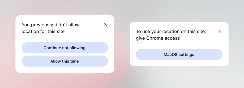
The Geolocation API has historically been one of the most cumbersome features for developers, often requiring complex negotiations between hardware sensors (GPS, Wi-Fi, and cellular triangulation) and restrictive browser permissions. The introduction of the <geolocation> element attempts to simplify this lifecycle.
While it introduces specific styling restrictions that developers must navigate, it offers a more declarative path toward location-based features. As explored by industry experts, the key to adoption today lies in hybrid implementation—pairing the new HTML element with the established Geolocation API to ensure backwards compatibility while future-proofing codebases for the eventual widespread adoption of the new standard.
MicroLighter and the ::highlight() API
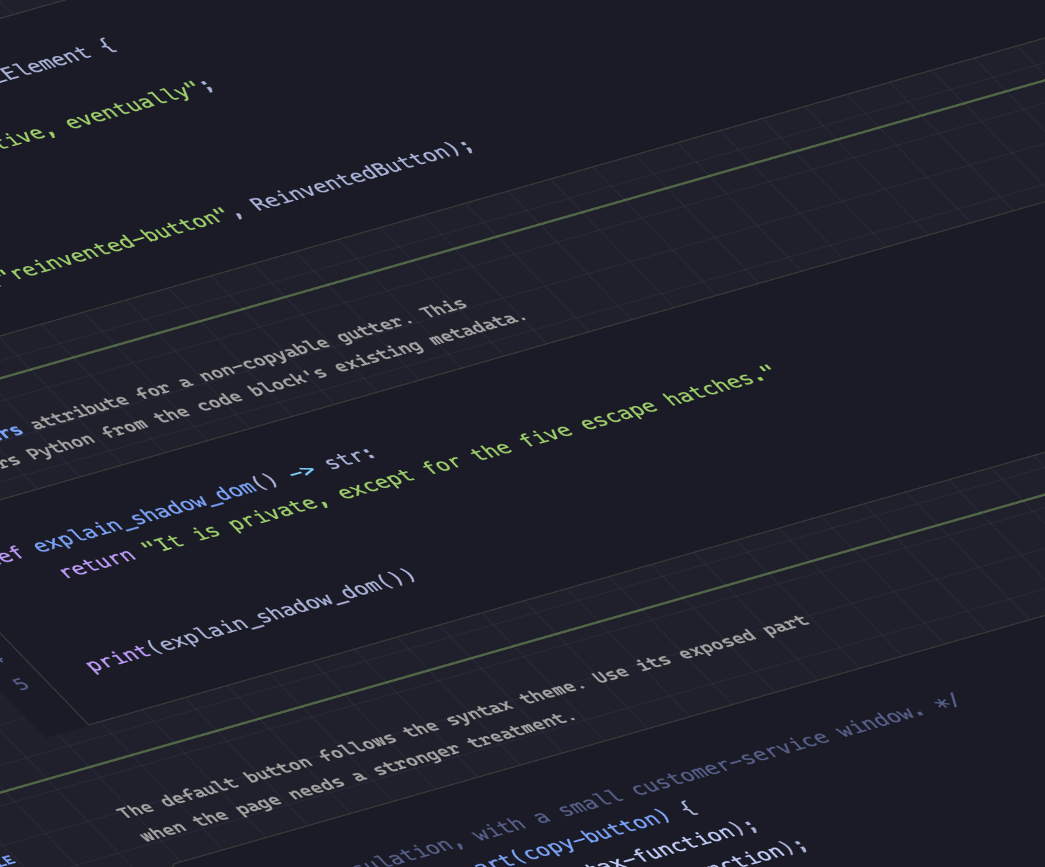
Perhaps the most visually impressive development is the rise of the Custom Highlight API. Dave Rupert’s MicroLighter project serves as a masterclass in how to leverage this API for syntax highlighting. By moving away from heavy, DOM-intensive syntax highlighting libraries toward a CSS-native approach, MicroLighter offers significant performance gains. Geoff Graham’s recent analysis underscores the architectural shift here: by using ::highlight(), we are treating code syntax as a styling concern rather than a document-structure concern, allowing for lighter payloads and faster render cycles.
Supporting Context & Metrics: Data-Driven Design
Extracting Grid Metadata into CSS Variables
One of the most requested features in layout engineering has been the ability to expose CSS Grid coordinates to the CSS Custom Property layer. Temani Afif has pioneered techniques to extract row/column indexes and cell coordinates directly into variables.
This is not merely an aesthetic convenience; it is a fundamental shift in how we handle complex layouts. By mapping grid information to variables, developers can calculate hover proximity, dynamic spacing, and adaptive layout triggers without reaching for JavaScript. While current implementations require equal column widths, the evolution of the CSS engine suggests that flexible, heterogeneous grid mapping is on the horizon.
The Great Debate: Two-State vs. Tri-State Dark Mode
A spirited debate has emerged regarding the implementation of theme toggles. Lea Verou advocates for a traditional two-state approach, whereas Bramus suggests the necessity of a tri-state model (Light, Dark, and System Default).
The industry is currently leaning toward the "auto-until-overridden" approach. This methodology respects the user’s OS-level preferences while providing a granular override that persists across sessions. This ensures that the web remains accessible and respectful of system-level settings while empowering power users to dictate their environment.
Official Proposals and Future Outlook
Class-Prefix Selectors: A Performance Revolution
Bramus recently unveiled a proposal for the class-prefix selector (e.g., .something-*), which promises to be a game-changer for component-based architecture. Currently, developers rely on attribute selectors like [class^="something-"], which can be computationally expensive for the browser’s CSS engine to parse.
A native class-prefix selector would be significantly more performant and syntactically cleaner. While it remains in the proposal phase, its simplicity suggests that browser vendors may prioritize its implementation to help developers move away from the "CSS-in-JS" trend back toward high-performance native CSS.
named-feature(): The Future of Feature Detection
The @supports rule has been the backbone of progressive enhancement for years, but it has hit a ceiling. Enter named-feature(), a function that allows for the detection of highly specific browser capabilities that were previously "undetectable."
By querying browser support for features like transform-respecting anchor positioning, developers can build interfaces that adapt to the browser’s internal engine state with surgical precision. This is the ultimate realization of the "progressive enhancement" philosophy: the ability to detect not just the presence of a property, but the quality and behavior of its implementation.
Balancing the Flexbox Layout
Finally, the introduction of flex-wrap: balance in Chrome marks a maturation of the Flexbox specification. Mirroring the success of text-wrap: balance, this property allows the browser to intelligently distribute flex items across rows to ensure visual harmony. It eliminates the "orphaned item" syndrome—where a single item sits awkwardly on the final line of a flex container—providing a level of automated design polish that previously required manual media query interventions.
Conclusion: The Path Ahead
As we transition into the autumn season, the web platform stands at a precipice of unprecedented capability. The integration of high-level logic (like grid coordinate awareness and native feature detection) into the CSS layer is not just about writing less JavaScript—it is about creating a more performant, accessible, and resilient web.
The trajectory is clear: the browser is reclaiming the responsibility of layout, interaction, and theme management. Developers who stay abreast of these native advancements will find themselves with significantly leaner codebases and a much higher degree of control over the user experience. The future of the web is not just about better design; it is about smarter, more capable infrastructure that works with the browser, not against it.
As we look toward the final quarter of the year, we expect these experimental features to move from the bleeding edge to the stable channel, fundamentally altering the way we conceive of web interfaces. The "wrap" on this edition of What !important is merely the prologue to a much larger story of web transformation.