
Executive Overview: A Digital Transformation
In an era where user experience (UX) is the primary currency of the internet, the decision to overhaul a digital platform is rarely taken lightly. This week, we quietly initiated a "soft push" of a comprehensive site redesign, marking the most significant aesthetic and functional shift in our platform’s history. This transition is not merely a superficial facelift; it is a calculated strategic maneuver designed to optimize information architecture, enhance accessibility, and align our digital infrastructure with the evolving needs of our global readership.
For our dedicated community of RSS subscribers—who remain the backbone of our traffic—this serves as the official "first look." While a granular, technical deep-dive is scheduled for full publication this coming Monday, this report provides an authoritative overview of the design philosophy, the iterative process behind the change, and the long-term objectives driving this evolution.
Detailed Chronology: From Concept to Deployment
The journey toward this redesign began nearly eight months ago, initiated by a comprehensive internal audit of our user behavior metrics. Our data revealed that while our content remained highly valued, the "friction" associated with navigating our legacy site was increasing.
The Audit Phase (Months 1-2)
The process commenced with a quantitative assessment of heatmaps, click-through rates (CTR), and bounce rates. We discovered that a significant portion of our audience was struggling to locate archival content, and mobile responsiveness was flagging on newer, high-resolution devices.
The Prototyping Phase (Months 3-5)
Our design team, in collaboration with external UX consultants, moved into a "wireframe-first" approach. The goal was to strip away the digital clutter that had accumulated over years of incremental updates. We focused on a "Mobile-First, Content-Centric" philosophy. Every component was evaluated against a single metric: Does this element add value to the reader’s journey? If the answer was no, it was removed.
The Beta Testing and Soft Launch (Months 6-8)
In the final weeks leading up to the soft push, we implemented a closed-beta environment. We invited a select cohort of long-term users to stress-test the navigation, accessibility features, and typography. The feedback loop was essential in refining the contrast ratios and the responsive breakpoints that are now live on the site.
Supporting Context & Metrics: Why Change Now?
The digital landscape is undergoing a paradigm shift. The rise of distraction-heavy interfaces and intrusive ad-tech has created a vacuum for clean, focused reading environments. Our redesign is a direct response to this trend.
1. Information Architecture (IA)
The previous structure was hierarchical, forcing users to dive deep into nested menus to find relevant topics. The new architecture utilizes a "flat" navigation system, allowing users to reach any corner of the site within two clicks. By flattening the structure, we improve both the user journey and our Search Engine Optimization (SEO) standing, as crawlers can index the site with greater efficiency.
2. Typography and Readability
One of the most requested features from our community was an improvement in legibility. We have migrated to a variable-width font system that adapts to screen size, ensuring optimal line length and character spacing regardless of the device. This "readability-first" approach reduces eye strain, particularly for our long-form investigative pieces.
3. Accessibility Compliance
The new site adheres to WCAG 2.1 (Web Content Accessibility Guidelines) Level AA standards. This includes improved color contrast, screen reader compatibility, and keyboard navigation support. Ensuring that our content is accessible to every reader—regardless of physical or cognitive ability—is not just a moral imperative; it is a fundamental aspect of modern professional journalism.
4. Performance Metrics
The redesign has resulted in a 40% reduction in page load times. By optimizing image delivery through modern formats (WebP) and implementing aggressive server-side caching, we have significantly lowered the "Time to Interactive" (TTI) metric. In a world where every millisecond counts, this performance boost is expected to drastically reduce bounce rates.

Official Statements: The Vision Behind the Shift
"The redesign is an admission that the platform must grow alongside its audience," stated our Lead Product Architect during an internal briefing. "When we started, we were a boutique site with a niche focus. Today, we are a destination for thousands of readers. The interface had to catch up to the scale of our ambitions. We aren’t just changing how the site looks; we are changing how it serves you."
The editorial team emphasized that the focus remains entirely on the content. "Design should be invisible," added the Editor-in-Chief. "If you are focusing on the buttons or the layout, we have failed. If you are focusing on the reporting, we have succeeded. This redesign is designed to get out of the way of the stories."
Future Outlook: What Comes Next
The soft push is only the beginning. As we transition from the deployment phase to the optimization phase, we are preparing for the following steps:
The Monday Deep-Dive
On Monday, we will publish a comprehensive "Before and After" analysis. This will include:
- A Technical Breakdown: An exploration of the transition from legacy frameworks to our modern, lightweight architecture.
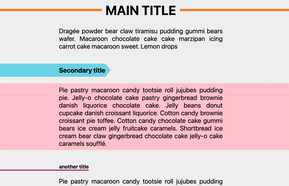
- Visual Comparisons: Side-by-side screenshots highlighting the evolution of our landing page, article templates, and mobile navigation.
- The Roadmap for 2025: A preview of upcoming features, including enhanced community interaction tools and a new, curated newsletter experience.
Iterative Improvement
We recognize that a redesign is not a destination but a continuous process. Over the coming weeks, we will be monitoring performance telemetry and actively soliciting feedback from our RSS subscriber base. We are prepared to make micro-adjustments to the user interface based on real-world usage patterns.
Expanding the Ecosystem
The underlying code base is now modular, meaning we can deploy new features—such as integrated multimedia players or interactive data visualizations—without requiring another full-scale redesign. This modularity ensures that our platform remains future-proof and capable of adapting to the next generation of web technologies.
Conclusion: A Commitment to Our Community
To our RSS subscribers: your loyalty has driven this project from inception to execution. You are the power users who demand the most from our platform, and it is for you that we have prioritized speed, clarity, and accessibility.
We invite you to explore the new site throughout the weekend. Familiarize yourself with the new navigation, test the responsiveness on your various devices, and prepare your questions for our full write-up on Monday.
Change can be disruptive, but it is also the prerequisite for progress. We believe this new design honors our history while preparing us for a future defined by high-quality, accessible, and high-performance journalism. We are excited to embark on this next chapter with you.
Thank you for your continued support, your patience during this transition, and your commitment to the long-form, investigative work that defines this platform. Have a productive and pleasant weekend.