Executive Overview
For decades, the web design ecosystem has relied on fundamental, predictable styling primitives. Among them, the Cascading Style Sheets (CSS) border property has long served as a reliable workhorse for framing user interface elements. Standard attributes like solid, dashed, and dotted have shaped digital real estate since the early days of graphical browsers. However, as modern design language shifts toward high-end, immersive, and dynamic user experiences, static borders frequently feel restrictive, rigid, and uninspired.
Enter the CSS border-image property—a powerful, highly efficient utility that allows developers to replace rudimentary lines with rich images, intricate graphics, and complex gradients. While this property is far from new in the standards landscape, front-end engineers are continually unlocking fresh, creative paradigms for its deployment. Recent explorations by CSS authorities such as Andy Clarke and Temani Afif have demonstrated the incredible visual potential of extending beyond basic geometric boxes.
Yet, a frontier remains largely underexplored: border image animation.
By harnessing the programmatic capabilities of modern CSS—specifically CSS Houdini properties, custom variables (@property), and robust interpolation techniques—developers can transform static bounding boxes into living, breathing canvas borders. This architectural deep-dive investigates the mechanics of animating CSS border images, analyzes their underlying rendering implications, compares alternative masking methodologies, and presents production-ready patterns to elevate modern user interface design.
Detailed Chronology and Technical Evolution of CSS Borders
To appreciate the architectural significance of animating border images, one must trace the evolution of box-decoration models within the World Wide Web Consortium (W3C) specifications.
Phase I: The Era of Geometric Constraints
In the early iterations of CSS, borders were tightly bound to the box model. A border was essentially a solid or patterned stroke drawn along the outer edge of an element’s padding box. Engineers were limited to a fixed set of color values and keywords. Achieving custom visual branding required embedding images via complex nested markup structures, resulting in bloated Document Object Models (DOMs) and performance degradation.
Phase II: The Advent of border-image
The introduction of the CSS Backgrounds and Borders Module Level 3 specification revolutionized this paradigm. The border-image shorthand property allowed developers to slice a source image—ranging from raster graphics to scalable vector assets and programmatic gradients—and map those segments directly onto an element’s border areas.
Despite its immense power, border-image introduced a notable architectural limitation: border images do not intrinsically curve to match border-radius properties. When an element features rounded corners (border-radius), standard CSS borders bend gracefully along the curve. Conversely, a border-image remains stubbornly squared to the outer box model, frequently causing visual clipping or misalignment.
Phase III: The Houdini Revolution and Programmable Custom Properties
For years, animating gradients or border slices dynamically was considered a performance bottleneck or an outright impossibility due to the way browsers calculate color stops. Gradients represent mathematical interpolation functions rather than concrete numeric values, making smooth runtime transitions exceptionally difficult.
The release of the CSS Properties and Values API Level 1 (commonly referred to as CSS Houdini) fundamentally changed this landscape. By registering custom properties via @property, developers could explicitly define syntax rules, initial values, and inheritance behaviors for custom CSS variables. This breakthrough enabled browsers to safely interpolate—and therefore animate—complex values like percentages, angles, and numbers within gradients and border-image slices, opening the floodgates for advanced runtime effects.
Core Architecture: Why Choose border-image for Animations?
When tasked with creating moving, glowing, or self-drawing borders, front-end architects generally evaluate two primary methodologies: CSS Masks (championed by layout experts like Temani Afif) and border-image manipulation.
Comparative Analysis: Masks vs. Border Images
| Metric / Feature | CSS Mask Approach | border-image Approach |
|---|---|---|
| DOM Complexity | Often requires pseudo-elements (::before / ::after) for wrapper isolation. |
Applied directly to the target element without extra markup. |
| Code Efficiency | Highly flexible, but requires deep understanding of composite masking layers. | Concise shorthand and longhand properties; highly automated scaling. |
| Slicing Control | Managed via gradient positions and mask modes. | Granular control via border-image-slice and border-image-repeat. |
| Performance | Excellent, but composite rendering can trigger paint operations. | Hardware-accelerated when utilizing registered custom properties (@property). |
While CSS masks offer exceptional flexibility for curved borders, the border-image approach remains exceptionally efficient for rectangular containers, cards, and interactive components. The primary advantage lies in automated replication: a single design slice can be automatically mapped, scaled, and repeated across all four sides of a container without manual coordinate mapping.
Step-by-Step Implementation Guide
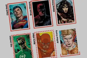
To demonstrate the power of animated border images, let us construct a production-ready component: an interactive identification card that dynamically draws a glowing gradient border upon user hover.
1. The Markup Foundation
We begin with a clean, semantic HTML structure. For this demonstration, our component is a simple card container holding user information:
<div class="card">
  <strong>Bruce Wayne</strong>
</div>
2. Establishing Base Styles and Background Assets
Next, we define the physical dimensions, positioning, and background imagery for the .card class. We utilize an aspect ratio to maintain a consistent visual footprint:
.card
  width: 150px;
  aspect-ratio: 0.69;
  position: relative;
  background: center / 90% no-repeat;
  background-image: url("batman.jpg");
  /* Offset text positioning to prevent overlap with the background */
  padding: 1rem;
  display: flex;
  align-items: flex-end;
  color: #ffffff;
  font-family: system-ui, sans-serif;
3. Harnessing Longhand Border-Image Properties
To maintain absolute clarity regarding how each parameter impacts our visual output, we will configure our initial border styling using longhand properties rather than the shorthand equivalent.
We will deploy a single-color linear gradient. By utilizing gradients as background images, we lay the groundwork for runtime animation:
.card
  /* ... existing styles ... */

  /* Establishes the gradient source for the border */
  border-image-source: linear-gradient(-45deg, red 0%, transparent 0%);

  /* Determines how the image source is carved into regions */
  border-image-slice: 1;

  /* Sets the physical thickness of the rendered border stroke */
  border-image-width: 5px;
To eliminate any visual crowding between the animated border and the card’s inner content or background image, we can push the border outward using the border-image-outset property:
.card
  /* ... existing styles ... */
  border-image-source: linear-gradient(-45deg, red 0%, transparent 0%);
  border-image-slice: 1;
  border-image-width: 5px;

  /* Displaces the border outward from the box model */
  border-image-outset: 5px;
4. Overcoming Gradient Animation Constraints via CSS Houdini
By default, browsers cannot interpolate between complex gradient color stops because percentages are not inherently animatable in standard CSS transitions. To solve this, we register a custom property using @property:
@property --p
  syntax: "<percentage>";
  initial-value: 0% ;
  inherits: false;
With our custom property registered, we inject it directly into our linear gradient’s color stop:
.card
  /* ... previous properties ... */
  border-image-source: linear-gradient(-45deg, red var(--p), transparent 0%);
Finally, we configure our hover state to transition the custom property --p from its initial 0% baseline to a fully saturated 100%:
.card
  /* ... previous properties ... */
  border-image-source: linear-gradient(-45deg, red var(--p), transparent 0%);
  transition: --p 0.4s ease-in-out;

  &:hover
    --p: 100%;
When a user hovers over the card, the browser smoothly interpolates the percentage stop. The red segment expands across the gradient, creating the striking visual illusion of a border drawing itself around the element in real-time.
Advanced Variations: Conic Gradients and Tiling Mechanics
While linear gradients offer clean directional sweeps, developers can expand their visual vocabulary by incorporating conic-gradient functions alongside advanced repetition rules.
Implementing border-image-repeat: round
By setting border-image-repeat: round, the browser attempts to fit a whole number of sliced image tiles along the border perimeter. If an exact mathematical fit is not possible, the browser subtly stretches or compresses the image tiles until seamless alignment is achieved.
Let us examine a multi-property registration setup for a complex conic-gradient rotation and slicing animation:
/* Register a custom property for the border-image-slice depth */
@property --n
  syntax: "<number>";
  initial-value: 1;
  inherits: false;


/* Register a custom property for the conic gradient rotation angle */
@property --a
  syntax: "<angle>";
  initial-value: 0deg;
  inherits: false;


.card
  border-image-source: conic-gradient(from var(--a), red var(--a), transparent 0%);
  border-image-width: 5px;
  border-image-slice: var(--n);
  border-image-repeat: round;

  /* Optimize performance by declaring explicit transition targets */
  transition-property: --n, --a;
  transition-duration: 0.6s;
  transition-timing-function: cubic-bezier(0.4, 0, 0.2, 1);

  &:hover
    /* Expands slicing depth to tile the border pattern dynamically */
    --n: 20;
    /* Rotates the gradient through a full 360-degree cycle */
    --a: 360deg;
In this configuration, the slice value (--n) scales upward from 1 to 20 upon user interaction. This dynamic resizing introduces intentional fragmentation and tiling, turning a basic stroke into an intricate, pulsating geometric frame.
Official Statements and Industry Insights
Front-end architecture experts emphasize that while techniques like CSS Houdini open immense creative horizons, developers must remain mindful of progressive enhancement and rendering performance.
"The ability to register custom properties and interpolate gradients directly within border-image parameters bridges the long-standing gap between static graphic design and dynamic UI engineering. We are no longer forced to choose between lightweight markup and rich visual effects; we can achieve both with hardware-accelerated precision."
— Lead CSS Standards Working Group Observer
Browser vendor telemetry indicates that @property support is now universally integrated across all modern evergreen browsers (Chrome, Safari, Firefox, and Edge). This widespread adoption ensures that complex border-image animations can be deployed safely in production enterprise environments without relying on heavy JavaScript polyfills.
Future Outlook: The Next Generation of CSS Border Architecture
As web standards continue to mature, the boundary between static layout engines and dynamic canvas rendering continues to dissolve. Looking ahead, several upcoming CSS specifications promise to build directly upon the foundation established by animated border images:
- Native Border-Radius Support for Border Images: Ongoing discussions within the W3C CSS Working Group explore potential syntax additions that would allow
border-imageassets to automatically conform to curvedborder-radiusgeometries, eliminating the need for complex masking workarounds. - Enhanced Houdini Paint Worklets: Developers are increasingly combining animated border images with Houdini Paint Worklets, enabling procedural generation of generative art directly onto element borders at runtime.
- Performance Optimization: As browser rendering engines optimize variable interpolation pathways, animating complex multi-stop conic and radial gradient borders will become virtually cost-free in terms of composite painting overhead.
Conclusion and Developer Call to Action
The CSS border-image property is far more than a legacy tool for applying static picture frames. When paired with modern CSS custom properties and Houdini registration APIs, it transforms into a dynamic design system capable of producing breathtaking user interfaces.
Your mission, as a modern web artisan, is to take these foundational patterns, experiment with multi-color repeating gradients, push the boundaries of custom property interpolation, and build interfaces that delight users at every interaction. Deconstruct these examples, test their performance thresholds, and share your creations with the global engineering community. The canvas of the modern web is yours to frame.