Executive Overview
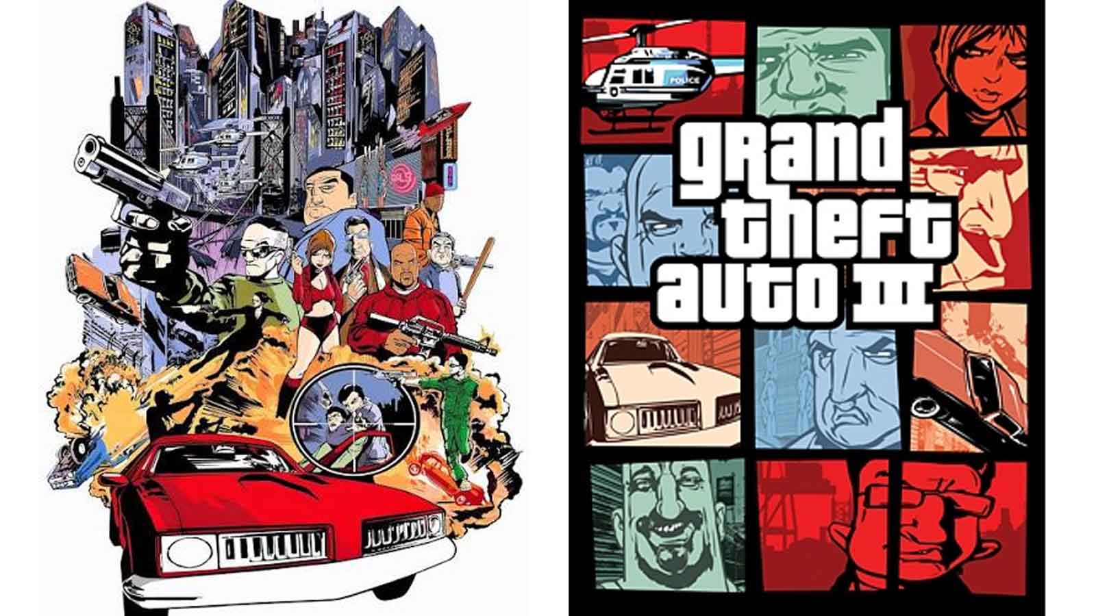
Few visual layouts in entertainment history are as instantly recognizable as the collage-style box art of the Grand Theft Auto franchise. Long before a player reads the stylized typography or registers the iconic serif font of the logo, they are greeted by a distinctive grid of multi-paned windows. These panels are tightly packed with vignettes of criminal life: stylized character portraits, high-speed police chases, palm trees, sun-drenched skylines, and gritty urban textures. For a quarter of a century, this mosaic format has served as the visual shorthand for the entire franchise. It bridges the gap between Grand Theft Auto III and the highly anticipated Grand Theft Auto VI, unifying distinct eras of gaming under a single, cohesive aesthetic banner.
Yet, as recent revelations from Rockstar Games co-founder Dan Houser highlight, this legendary graphic template was born not out of a deliberate, multi-year marketing strategy, but out of a desperate, eleventh-hour scramble. In the tragic wake of the September 11 terrorist attacks in 2001, Rockstar found itself staring down a rapidly approaching October release window with a completed box art design that suddenly felt entirely inappropriate for the American public.
What followed was a frantic, high-pressure redesign process that ultimately yielded one of the most successful and enduring branding templates in the history of interactive entertainment. This is the story of how an industry-defining visual identity was forged in a matter of days—and how a tragic historical inflection point fundamentally reshaped the marketing of the world’s biggest video game franchise.
Detailed Chronology: From Concept to Crisis
The Original Vision: A Cinematic, Gritty Action Poster
In the lead-up to the autumn 2001 launch of Grand Theft Auto III—a title that promised to revolutionize the industry by transitioning the top-down 2D crime simulator into a fully realized, three-dimensional living world—Rockstar’s marketing and art teams had envisioned a very different aesthetic.
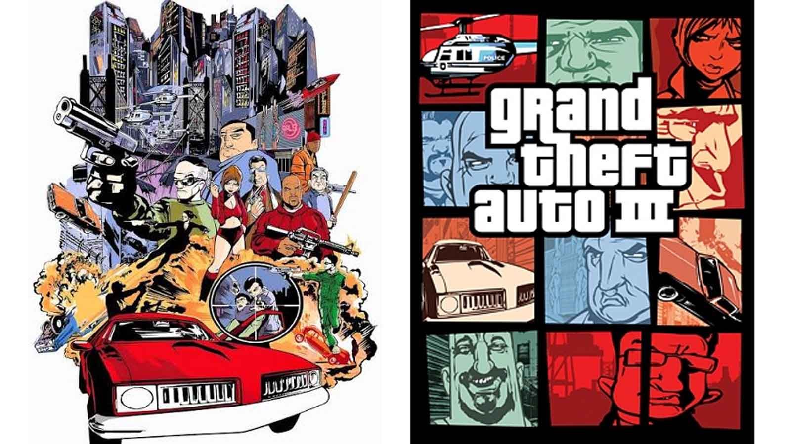
For roughly six months, artists had labored over a traditional, cinematic box art design. Heavily inspired by classic Hollywood crime thrillers and gritty urban movie posters, this initial concept featured a dramatic, singular composition. Early accounts and historical archives describe an artwork dominated by a blown-up bridge, police officers firing weapons blindly into the air, and hovering tactical helicopters circling a fractured skyline. The tone was chaotic, aggressive, and undeniably heavy—a reflection of the underground, lawless underworld that players would soon inhabit as they explored Liberty City.
The plan was to finalize this grand painting and push it out to international markets for a coordinated Christmas 2001 release. The creative team believed they had captured the anarchic spirit of the game. However, the world changed overnight on September 11, 2001.
[Early 2001: Six-Month Development]
       │
       ▼
[Cinematic Movie-Poster Concept] (Blown bridges, police gunfire, heavy urban chaos)
       │
       ▼
[September 11, 2001: Historical Turning Point] (Original art deemed too politically and emotionally sensitive)
       │
       ▼
[Late September 2001: The Scramble] (Stephen Bliss tasked with emergency redesign)
       │
       ▼
[October 2001: The Birth of the Grid] (Multi-panel collage adopted, setting a 25-year design template)
The Shadow of 9/11 and the Emergency Redesign
The terrorist attacks on the World Trade Center sent shockwaves through the American entertainment and media landscape. Industries across the board immediately began self-censoring, delaying, or heavily revising content that featured terrorism, mass destruction, police violence, or the collapse of major metropolitan infrastructure.
For Rockstar Games, the timing could not have been more precarious. Grand Theft Auto III was scheduled for a fall release, and its promotional materials featured imagery that suddenly hit far too close to home. The burning bridge, aggressive police shootouts, and urban aerial bombardment depicted in the original box art risked courting massive public backlash, potential retail bans, and severe regulatory scrutiny during a deeply vulnerable national moment.
Faced with an unprecedented crisis, Rockstar’s leadership made the difficult decision to scrap six months of meticulous artistic labor. The team needed a completely new visual direction, and they needed it immediately.
Enter Stephen Bliss, an artist tasked with an almost impossible mandate: design a replacement cover that maintained the edgy, criminal ethos of the game while steering clear of sensitive real-world destruction imagery.
Accounts regarding the exact timeline of this frantic pivot have varied slightly over the years, adding a layer of industry lore to the event. In recent interviews, Dan Houser recalled that Bliss pulled off the miraculous redesign in "about two evenings." Meanwhile, Bliss’s own recollections suggest a slightly more generous window of roughly a week—still an astonishingly brief period to conceptualize, illustrate, and finalize the face of a multi-million-dollar entertainment property. Regardless of whether it took 48 hours or seven days, the sheer velocity of the execution remains a testament to the pressure cooker environment at Rockstar during those fateful weeks.
Supporting Context & Metrics: The Anatomy of a Design Template
The genius of the rushed replacement lay in its structural modularity. Lacking the time to paint a cohesive, large-scale narrative scene, Bliss leaned into a compartmentalized approach. By breaking the cover art down into a grid of distinct, graphic novel-inspired panels, the design team solved several problems at once:
- Narrative Versatility: Each individual box could highlight a different element of the game—a specific character portrait, a muscle car mid-turn, a weapon, or a sliver of Liberty City architecture.
- Visual Hierarchy: The segmented layout allowed the human eye to scan the cover quickly, absorbing diverse gameplay elements without becoming overwhelmed by visual clutter.
- Franchise Scalability: Most importantly, the template proved infinitely adaptable. When Rockstar expanded the franchise to sunnier climes and distinct eras with Grand Theft Auto: Vice City (1986 neon aesthetic) and Grand Theft Auto: San Andreas (early-90s West Coast hip-hop culture), the exact same panel grid accommodated the new settings effortlessly.
The Transatlantic Divide: Two Realities for Two Continents
One of the most fascinating footnotes of this turbulent period is that the original, pre-9/11 box art was not entirely destroyed or scrubbed from existence. While North American distribution channels received Stephen Bliss’s emergency grid redesign, the European division—including the United Kingdom—proceeded with the original action-heavy, movie-poster-style artwork.
For British and European gamers who picked up Grand Theft Auto III at launch in late 2001, the cover depicted a much more volatile, single-scene composition featuring the iconic police helicopter and urban chaos. Meanwhile, American players held the clean, multi-panel grid that would go on to define the visual vocabulary of the series.
This geographic split created a unique generational divide in gaming memory. Millions of players across the Atlantic remember the exact same software looking entirely different on their bedroom shelves, split down the middle by an administrative pivot born from an American tragedy.

Official Statements and Industry Reflections
Reflecting on the era, industry insiders and executives have frequently marveled at how a panicked, reactive design decision turned into one of the most enduring branding assets in corporate history.
Dan Houser’s commentary to media outlets over the years underscores the casual, almost accidental nature of the shift:
"The cover art that became the iconic GTA cover art; Stephen Bliss did that in about two evenings," Houser noted, capturing the disbelief that a temporary fix could cement itself into the cultural consciousness for a quarter-century.
Bliss’s contributions extend far beyond that initial frantic week in September 2001. His distinct vector-illustration style—defined by heavy outlines, high-contrast flat coloring, and stylized character silhouettes—became the house style for Rockstar Games. It established a visual continuity that persisted through GTA IV, GTA V, and now forms the foundation for the upcoming marketing campaigns surrounding Grand Theft Auto VI.
Future Outlook: The Legacy Lives On in GTA VI
As the industry looks ahead to the launch of Grand Theft Auto VI on PlayStation 5 and Xbox Series X/S, Rockstar Games continues to lean heavily into the visual language established during that turbulent autumn of 2001.
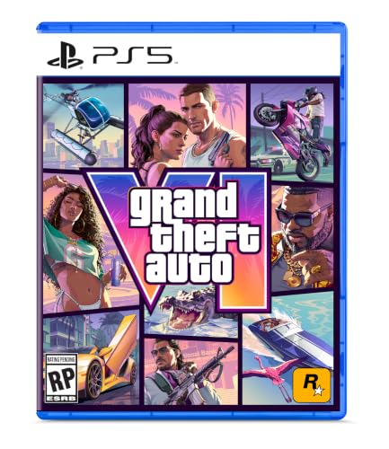
Recent promotional materials and official box art reveal that the multi-panel grid system remains firmly intact. The windows are once again packed with modern manifestations of criminal life—vignettes of neon-lit Miami-esque nightlife, social media influencers broadcasting from sports cars, sun-bleached beach scenes, and gritty underworld encounters.
┌─────────────────────────────────────────────────────────┐
│              GRAND THEFT AUTO VI LEGACY                 │
├──────────────────────────┬──────────────────────────────┤
│ 2001: The Accidental Pivot│ 2026: The Eternal Standard   │
│ • Emergency 48hr redesign│ • Multi-panel grid preserved │
│ • 9/11 response strategy │ • Modern Vice City nostalgia │
│ • Split regional releases│ • Unified global franchise   │
└──────────────────────────┴──────────────────────────────┘
What began as a desperate workaround to avoid controversy in a grieving nation has evolved into a masterclass in brand identity. The grid is no longer just a clever graphic trick used to save time; it is a cultural artifact. It serves as a visual promise to the player: a chaotic, sprawling, satirical world neatly organized into a single, cohesive frame.
As Grand Theft Auto VI prepares to shatter entertainment records upon its release, the box art standing on store shelves and digital storefronts will carry the invisible DNA of a hastily drawn sketch from September 2001—proving that sometimes, the greatest artistic triumphs in gaming history emerge from the ashes of crisis.