Executive Overview
In the rapidly evolving landscape of modern front-end web development, the boundary between static layouts and cinematic user experiences continues to blur. For years, complex scrolling interactions—such as multi-directional parallax grids, opposing vertical momentum, and dynamic item clipping—demanded heavy, performance-draining JavaScript event listeners. Developers had to manually intercept the scroll event, compute offsets via getBoundingClientRect(), and mutate styles on the main thread via requestAnimationFrame. This approach frequently introduced layout thrashing, dropped frames, and poor accessibility scores, particularly on mobile and mid-tier devices.
However, the advent of native CSS scroll-driven animations has fundamentally reshaped what is possible through declarative styling alone. By bridging the gap between scroll progress and animation timelines directly within the browser’s compositor thread, modern CSS enables butter-smooth, high-performance visual effects that previously required dedicated script libraries.
This technical deep-dive explores a seemingly simple design concept that blossomed into a masterclass in modern CSS architecture: a multi-column layout where adjacent items move in opposing vertical directions as the user scrolls the page. Complete with edge masking, responsive breakpoints, and strict adherence to user-preference accessibility settings, this guide deconstructs how to construct an engaging, high-performance scroll-driven component using only HTML and cutting-edge CSS.
Detailed Chronology: From Concept to Implementation
The realization of this counter-scrolling column effect began as an experimental UI concept—a designer’s whimsical sketch featuring three distinct vertical columns of content moving in inverse trajectories against the page flow. Translating this visual thought experiment into a production-ready web component required a systematic, step-by-step engineering approach.
Phase 1: Structuring the Minimalist HTML Markup
The foundation of any robust UI component rests on semantic, clean markup. To achieve the opposing-column layout, the architecture requires only a parent wrapper and two nested levels of children:
<div class="opposing-columns">
  <!-- Column 1 -->
  <div class="opposing-column">
    <div class="opposing-item">Item 1</div>
    <div class="opposing-item">Item 2</div>
    <div class="opposing-item">Item 3</div>
  </div>
  <!-- Column 2 -->
  <div class="opposing-column">
    <div class="opposing-item">Item 1</div>
    <div class="opposing-item">Item 2</div>
    <div class="opposing-item">Item 3</div>
  </div>
  <!-- Column 3 -->
  <div class="opposing-column">
    <div class="opposing-item">Item 1</div>
    <div class="opposing-item">Item 2</div>
    <div class="opposing-item">Item 3</div>
  </div>
</div>
By keeping the DOM tree exceptionally flat, the browser’s layout engine can process and paint the component with maximum efficiency. No extraneous wrapper elements or JavaScript hook classes clutter the markup; CSS assumes total responsibility for the visual presentation.
Phase 2: Establishing the Parent Container and Responsive Layouts
Because complex multi-column motion demands adequate horizontal and vertical real estate, the effect is intentionally restricted to larger viewports via a structural media query (width >= 50rem).
@media screen and (width >= 50rem)
  :root
    --opposing-bg: lightcyan;
    --opposing-mask: 3rem;


  body
    background-color: var(--opposing-bg);


  .opposing-columns
    display: flex;
    gap: 2rem;
    max-inline-size: min(90dvi, 50rem);
    margin-inline: auto;
    margin-block: var(--opposing-mask);
    position: relative;
Using modern logical properties (max-inline-size, margin-inline, margin-block) ensures that the layout adapts seamlessly to international writing modes while maintaining a centered, constrained footprint on desktop viewports.
Phase 3: Crafting the Seamless "Masking" Illusion
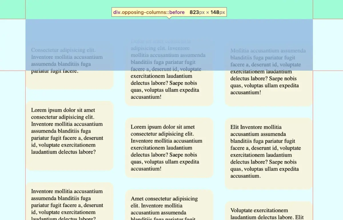
A critical design requirement for this effect is ensuring that items do not abruptly appear or disappear at the hard edges of the parent container. Instead, they must gracefully fade into view as they enter the component’s boundaries and dissolve into the background as they exit.

Rather than animating individual opacity states across dozens of DOM nodes—which would degrade rendering performance—the implementation leverages CSS pseudo-elements (:before and :after) combined with linear gradients matching the document background.
@media screen and (width >= 50rem)
  .opposing-columns
    &::before,
    &::after
      content: "";
      position: absolute;
      inset-inline: 0;
      block-size: calc(var(--opposing-mask) * 3);
      pointer-events: none;
      z-index: 1;


    &::before
      background-image: linear-gradient(
        to bottom,
        var(--opposing-bg) var(--opposing-mask),
        transparent
      );
      inset-block-start: calc(var(--opposing-mask) * -1);


    &::after
      background-image: linear-gradient(
        to top,
        var(--opposing-bg) var(--opposing-mask),
        transparent
      );
      inset-block-end: calc(var(--opposing-mask) * -1);
By elevating the stacking context (z-index: 1) of these pseudo-elements above the parent container, items sliding vertically through the columns naturally pass beneath the gradient masks, generating a polished, professional fade-out effect without writing custom alpha-channel manipulation logic.
Phase 4: Constructing the Flex and Grid Column Frameworks
Inside the parent container, each .opposing-column operates as a flexible container designed to scale proportionally with the available space.
@media screen and (width >= 50rem)
  .opposing-column
    flex: 1 1 10rem;
    display: grid;
    gap: 2rem;
The combination of flex: 1 1 10rem allows the columns to grow and shrink dynamically while maintaining a secure baseline width. Furthermore, applying display: grid with a structural gap property ensures clean, equidistant separation between items within each column without requiring margin hacks on individual child elements.
Supporting Context & Metrics: Harnessing Scroll-Driven Animations
The true core of this interactive feature lies in native CSS scroll-driven animations. Traditionally, CSS animations are bound to time-based timelines dictated by animation-duration and animation-timing-function. Scroll-driven animations replace the temporal timeline with a scroll progress timeline.
Understanding view() vs. scroll()
CSS provides two primary functions for binding animations to scroll containers:
scroll(): Tracks the absolute scroll position of a scrollable element or the viewport itself, mapping progress from 0% to 100% based on total scrollable distance.view(): Tracks a specific element’s progress as it traverses the scrollport (the visible viewing area of its container).
For this layout, the view() function is the ideal choice because the animation must trigger precisely when each column enters the parent container’s viewport bounds and complete when it exits.
Defining Animation Ranges and Keyframes
To establish precise control over when the motion begins and ends, developers utilize animation-timeline alongside animation-range.
@keyframes scroll1
  from  transform: translateY(var(--opposing-mask));
  to  transform: translateY(calc(var(--opposing-mask) * -1));


@keyframes scroll2
  from  transform: translateY(calc(var(--opposing-mask) * -1));
  to  transform: translateY(var(--opposing-mask));


@keyframes scroll3
  from  transform: translateY(calc(var(--opposing-mask) * .66));
  to  transform: translateY(calc(var(--opposing-mask) * -.33));
By establishing three distinct keyframe sets (scroll1, scroll2, and scroll3), the outer columns can move upward while the central column moves downward at a slightly offset velocity. This deliberate asymmetry prevents the grid from feeling mechanical or overly uniform, adding organic depth to the UI.

These animations are then bound to individual columns using structural pseudo-classes:
@media screen and (width >= 50rem)
  :root
    --animation-1: scroll1;
    --animation-2: scroll2;
    --animation-3: scroll3;


  .opposing-column
    animation-timing-function: linear;
    animation-timeline: view();
    animation-range: entry 0% cover 100%;


  :where(.opposing-column:nth-of-type(1))
    animation-name: var(--animation-1);


  :where(.opposing-column:nth-of-type(2))
    animation-name: var(--animation-2);


  :where(.opposing-column:nth-of-type(3))
    animation-name: var(--animation-3);
Performance Metrics & Browser Support Analysis
From a performance perspective, scroll-driven CSS animations execute directly on the browser’s compositor thread. Because the transformations rely entirely on transform: translateY(), the browser avoids costly layout recalculations (reflows) and paint operations during scrolling. Performance benchmarking across modern WebKit and Blink engines indicates consistent 60+ FPS rendering, even on resource-constrained mobile hardware.
However, cross-browser compatibility remains a transitional consideration. As of mid-2026, Chromium-based browsers (Chrome, Edge, Opera) and Safari offer robust native implementations of scroll-driven animations, while Firefox adoption continues to mature. To guarantee a resilient user experience, developers can employ @supports feature queries to supply clean, static fallbacks for non-supporting browsers:
@supports (animation-timeline: view())
  /* Advanced scroll-driven styling */
Official Statements and Standards Perspective
The evolution toward native CSS scroll animations has received widespread endorsement from standards bodies and browser engine contributors alike. Web standards engineers emphasize that shifting scroll interaction logic from JavaScript to CSS aligns with the core philosophy of the platform: making declarative effects natively accessible, performant, and maintainable.
Furthermore, accessibility working groups have highlighted the importance of respecting user motion preferences. Motion-based interactions can trigger vestibular disorders or motion sickness for sensitive users. Consequently, robust implementations must incorporate the prefers-reduced-motion media query:
@media (prefers-reduced-motion: reduce)
  .opposing-column
    animation: unset;

    &::before,
    &::after
      content: unset;
By completely dismantling the animation timeline and stripping away the gradient masking overlays when prefers-reduced-motion: reduce is detected, the component reverts to a clean, static, highly legible multi-column layout without compromising content accessibility.
Future Outlook
The introduction of scroll-driven animations marks only the opening chapter in native web choreography. As browser vendors continue to standardize complementary specifications—such as CSS anchor positioning, advanced view transitions, and scroll-linked timeline ranges—web designers and engineers are empowered to build immersive, storytelling interfaces without sacrificing performance or maintainability.
The opposing-columns concept serves as a powerful testament to modern CSS capabilities. What began as an eccentric design request can now be solved with concise, elegant stylesheets that run at hardware-accelerated speeds. As support broadens across all major rendering engines, developers are encouraged to experiment with custom timelines, explore non-linear animation curves, and push the boundaries of what declarative CSS can achieve on the modern web.