Executive Overview
The web development landscape is undergoing a period of profound structural evolution. As browsers continue to rapidly adopt advanced styling primitives, layout engines, and dynamic scripting APIs, frontend engineers are being handed unprecedented control over visual presentation and component behavior. The latest installment of the industry’s ongoing design dispatches—What’s !important #15—captures this transformative moment, highlighting a series of breakthrough techniques that challenge traditional layout constraints, enhance interface accessibility, and bridge the gap between static stylesheets and dynamic, context-aware applications.
From the introduction of boundary-aware styling via the view() function to time-based web designs driven by the Temporal API and container query-powered full-bleed layouts, the contemporary web platform is shedding decades of workarounds. However, this rapid pace of innovation brings its own systemic challenges. Newly introduced layout paradigms, such as CSS grid lanes (formerly known as masonry layouts), present critical accessibility hurdles that require immediate architectural intervention. Meanwhile, web platform leaders continue to audit historical oversights, with the CSS Working Group openly cataloging legacy design mistakes while community developers craft imaginative tools to modernize property naming conventions.
This report provides a comprehensive, deep-dive analysis into the most significant web development breakthroughs, accessibility updates, and platform features shaping the immediate future of frontend engineering.
Detailed Chronology: A Fortnight of Web Platform Breakthroughs
Boundary-Aware Styling via the view() Function
For years, element styling has been strictly isolated to internal component states, inherited properties, or media query breakpoints relative to the entire viewport. Preethi Sam’s recent exploration of boundary-aware styling marks a significant departure from this limitation. By leveraging the power of the view() function, developers can now apply conditional styles based on an element’s position and containment relative to its scroll port or specific boundary boxes. This enables sophisticated visual transitions, dynamic shadow depths, and intersection-based visual effects without relying on heavy JavaScript intersection observer polyfills.
In a parallel development addressing component containment and interaction, the discourse around hiding elements has shifted. While traditional methods like display: none completely strip elements from the accessibility tree, emerging specifications explore robust ways to keep interactive elements invisible yet fully readable by screen readers. Experts suggest that evolving the native hidden attribute or introducing dedicated attribute values may soon provide a native, semantic solution for complex UI patterns like accessible dropdown menus and hidden tooltips.
The Accessibility Crisis and Evolution of CSS Grid Lanes
Few layout paradigms have generated as much excitement—or as much architectural debate—as CSS grid lanes (historically referred to as masonry layouts or Pinterest-style grids). Dan Holloran’s documentation of native masonry landing in layout engines highlights a long-awaited design capability, allowing developers to create uneven, staggered column and row distributions without writing complex JavaScript layout scripts.
However, this visual freedom has raised immediate red flags within the accessibility community. Noted accessibility expert Manuel Matuzovic pointed out a fundamental flaw: the DOM order required for a multi-lane visual layout often creates a chaotic, non-linear reading and navigation flow for keyboard users and screen reader technologies. Because grid lanes visually reorder items across tracks independently of their source code sequence, assistive technologies struggle to parse the content logically.
To solve this, Matuzovic proposed a progressive enhancement strategy utilizing the experimental reading-flow property. While still awaiting comprehensive cross-browser testing and refinement, reading-flow promises to decouple visual grid arrangements from spatial traversal orders, ensuring that users navigating via keyboards or assistive tech experience a coherent, predictable flow of information.
Temporal API and color-mix(): The Dawn of Time-Based Web Design
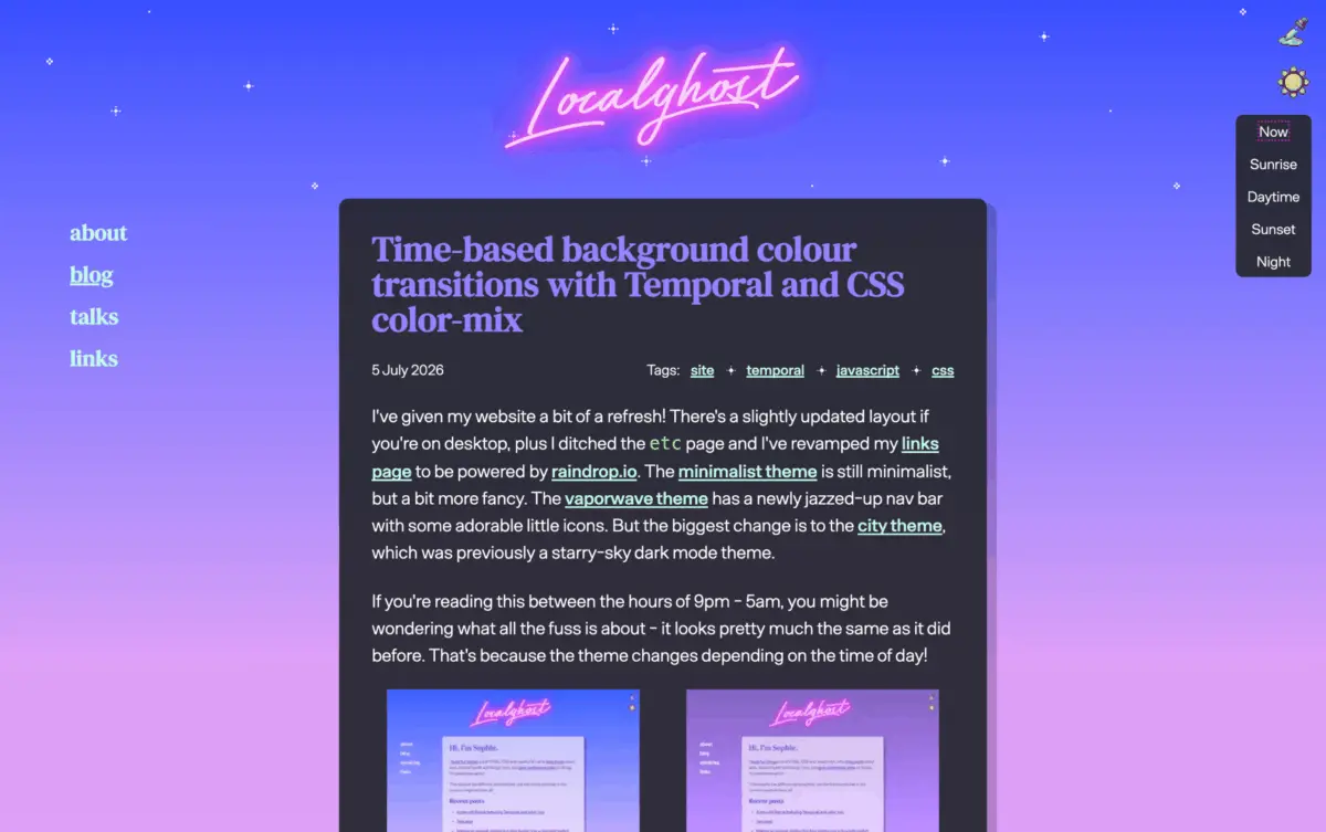
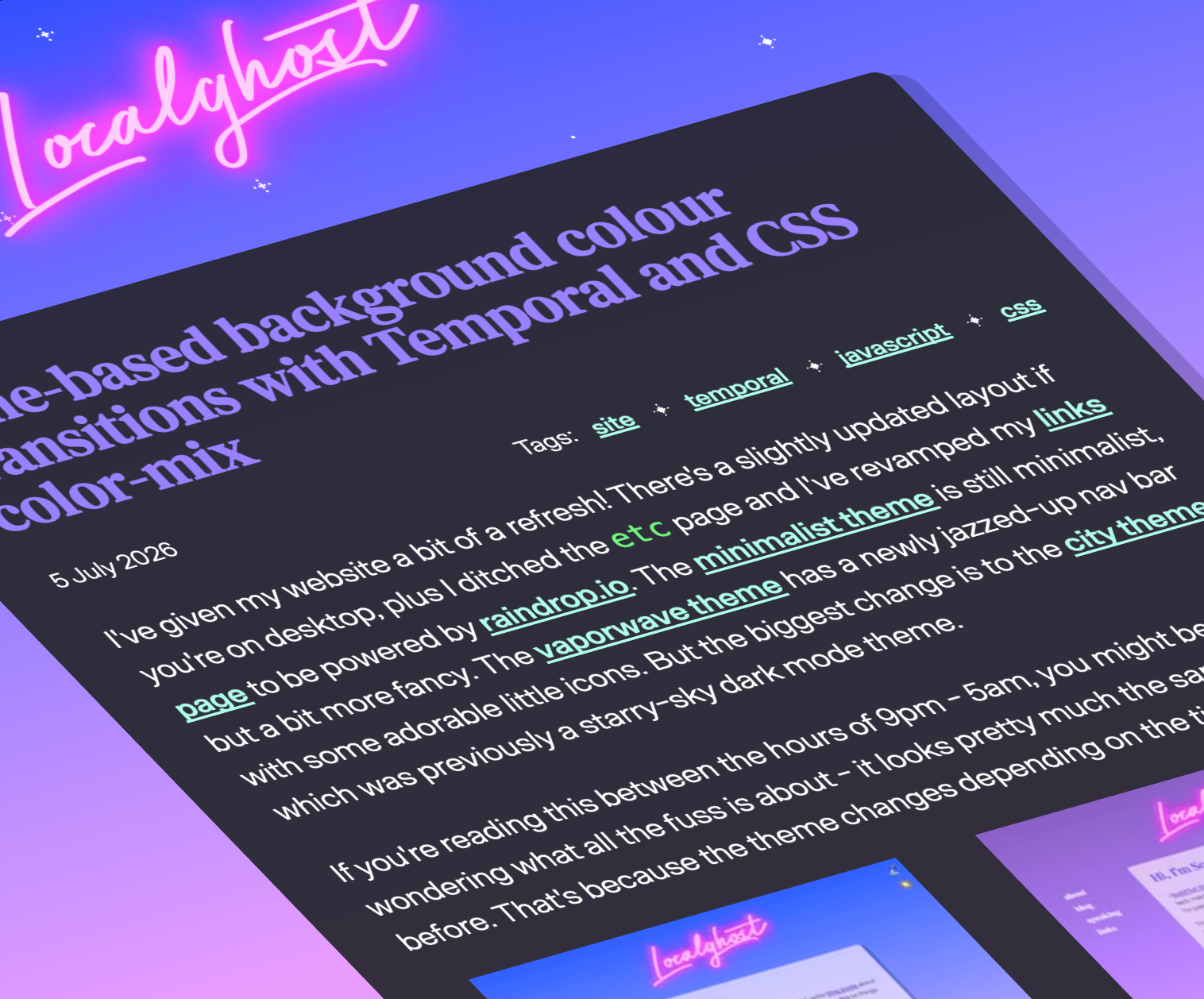
Static web themes are increasingly giving way to dynamic, environmentally responsive interfaces. Sophie Koonin recently demonstrated an elegant implementation of time-based background transitions by pairing the modern Temporal API with CSS color-mix().
/* Conceptual implementation of time-aware color blending */
:root
  --base-color: color-mix(in srgb, var(--morning-hue) var(--time-progress), var(--evening-hue));
By querying the exact temporal state of the user’s local environment and dynamically shifting CSS color variables, websites can now organically transition through morning, afternoon, evening, and night palettes. This brings the beloved dynamic wallpaper aesthetic of operating systems like macOS directly to the browser, offering a richer, more immersive contextual user experience without performance penalties.
Solving Full-Bleed Layouts with Container Query Units
One of the most persistent frustrations in responsive web design has been the "full-bleed" layout challenge: forcing a nested element within a constrained container (such as a centered blog post wrapper) to abruptly break out and span the absolute width of the viewport. Historically, this required complex negative margins, hardcoded viewport units (100vw), or restructuring the entire HTML DOM tree.
David Bushell’s recent breakthrough offers a remarkably clean fix using modern container query units (cqw). By anchoring breakout widths to parent container metrics rather than global viewport dimensions, developers can achieve seamless full-bleed elements without triggering unwanted horizontal scrollbars or layout overflows. Complementing this, Temani Afif introduced advanced breakout decorations utilizing the newly standardized border-shape property, granting creators unprecedented geometric freedom over component boundaries.
Auditing the Past: The CSS Working Group and "FixCSS"
Even as new features emerge, the foundational architecture of CSS carries historical scars. The CSS Working Group maintains an active repository documenting its own retrospective mistakes—design choices they would reverse if they possessed a time machine.
Embracing this spirit of playful yet pragmatic critique, developer Declan Chidlow introduced FixCSS, a conceptual utility framework designed to align real-world syntax with idealized developer ergonomics. By jokingly replacing legacy anomalies like border-radius with the intuitively anticipated corner-radius, projects like FixCSS underscore the ongoing community desire for cleaner, more unified naming conventions across web standards.
Perfecting the Customizable <select> Element
Native form controls have notoriously resisted deep visual customization, often forcing developers to build fragile, inaccessible JavaScript-driven dropdown widgets. The introduction of natively customizable <select> elements represents a major victory for web standards, but it brings unique UX challenges—particularly regarding sizing, popup positioning, and proportional scaling.
Jake Archibald’s deep dive into the "Goldilocks" select height tackles these sizing anomalies head-on. By establishing optimal intrinsic sizing rules and responsive height behaviors, Archibald provides a definitive guide for engineers looking to style native <select> elements without breaking user expectations or inducing layout shift.
Supporting Context & Metrics: The 2026 Web Platform Horizon
To understand the scale of current frontend transformation, one must look toward comprehensive platform overviews, such as the Google I/O 2026 presentation by developer advocates Bramus and Una Kravets. The duo cataloged 35 new and upcoming web platform features aimed at bridging the capability gap between native desktop software and browser-based applications.
| Feature Category | Key Technologies / Properties | Primary Developer Benefit |
|---|---|---|
| Advanced Layout | Grid Lanes, reading-flow, Container Units (cqw) |
Native masonry layouts with repaired keyboard navigation and simplified full-bleed controls. |
| Styling & Geometry | view(), border-shape, color-mix() |
Boundary-aware styling, custom geometric borders, and smooth environmental color transitions. |
| Form Controls | Customizable <select> APIs |
Elimination of heavy JS dropdown libraries through native, stylable form elements. |
| Runtime Logic | Temporal API | High-precision, timezone-aware date and time manipulation natively in JavaScript. |
The convergence of these features indicates a strategic shift within standards bodies: prioritizing developer ergonomics while aggressively closing long-standing functional gaps that previously required heavy JavaScript runtimes.
Official Statements and Industry Perspectives
The rapid deployment of these features has prompted widespread discussion across engineering communities regarding best practices and architectural readiness.
- On Grid Lanes and Accessibility: Industry voices have universally praised the layout capabilities of grid lanes while issuing strict warnings against premature production deployment without accessibility fallbacks. As Manuel Matuzovic noted, "Visual innovation without structural semantics is merely an illusion of progress; until reading-flow standardization matures, progressive enhancement must remain our guiding principle."
- On Native Component Customization: Commenting on the rollout of customizable form controls, core web platform contributors emphasize that native semantics must never be sacrificed for aesthetic flexibility. Architectural guidelines continue to stress that native accessibility tree fidelity remains non-negotiable, even as deep CSS styling hooks become widely available.
Future Outlook
As the web platform moves toward the latter half of the decade, the trajectory is clear: the browser is evolving into an increasingly powerful, self-contained application engine.
In the immediate future, frontend architects must balance the adoption of high-impact visual features—such as boundary-aware styling via view() and time-based color blending—with rigorous accessibility auditing. As specifications like reading-flow transition from experimental proposals to baseline interoperability, developers will finally possess the tools needed to harmonize complex layout structures with universal usability.
The web of tomorrow promises to be more responsive, visually expressive, and environmentally aware than ever before—provided the developer community maintains an unyielding commitment to foundational web standards and inclusive design.