Executive Overview
In the evolution of web design, few tools have fundamentally reshaped how developers approach layout, micro-interactions, and performance quite like CSS transforms. At the very heart of this toolkit lies the translate() function. Defined within the CSS Transforms Module Level 1 specification, translate() is a fundamental utility used to shift elements along a two-dimensional (2D) plane. By permitting horizontal, vertical, or simultaneous diagonal offsets without triggering expensive layout reflows, it has become an indispensable primitive for modern front-end engineering.
Whether you are centering complex absolute overlays, building fluid slide-in toast notifications, or animating micro-interactions on hover, translate() offers a level of compositional control that margins and absolute positioning simply cannot match. However, mastering this function requires more than just knowing its syntax. Developers must navigate the nuances of absolute versus relative length values, understand how it interacts with document flow, and sidestep common architectural pitfalls—such as pointer event flickering during state transitions.
This deep-dive technical overview examines the underlying mechanics, syntactic variations, performance implications, and practical design patterns of the CSS translate() function, providing a comprehensive manual for modern web practitioners.
Detailed Chronology and Technical Evolution
The journey of layout manipulation in cascading style sheets has been marked by a continuous quest for precise positioning and optimized rendering pipelines.
The Era of Static Flow and Margins
In the early days of CSS, moving elements relative to their native positions was handled almost exclusively via box-model properties: margin and padding, alongside top, right, bottom, and left coordinates combined with position: relative or position: absolute. While effective for static design, these properties were fundamentally tied to the document flow. Changing a margin required the browser engine to recalculate layout coordinates for surrounding elements—a computationally expensive process known as a reflow or layout thrashing.
The Rise of CSS Transforms
To decouple visual movement from document flow, the World Wide Web Consortium (W3C) introduced the CSS Transforms module. Standardized under CSS Transforms Module Level 1, functions like translateX(), translateY(), and the combined translate() introduced a paradigm shift: properties could now be manipulated at the compositor layer.
Instead of forcing the browser to redraw surrounding DOM nodes, transforms enabled graphics hardware acceleration (GPU offloading). This reduced jank, ensured silky-smooth 60fps (or higher) animations, and changed the standards for user interface responsiveness. Today, translate() enjoys universal, baseline support across all modern web browsers, cementing its status as a core capability of the modern web platform.
Supporting Context, Syntax, and Arguments
To use translate() effectively, developers must understand its exact syntactic structure and how values are interpreted by the rendering engine.
Core Syntax
The translate() function is a value assigned to the CSS transform property. Its generalized syntax is expressed as:
<translate()> = translate( <length-percentage>, <length-percentage>? )At its core, this means translate() accepts one or two arguments representing distances along the X and Y axes.
Argument Breakdown: Single vs. Double Values
-
Single Argument (
tx): When only one argument is provided, it is automatically assigned to horizontal translation (tx). The vertical translation (ty) defaults to0.transform: translate(100px); /* Moves 100px to the right */ transform: translate(-100%); /* Moves 100% of the element's width to the left */ -
Double Arguments (
tx,ty): When two comma-separated arguments are supplied, the first dictates horizontal movement (tx) and the second dictates vertical movement (ty), allowing for precise diagonal shifts.transform: translate(50px, 100px); /* Shifts 50px right, 100px down */ transform: translate(50%, 100%); /* Shifts 50% of element's width right, 100% of its height down */
Length vs. Percentage Values
The arguments accepted by translate() fall into two distinct categories:
- Absolute Lengths (
<length>): Units such aspx,em,rem, orvwrepresent fixed, absolute distances regardless of the element’s dimensions. - Percentages (
<percentage>): Unlike margins, where percentages are always relative to the containing block’s width, percentage values insidetranslate()are relative to the element’s own dimensions. Specifically, the X-axis percentage is relative to the element’s width, while the Y-axis percentage is relative to the element’s height. This unique behavior makestranslate()exceptionally powerful for fluid, intrinsic UI components whose dimensions may not be known ahead of time.
Architectural Applications and Practical Design Patterns
Because translate() interacts uniquely with the browser rendering pipeline and document flow, developers have leveraged it to solve some of CSS’s oldest structural hurdles.
1. The Classic Center-Alignment Pattern
For decades, centering an absolutely positioned element (such as a modal window or popup tooltip) was a frustrating exercise. The traditional technique involved anchoring the top-left corner to the center of the viewport using percentage offsets:
.modal-legacy
  position: absolute;
  top: 50%;
  left: 50%;
While this places the top-left corner of the box at the exact center of the container, it leaves the element skewed down and to the right because the element’s own dimensions are ignored. Historically, developers used negative pixel margins to compensate. Today, translate() provides a clean, intrinsic solution:
.modal-center
  position: absolute;
  top: 50%;
  left: 50%;
  transform: translate(-50%, -50%);
By shifting the element back by 50% of its own width and height, the exact geometric center of the modal aligns with the center of the viewport, regardless of how large or small the modal content is.
Note: While modern CSS features like CSS Grid (justify-self and align-self) or native HTML <dialog> elements offer alternative centering strategies, translate() remains a robust fallback for legacy codebases and complex absolute overlays.
2. Smooth Diagonal Entrances (Toast Notifications)
Building animated entry states for UI components like toast notifications or floating action buttons is effortless with translate(). By combining positioning properties with an offset transform, components can be pre-positioned off-screen and smoothly slid into view upon state changes.
.toast
  position: fixed;
  bottom: 30px;
  right: 30px;
  transform: translate(40px, 40px); /* Pushed slightly off-screen */
  opacity: 0;
  transition: transform 0.28s ease, opacity 0.28s ease;


.toast.show
  opacity: 1;
  transform: translate(0, 0); /* Slides neatly into place */
3. Document Flow Preservation
One of the most critical characteristics of translate() is that it does not affect the surrounding document flow.
When you modify an element’s margin or top properties, the browser must recalculate the geometry of neighboring elements to accommodate the shift. In contrast, translate() performs a post-layout graphical transformation. The space originally occupied by the element remains fully reserved in the DOM layout, exactly as if the element had never moved.
.translated-box
  position: absolute;
  top: 0;
  left: 0;
  transform: translate(80px, 40px);
Neighboring DOM nodes (such as adjacent sibling boxes) remain completely oblivious to the transformation, preventing unexpected layout jumps and maintaining high rendering performance.
Official Statements and Technical Considerations
As web components grow more interactive, developers must account for edge cases and interaction bugs associated with CSS transforms. One of the most notorious challenges involves pointer pseudo-classes like :hover.
The Pointer Event Flicker Trap
Consider a scenario where translate() is applied directly to an element inside a hover pseudo-class:
/* Problematic Implementation */
.card:hover
  transform: translateX(160px);
When a user hovers over .card, it immediately shifts 160 pixels to the right. However, if the element moves away from the user’s cursor during this transition, the cursor is no longer technically resting over the element. Consequently, the :hover state ends instantly, causing the element to snap back to its original position.
Once it snaps back, the cursor is once again hovering over it, triggering another translation cycle. This creates an infinite, flickering loop of jittery motion.
The Architectural Solution
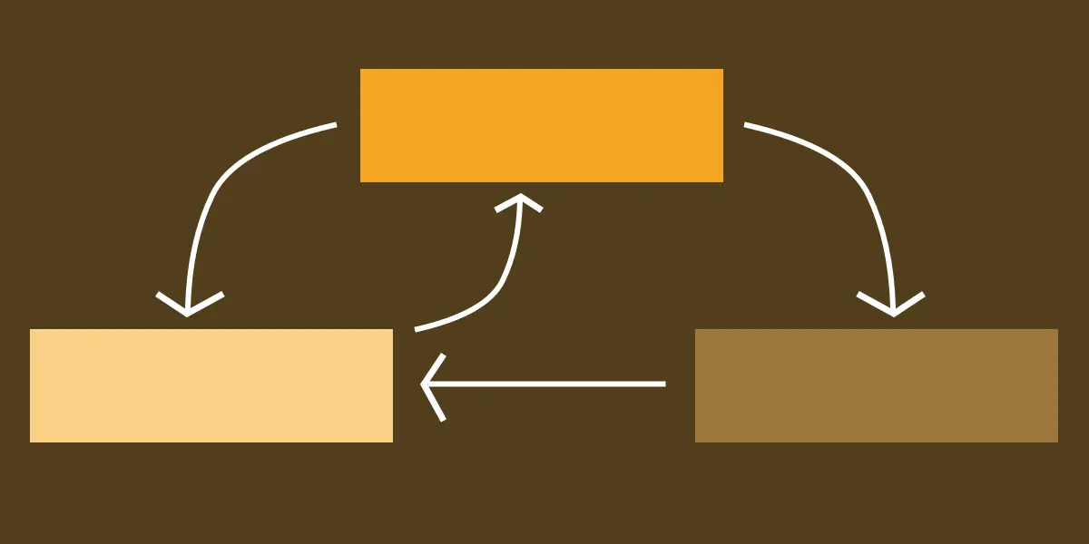
To prevent this interaction bug, the layout architecture must be decoupled. The hover state should be applied to a static parent container, while the translate() transformation is applied exclusively to a child element nested inside it:
/* Robust Implementation */
.parent-container
  /* Container remains stationary, maintaining the hover zone */


.parent-container:hover .child-element
  transform: translateX(160px); /* Only the child moves */
By keeping the hover target stationary while moving only the visual child, the cursor remains continuously inside the activation zone, ensuring smooth, uninterrupted animations.
Future Outlook
As web standards continue to evolve under the guidance of the CSS Working Group, the underlying infrastructure powering layout and motion is becoming even more unified.
The CSS Transforms Module Level 1 specification, currently living in Editor’s Draft status, continues to enjoy baseline optimization across all evergreen browsers (Chrome, Safari, Firefox, and Edge). Furthermore, modern CSS properties such as individual transform properties (translate: 50px 50%;) are beginning to supersede the monolithic transform property in certain use cases, allowing developers to target individual axes without remembering function order strings.
Nevertheless, the foundational mechanics of translate() remain a cornerstone of front-end web development. By understanding its percentage-based calculations, its respect for document flow, and its performance advantages over layout-triggering properties, developers can build interfaces that are not only visually stunning and responsive, but also performant and resilient across all user devices.