Executive Overview
For a quarter of a century, the multi-billion-dollar Grand Theft Auto franchise has maintained a visual signature as instantly recognizable as its satirical worldview and open-world mayhem. Glance at a shelf displaying any mainline title from the past two decades—from the sun-drenched neon of Vice City to the sprawling rural expanse of San Andreas, and now the highly anticipated GTA 6—and you will immediately spot it: the distinctive, comic-book-style multi-panel grid. Packed with eccentric characters, high-speed muscle cars, cryptic close-ups, and glimpses of urban criminal debauchery, this compartmentalized collage has become the undisputed calling card of modern video game packaging.
Yet, this legendary design template was never part of Rockstar Games’ master plan.
Recent revelations from Rockstar co-founder Dan Houser, reinforced by retrospective accounts from the artists involved, shed new light on the origins of the franchise’s visual identity. Far from being the result of a deliberate, long-term branding strategy, the iconic collage format was born out of a sudden, desperate crisis. In the devastating shadow of the September 11, 2001 terrorist attacks, Rockstar was forced to completely scrap its original cover art for Grand Theft Auto 3 just weeks before its scheduled release.
What followed was a frantic, eleventh-hour scramble that permanently altered not only the marketing of one of gaming’s most influential properties, but also the global perception of its box art. This deep dive explores how a global tragedy birthed a graphic design masterpiece, the conflicting accounts of its creation, and how an accidental placeholder layout became a 25-year industry standard.
Detailed Chronology: The Summer and Fall of 2001
To understand the magnitude of the design pivot in late 2001, one must first look at the state of the video game industry at the turn of the millennium. Grand Theft Auto 3 was poised to be a monumental technical and cultural shift. Transitioning the franchise from a top-down, 2D perspective into a fully realized, immersive 3D open-world simulation, the game represented an unprecedented leap forward in interactive entertainment.
The Binned Masterpiece: A Pre-9/11 Vision
For roughly six months leading up to the game’s planned autumn rollout, Rockstar Games had commissioned and refined an entirely different visual approach for the GTA 3 box art. Conceived as a traditional, cinematic movie poster, this original artwork leaned heavily into gritty, chaotic action tropes of the era.
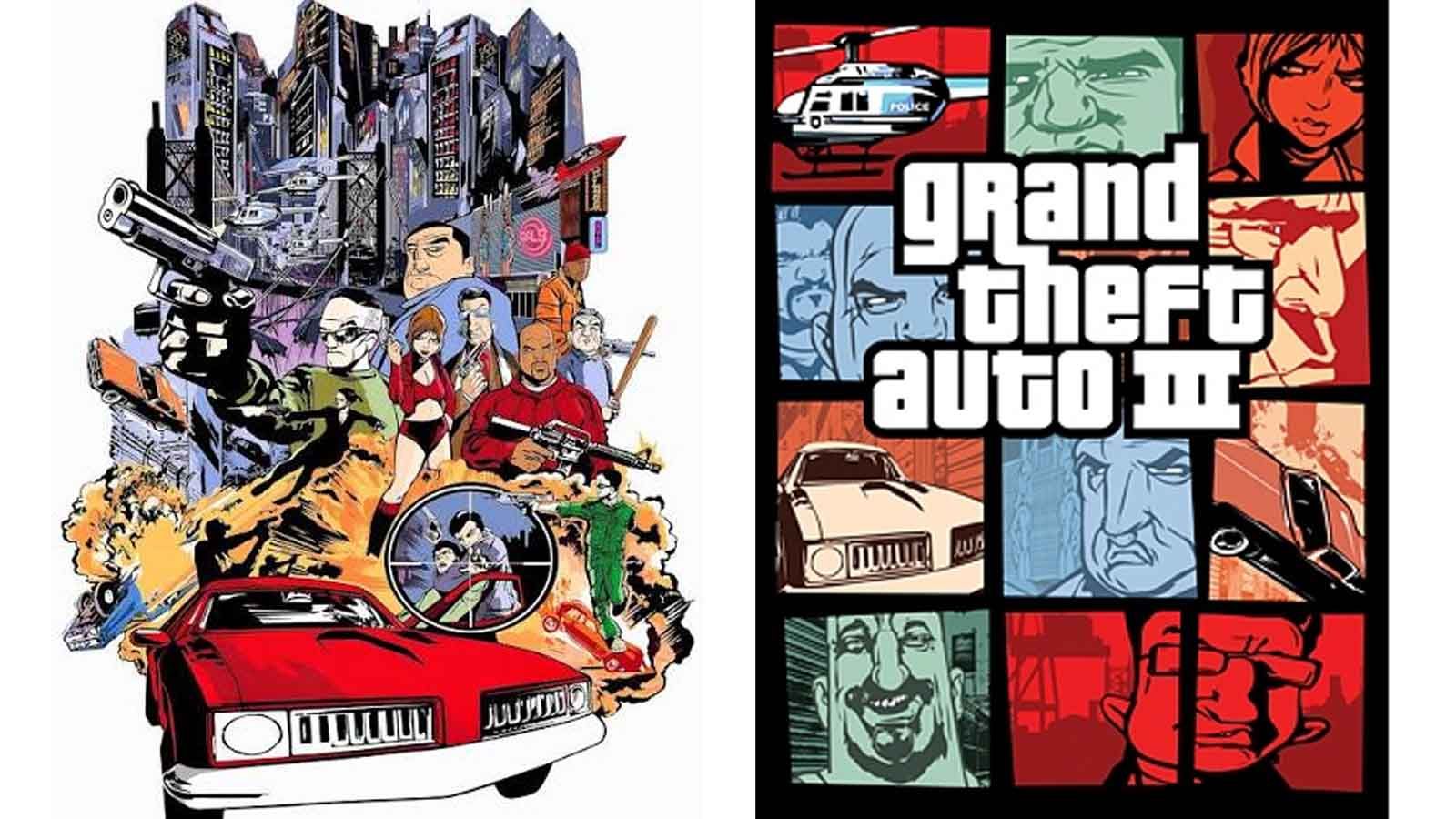
According to design archives and industry retrospectives, the discarded cover featured:
- A dramatic, blown-up suspension bridge dominating the background.
- Law enforcement officers firing weapons directly into the air.
- Heavily detailed police helicopters swarming a smoke-filled skyline.
The aesthetic was aggressive, linear, and remarkably cohesive in the style of Hollywood crime thrillers like Heat or The French Connection. It was designed to look like a blockbuster crime drama arriving for the Christmas 2001 shopping season.
The Shockwave of September 11
Then came the morning of September 11, 2001. The terrorist attacks on the World Trade Center and the Pentagon sent psychological shockwaves across the United States and the wider world. In the immediate aftermath, industries across entertainment, media, and advertising entered a period of intense reflection and self-censorship.
For Rockstar Games, the implications were immediate and severe. Grand Theft Auto 3 featured content that suddenly felt uncomfortably close to the real-world horrors unfolding in New York City. Players could hijack police cars, run over pedestrians, and engage in chaotic shootouts with law enforcement against the backdrop of a fictional metropolis modeled heavily after New York (Liberty City).
Furthermore, the original box art—featuring blowing bridges, armed police confrontations, and burning skylines—carried unsettling visual echoes of terrorism and civic collapse. With the game’s release date looming in October 2001, company executives made the swift, unanimous decision to pull the plug on the marketing materials they had spent half a year crafting. The entire visual campaign had to be thrown into the bin.
The Midnight Scramble: Two Days vs. One Week
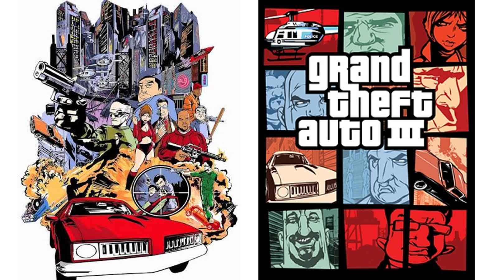
Out of this high-pressure vacuum emerged Stephen Bliss, a key designer tasked with engineering a completely new visual identity for the title under impossible time constraints. However, the exact timeline of how quickly Bliss pulled off the miraculous redesign remains a subject of playful contradiction among those who lived through it.
In a recent interview with IGN, Rockstar co-founder Dan Houser recounted the frantic pace of the pivot:
"The cover art that became the iconic GTA cover art; Stephen Bliss did that in about two evenings," Houser stated, underscoring the sheer velocity with which a multi-billion-dollar franchise’s identity was accidentally defined.
Conversely, Bliss’s own recollections paint a slightly more forgiving, yet still grueling, picture. Bliss has noted in past interviews that he was given roughly a week to produce the replacement artwork. He has also highlighted the jarring reality that while his replacement was whipped together in days, the original six-month painting had been entirely discarded at the eleventh hour.
Regardless of whether it took 48 hours or seven days, the result was a radical departure from traditional video game packaging. Unable to rely on a single, clean cinematic shot that might evoke sensitive real-world imagery, Bliss opted for a fragmented approach. By breaking the canvas up into a grid of distinct panels—each focusing on a different character, vehicle, weapon, or localized slice of criminal absurdity—the team successfully diluted the centralized focus on mass destruction and police warfare, replacing it with a colorful, graphic-novel-esque mosaic.
Supporting Context & Metrics: The International Split and Cultural Legacy
One of the most fascinating footnotes in the history of this design evolution is that the original, pre-9/11 box art did not entirely vanish from the face of the earth. While North American consumers received Stephen Bliss’s frantic grid-based redesign, European markets—including the United Kingdom—proceeded with a localized rollout that still incorporated elements of the action-heavy, bridge-and-chopper aesthetic.
For British and European gamers who picked up copies of GTA 3 in late 2001, the box art resting on their shelves was vastly different from what their American counterparts were holding. This geographical split created two distinct generational memories of the exact same groundbreaking video game:

- North American Players: Grew up associating Grand Theft Auto exclusively with the comic-book grid layout, character portraits, and vibrant framing panels.
- European Players: Many held the action-heavy cinematic poster design that Rockstar ultimately decided was too politically and socially sensitive for the U.S. market in the wake of the tragedy.
The Standardization of an Empire
What began as an emergency band-aid solution quickly metastasized into Rockstar’s definitive brand equity. Recognizing the psychological and marketing power of the grid format, the studio institutionalized it across subsequent sequels.
- Grand Theft Auto: Vice City (2002): Embraced the multi-panel layout to capture the vibrant, pastel-soaked chaos of 1980s Miami, featuring palm trees, roller-skating women, and mobsters.
- Grand Theft Auto: San Andreas (2004): Applied the grid to early-90s West Coast gang culture, rural desert landscapes, and hip-hop aesthetics.
- Grand Theft Auto V (2013): Refined the template for the modern era, balancing three distinct protagonists alongside iconic symbols of contemporary Southern California excess (smartphones, yoga, armored trucks, and police helicopters).
- Grand Theft Auto VI (Upcoming): The recently revealed box art for GTA 6 leans heavily into modern Vice City nostalgia, proving that even two decades later, Rockstar refuses to break the sacred design template forged in the autumn of 2001.
Even the iconic Grand Theft Auto logotype—with its distinctive, heavy-set block lettering—underwent a parallel evolution, becoming a masterclass in visual consistency that spawns intense fan speculation and breakdown theories with every single franchise announcement.
Official Statements and Industry Impact
The story of the GTA 3 cover art serves as a masterclass in creative adaptability during times of crisis. Industry historians often point to this specific moment as a turning point where video games matured not only in their narrative depth and technical sophistication, but also in how they navigated real-world socio-political sensitivities.
Dan Houser’s reflections over the years emphasize how close the industry came to missing out on one of its most potent branding tools. Had 9/11 not occurred, Rockstar might have spent the next twenty years utilizing traditional, single-image cinematic movie posters for its releases, entirely bypassing the comic-book collage style that gave the series its signature graphic identity.
Design theorists frequently categorize the GTA box art template among the most successful accidental designs in commercial history—joining the ranks of icons like the Chiquita Banana logo or the Nike Swoosh, which similarly evolved through unexpected creative turns or rapid iterations. By constraining the artist to a rigid grid, Bliss inadvertently forced a visual hierarchy that allowed consumers to digest multiple narrative elements (the femme fatale, the getaway driver, the corrupt cop, the weapon of choice) in a single glance.
Future Outlook: The Endurance of a Classic Template
As the gaming industry stares down the barrel of the next major epoch in interactive entertainment—anchored by the upcoming launch of Grand Theft Auto 6 on PlayStation 5 and Xbox Series X/S—the power of strong, consistent visual identity cannot be overstated.
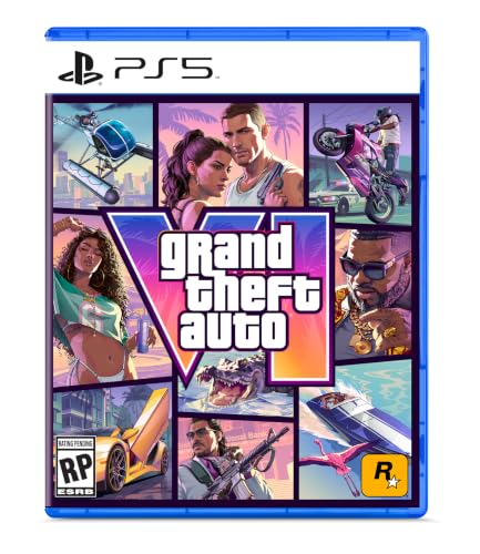
In an era dominated by digital storefronts, algorithmic recommendations, and compressed thumbnail art on digital dashboards, physical box art matters less to the bottom line than it did in 2001. Yet, Rockstar’s stubborn adherence to the multi-panel grid remains a masterstroke of brand continuity. When fans across the globe see that familiar arrangement of bordered squares pop up on social media feeds or retail displays, the psychological trigger is immediate: they are looking at a cultural event.
The accidental masterpiece crafted by Stephen Bliss in two dimly lit evenings over twenty years ago has outlived hardware generations, regulatory controversies, and massive shifts in gaming culture. It stands as an enduring testament to the resilience of human creativity—proving that sometimes, the greatest artistic triumphs in history are forged not from meticulous planning, but from the ashes of unimaginable crisis.