
Executive Overview
The web platform is currently undergoing a period of accelerated evolution, characterized by a transition from “workaround-heavy” development to a native-first approach. The latest edition of What’s !important (#18) highlights a series of shifts that promise to fundamentally alter how front-end developers approach interactivity, layout architecture, and browser-native capabilities.
From the introduction of the <geolocation> element, which seeks to simplify the historically cumbersome Geolocation API, to experimental features like the class prefix selector, the landscape is clearly moving toward reduced technical debt. This report examines the most significant updates from the last fortnight, analyzing their technical implications, current browser support, and the strategic importance of progressive enhancement in a fragmented rendering landscape.
Detailed Chronology: Innovations in Interactivity and Layout
The Tooltip Paradigm: Delay, Then Instant
A recurring point of friction in UI design is the implementation of intuitive tooltips. Abhishek Jakhar recently reignited the discourse on optimal UX, arguing that tooltips should adhere to a "delayed-then-instant" behavior. This strategy prevents "flicker"—the unintentional triggering of tooltips during rapid cursor movement—while ensuring that subsequent interactions feel immediate and responsive.
Chris Coyier expanded on this by introducing the concept of interest invokers, a modern CSS-native approach leveraging the interest-delay-start and interest-delay-end properties. While currently restricted to Chrome, this advancement suggests a future where developers can offload complex JavaScript state management to the browser engine, significantly improving both performance and maintainability.
The <geolocation> Element
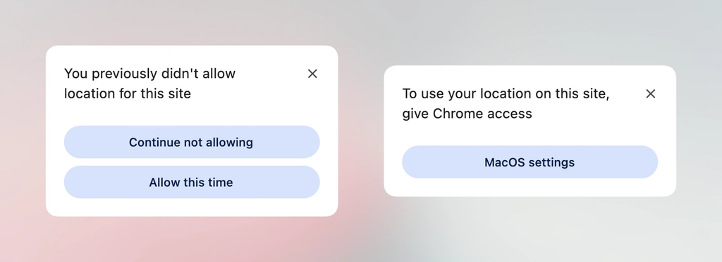
The Geolocation API has long been a source of frustration for developers, marred by dependencies on external hardware states and volatile permission models. The newly proposed <geolocation> element is an attempt to standardize location access. However, as noted in recent technical explorations, the element introduces unique styling constraints. By utilizing a wrapper-based strategy, developers can bridge the gap between current legacy implementations and the future of declarative location access, ensuring that sites remain functional today while preparing for a standardized tomorrow.
Syntax Highlighting via ::highlight()
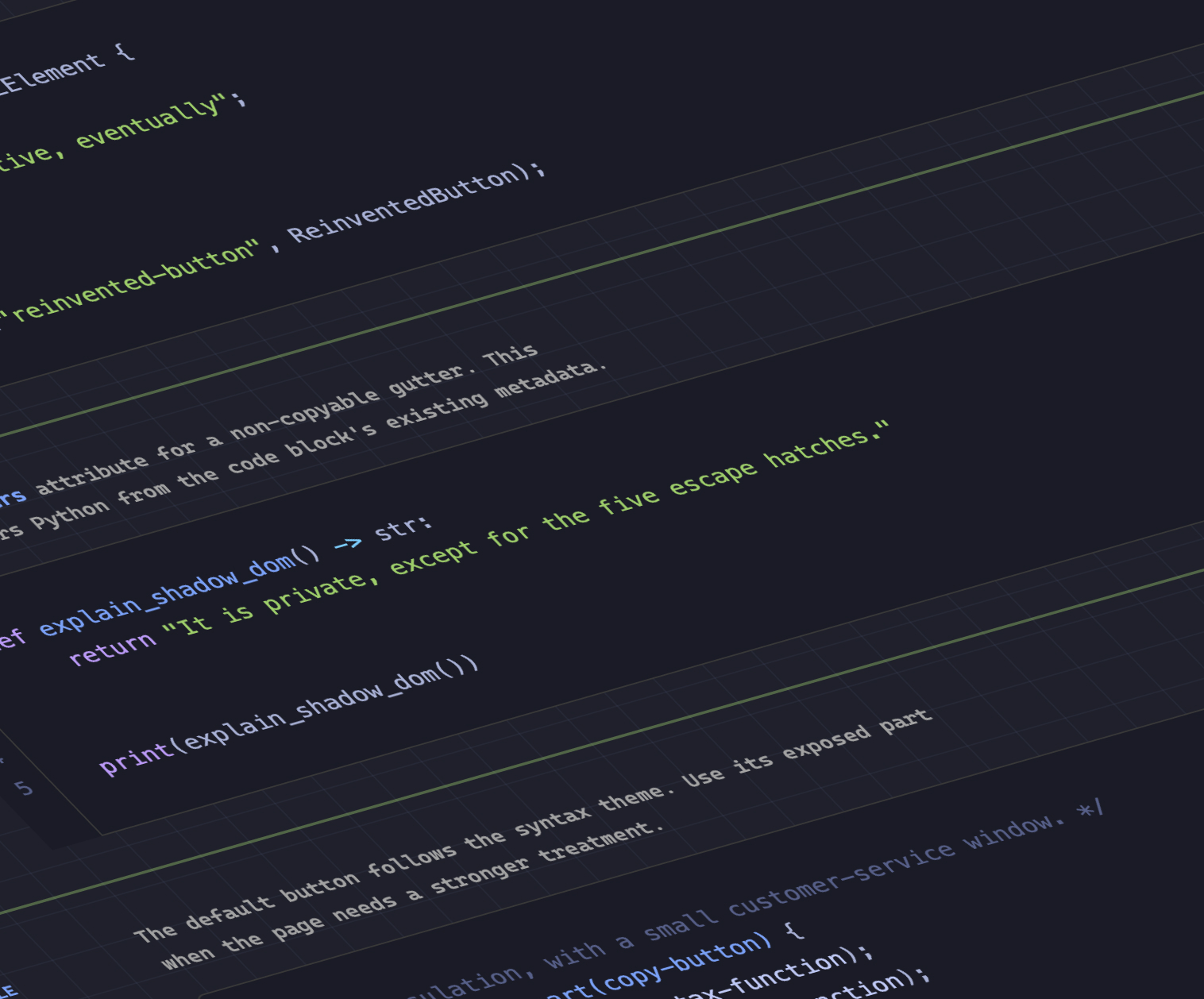
Dave Rupert’s MicroLighter project represents a sophisticated use of the CSS Custom Highlight API. By bypassing traditional DOM-heavy syntax highlighting methods, MicroLighter uses the ::highlight() pseudo-element to render syntax coloring. This approach is not merely a performance optimization; it is a shift toward a more semantic way of styling text ranges, allowing for dynamic, non-destructive highlighting that integrates seamlessly with existing document structures.
Supporting Context: Metrics and Strategic Implementation
Bridging the Grid-Variable Gap
The ability to map CSS Grid information—specifically row and column counts and cell coordinates—into CSS custom properties has long been a "holy grail" for advanced layout systems. Temani Afif’s recent work demonstrates how to extract these values dynamically. While current implementations require uniform column widths, the implications for responsive design are profound.
By feeding grid metadata into CSS variables, developers can achieve "hover proximity" effects that were previously only possible through complex JavaScript calculations. This enables a new class of fluid, context-aware interfaces that react to the user’s position relative to a grid structure, effectively collapsing the distance between layout logic and styling.
The Tri-State Dark Mode Debate
A spirited debate has emerged regarding the architecture of dark mode toggles. Lea Verou advocates for a two-state system, while others, such as Bramus, argue for a tri-state model (Light, Dark, and System Default). This discussion touches on a broader UX philosophy: how much control should be stripped from the user in favor of automated "auto-until-overridden" systems? The consensus in modern web development increasingly favors the latter, as it respects user system preferences while allowing for manual overrides that persist across sessions.
Official Analysis: The Future of Selectors and Features
The Class Prefix Selector
Perhaps the most anticipated addition to the CSS specification is the "class prefix selector." The proposed syntax:
.something-*
  /* Targeted styling for all classes starting with 'something-' */
This represents a massive departure from current, performance-intensive attribute selectors like [class^="something-"]. By providing a native selector for class prefixes, the browser can optimize style matching, leading to faster paint times and cleaner stylesheets. This is a clear indicator that the CSS Working Group is listening to the needs of developers who work within component-based architectures like BEM (Block Element Modifier) or utility-first frameworks.
The named-feature() Function
Bramus also unveiled the named-feature() function for the @supports at-rule. This is a critical development for feature detection. Traditionally, @supports has been limited to checking for the existence of specific CSS properties or values. named-feature() allows for querying high-level browser capabilities—such as whether a browser correctly handles transforms within anchor-positioned elements—that are otherwise "undetectable" via standard means. This allows for a more granular approach to progressive enhancement, enabling developers to ship robust, specialized code only when the browser environment is guaranteed to support it.
Balancing the Flex Layout
Ahmad Shadeed’s analysis of flex-wrap: balance brings the elegance of text-wrap: balance to layout containers. This feature, currently landing in Chrome, allows flex items to distribute themselves evenly across rows or columns, eliminating the "orphan" items that often plague traditional flexbox layouts. This is a victory for aesthetic consistency, as it allows for programmatic control over the visual rhythm of a flex container.
Future Outlook: A Standardized Horizon
As we move into the autumn season, the trajectory of the web platform is clear: we are moving toward a more declarative, browser-native ecosystem. The transition from JavaScript-heavy UI logic to native CSS features—such as interest invokers, syntax highlighting, and advanced grid mapping—is not merely about convenience; it is about building a more resilient, accessible, and performant web.
The ongoing "patchwork" phase of development, characterized by polyfills and complex feature detection, is slowly giving way to a more mature standard. For the modern developer, the takeaway is twofold: first, maintain a rigorous commitment to progressive enhancement; second, prepare for a future where the browser does the heavy lifting.
The introduction of the class prefix selector and named-feature() signifies that the CSS Working Group is becoming increasingly responsive to the real-world bottlenecks faced by developers. As these features move from experimental status to full cross-browser implementation, we should expect a significant reduction in the weight of front-end dependencies and a surge in the creativity of web-based UIs. The next six months will be pivotal, and the developers who lean into these native capabilities today will be the ones defining the user experience of tomorrow.