Executive Overview
The web development landscape continues its relentless march forward, characterized by an intriguing juxtaposition: while stable browser releases have experienced a brief, quiet interlude, the developer community and standards bodies are operating at a breakneck pace. Edition #14 of What’s !important captures a packed fortnightly cycle that proves the web platform remains a hotbed of creative experimentation and architectural maturation. From retro gaming ports running entirely on stylesheet engines to groundbreaking layout tools and native audio components, the ecosystem is rapidly redefining what is possible in the browser.
This period’s highlights showcase a profound shift toward declarative capability and ecosystem-wide interoperability. We are witnessing the maturation of long-awaited layout primitives like CSS Gap Decorations, the practical exploration of cutting-edge functions like random(), and a paradigm shift in how developers approach cross-platform consistency. Far from forcing websites to render identically across every glass screen and interaction model, modern web development is embracing fluidity, contextual awareness, and platform-specific capabilities.
This comprehensive report dives deep into the latest breakthroughs shaping the frontend ecosystem. We will examine how developers are making music without JavaScript, running 1990s masterpieces via CSS alone, mastering fluid form controls, and redefining the standards for enterprise-grade design systems.
Detailed Chronology & Feature Breakdown
1. Audio Without JavaScript: Hyperblam and the Web Components Revolution
The web has long treated JavaScript as the undisputed master of dynamic behavior, particularly when dealing with media APIs. However, developer Heydon Pickering has challenged this paradigm with the introduction of Hyperblam.
Hyperblam is a radically innovative, HTML-driven implementation of the Web Audio API. By harnessing the power of Web Components, the project allows developers to orchestrate, synthesize, and manipulate audio streams entirely through declarative markup. The core philosophy—encapsulated by its bold mantle, "Write Music, Not JavaScript"—demonstrates that our understanding of HTML’s semantic boundaries is still evolving. While not strictly a CSS development, Hyperblam underscores a growing movement to offload complex computational orchestration into native browser primitives, reducing script-heavy overhead and empowering developers to build reactive, accessible media experiences with minimal tooling.
2. Nostalgia Meets Layout Engines: CSS Quake
Following closely in the footsteps of the viral CSS DOOM experiment, the digital craftsmanship community has struck again. Powered by PolyCSS, the design team at Layoutit has rolled out CSS Quake—a fully functional port of the genre-defining 1996 first-person shooter Quake, running inside a layout engine environment.
This project stretches the capabilities of modern browsers to their absolute limits. While computational heavy lifting is naturally supported by underlying polyfills, the mere act of rendering a real-time, three-dimensional spatial environment through the lens of CSS architecture is a testament to the sophistication of contemporary browser painting and layout pipelines. It serves as both a nostalgic playground for retro gaming enthusiasts and an extreme benchmark for performance engineers tracking browser rendering bottlenecks.
3. Bridging the Spatial Divide: A Deep Dive into CSS Gap Decorations
For years, layout designers have wrestled with the spatial anatomy of CSS Flexbox, Grid, and Multi-column layouts. While the gap property successfully introduced breathing room between structural tracks and items, styling those interstitial gutters required hacky workarounds—such as borders on individual children, pseudo-elements, or convoluted background gradients.
That era is officially coming to an end. Temani Afif recently published a definitive masterclass on CSS Gap Decorations, illuminating how developers can directly style the empty spaces created by layout gaps. As these specifications solidify across browser vendors, developers gain native control over grid lanes, allowing for alternating background colors, decorative rules, dashed dividing lines, and intricate patterns embedded directly within structural gutters. This long-awaited addition eliminates redundant DOM nodes, streamlining markup while elevating visual design fidelity.
4. Injecting Entropy: The CSS random() Function Experiments
The quest for native randomness in stylesheets has persisted for over a decade. While the elusive CSS random() function remains limited in native browser support—currently championed primarily by experimental builds in Safari—tooling providers like Polypane have stepped forward to stress-test its potential.
Polypane’s extensive exploration of CSS random() reveals an astonishing array of use cases that previously demanded heavy JavaScript injection. Their experiments include:
- Dynamic Bokeh Effects: Generating randomized blurs, opacities, and positions for ambient background lighting.
- Falling Petals & Particle Systems: Simulating natural, organic motion without invoking
requestAnimationFrameloops. - Untidy Polaroids: Instantly scattering UI elements with randomized rotations and offsets on page load.
- Generative Poetry & Aurora Animations: Producing shifting, non-repeating visual states driven entirely at the styling layer.
This deep dive proves that when random() achieves cross-browser Baseline status, it will fundamentally transform how we handle generative design, organic UI variations, and lightweight aesthetic animations.

5. Fluid Form Elements: Mastering <select> with field-sizing: content
One of the most persistent frustrations for frontend designers has been the rigid, unpredictable sizing behavior of native <select> dropdown menus. Historically, these elements either collapsed to the size of the currently selected option—clipping longer texts—or forced developers to implement complex, inaccessible custom JavaScript wrappers.
Thanks to the official Baseline status achieved when Firefox 152 shipped support, Manuel Matuzovic highlighted the transformative potential of field-sizing: content. This simple CSS declaration allows <select> elements to dynamically resize themselves to match the width of their currently selected <option>.
However, developers must exercise caution regarding edge cases. When utilizing the legacy size attribute (e.g., <select size="3">), which defaults the element to a scrollable list box displaying multiple options simultaneously, field-sizing: content aggressively overrides that behavior to prioritize full content visibility. Understanding this interplay is vital for maintaining robust, accessible form architectures without sacrificing visual polish.
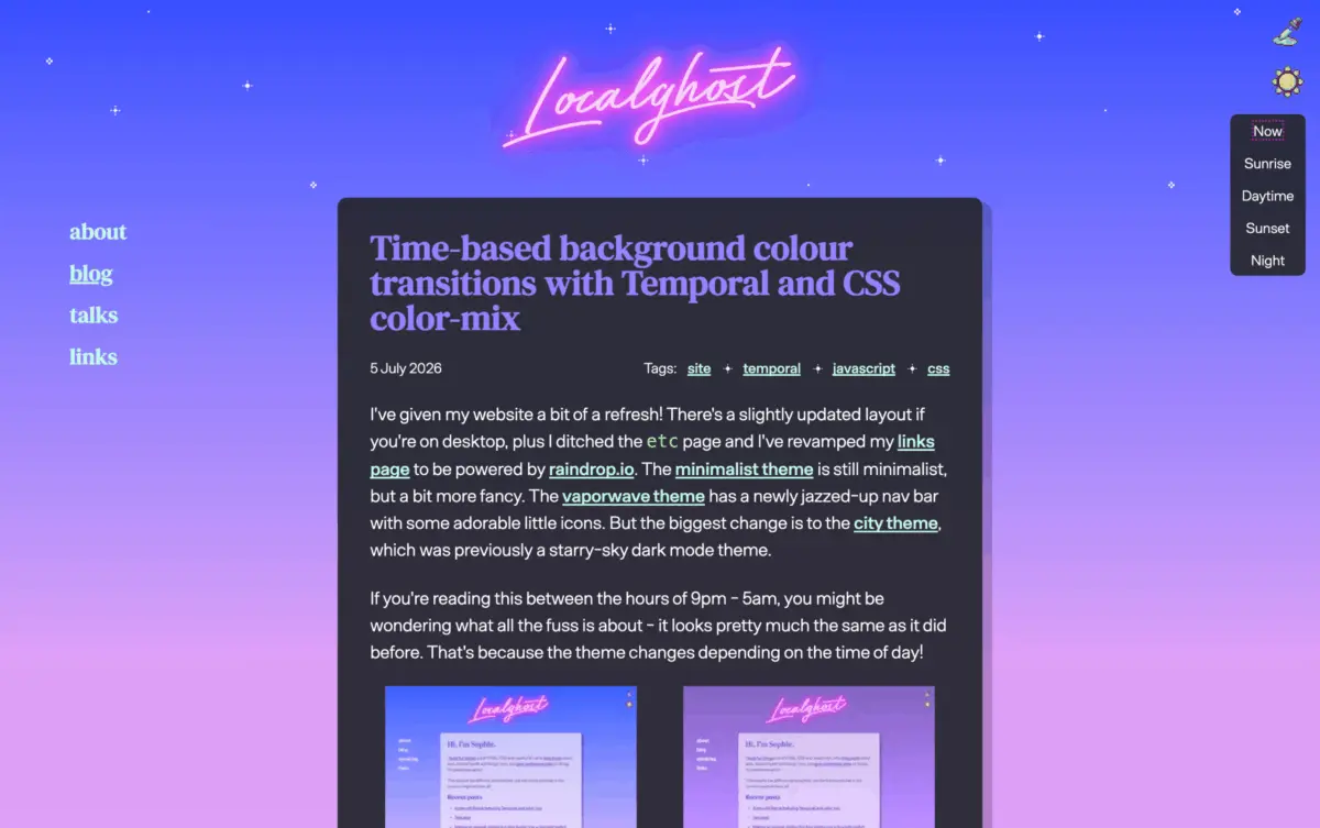
6. The New Standard for CSS Theming
Modern CSS has evolved far beyond basic color variable declarations. In a comprehensive architectural breakdown, Una Kravets mapped out the new standard for web theming, showcasing a suite of features that have officially reached Baseline status:
@property: Unlocking registered custom properties with explicit types, initial values, and inheritance rules, enabling smooth gradient and variable transitions.light-dark(): Streamlining color-scheme management by toggling values natively based on user preferences without redundant media queries.contrast-color(): Automatically calculating and applying optimal text and foreground contrast ratios against dynamic backgrounds.@container style(): Extending container queries beyond mere dimensional tracking to query the computed style state of parent elements.
When combined, these features represent a cohesive, powerful framework for designing resilient, high-performance themes that adapt effortlessly to user environments and system preferences.
7. Rethinking Cross-Platform Parity: Why Websites Shouldn’t Be Identical
For decades, web developers chased the elusive ghost of pixel-perfect consistency: the belief that a website must render and function identically whether accessed on an ultra-wide desktop monitor, a foldable smartphone, or a spatial computing headset.
In a thought-provoking analysis, Bramus dismantled this dogma, arguing that forcing uniform behavior across disparate platforms actively harms the user experience. Different devices possess distinct primary input modalities—and users frequently layer secondary inputs on top of them.
Bramus spotlighted three revolutionary web platform features that inherently demand platform-specific adaptation:
- Interest Invokers: Tailoring hover and focus previews based on whether the device relies on precise cursor tracking or coarse touch gestures.
- Overscroll Actions: Customizing bounce and boundary behaviors to match native operating system ergonomics.
- Document Picture-in-Picture API: Providing detached, multi-window experiences that adapt fluidly to desktop multitasking workflows rather than mobile constraints.
8. Community Insights: Web Engines Hackfest in A Coruña
While the echoes of CSS Day continued to reverberate across the development community, the global standards conversation shifted to A Coruña, Galicia, for the annual Web Engines Hackfest.
Documented brilliantly by Marina Aïsa, the two-day gathering brought together browser engineers, spec authors, and core contributors to debate the future of web engines and standards. Blending rigorous technical sessions with outdoor excursions and communal wall-climbing, the event underscored the human element behind web standards. Discussions heavily prioritized browser-level interventions to drastically improve web accessibility, proving that the technical evolution of the web remains deeply intertwined with its social responsibility.
Supporting Context & Metrics
To contextualize the velocity of these developments, industry tracking metrics indicate a profound shift in browser engine parity and feature deployment timelines. With Baseline 2026 criteria heavily weighted toward interoperable implementations across Chromium, Gecko, and WebKit, the gap between experimental specification and production readiness has narrowed significantly.
| Feature / Technology | Current Status | Primary Driver / Advocate | Impact Level |
|---|---|---|---|
| Hyperblam (Web Audio API) | Experimental / Production-ready | Heydon Pickering | Medium (Architectural Shift) |
| CSS Quake | Experimental Demo | Layoutit / PolyCSS | Low (Benchmark / Novelty) |
| CSS Gap Decorations | Standardizing / Emerging | Temani Afif | High (Layout & Design) |
CSS random() |
Experimental (Safari supported) | Polypane | High (Generative UI) |
field-sizing: content |
Baseline (Firefox 152+) | Manuel Matuzovic | High (Form Usability) |
| Modern Theming Suite | Baseline (Recent rollouts) | Una Kravets | Critical (Enterprise Architecture) |
| Platform-Aware UX | Conceptual Evolution | Bramus | Critical (Product Strategy) |
Official Statements & Community Discourse
The dialogue surrounding these updates reflects a maturing industry eager to shed the hacks and polyfills of the past in favor of robust, native platform primitives.

Reflecting on the convergence of modern theming features, Una Kravets noted in her architectural review:
"We are no longer just styling documents; we are programming design tokens natively in the browser. The combination of registered properties, dynamic contrast calculations, and style queries means our stylesheets are finally acting as intelligent, reactive systems."
On the philosophical shift away from forced cross-platform uniformity, Bramus emphasized:
"The web’s greatest strength has always been its resilience and adaptability. When we force a desktop paradigm onto a touch device—or vice versa—we fight the hardware. We need to build platforms that embrace context, leveraging interest invokers and picture-in-picture APIs to meet the user where they are."
Marina Aïsa, capturing the spirit of the Web Engines Hackfest via Bluesky, highlighted the collaborative nature of standards development:
"Spending days debating the future of web engines reminds you how much human care goes into every pixel rendered on screen. Accessibility isn’t an afterthought checkbox; it’s the foundational metric by which we judge the success of our engine standards."
Future Outlook
As the industry looks toward the horizon—highlighted by rolling updates like Chrome’s ongoing version cycles and Firefox’s aggressive Baseline alignments—the trajectory of frontend development is crystal clear.
The immediate future will not be defined by massive, sweeping browser updates that rewrite the rules overnight, but rather by the deep, compounding mastery of the tools we already have. As features like field-sizing, modern theming properties, and gap decorations settle securely into Baseline status, enterprise design systems will undergo a massive refactoring phase. Legacy CSS hacks will be systematically purged, replaced by clean, performant, native declarations.
Concurrently, the boundaries of HTML and CSS will continue to be pushed by visionary experimenters building audio synthesizers and retro game engines into layout flows. Developers who stay ahead of these trends—embracing platform-aware design, generative styling, and semantic minimalism—will lead the next generation of web architecture.
Keep a close eye on developer channels and quick-hit releases as browser vendors finalize their upcoming pipelines. The web platform is healthier, more expressive, and more powerful than ever before.