Executive Overview
In the sprawling, often hyper-commercialized landscape of digital wellness and spiritual platforms, standing out requires more than just a fresh coat of paint. It demands a profound alignment between visual expression and the esoteric services being offered. When psychic services platform Purple Garden sought to redefine its market position and cement its status as an industry leader, it turned to the renowned creative agency Mother Design.
The result is a masterclass in modern brand transformation: a serene, highly tactile, and deeply resonant identity that rejects the superficial clichés of the psychic sector in favor of organic authenticity. Spearheaded by Mother Design’s Creative Director Jo Tulej, the project discarded conventional corporate brand strategies. Instead, the team embraced an unconventional creative genesis—incorporating chakra readings, automatic writing, and trance-state drawing workshops inspired by pioneer abstract artists like Hilma af Klint.
This comprehensive case study explores how Mother Design translated the formless energy of spirituality into a cohesive, highly functional digital-first brand. By balancing introspective methodology with rigorous design execution, the agency crafted a visual and verbal vocabulary that honors "seasoned seekers" while carving out a sophisticated new standard for the spiritual wellness category.
Detailed Chronology: From Séance to System
The creation of the Purple Garden rebrand was far from a linear, spreadsheet-driven corporate overhaul. It was an experiential journey that tested the boundaries of traditional client-agency relationships, requiring vulnerability, trust, and time.
Phase 1: Immersion and the "Wild Card" Initiative
Operating under Mother Design’s internal "Wild Card" initiative—a framework designed to protect experimental, high-risk creative phases from being sidelined by rigid Key Performance Indicators (KPIs)—the design team resolved to experience the product firsthand. Recognizing that translating psychic energy into visual assets required authentic understanding, the team enlisted a holistic practitioner from the Purple Garden platform.
This advisor guided the agency through an unconventional brand audit consisting of:
- Chakra Readings: To ground the designers in the energetic frameworks central to the platform’s core offerings.
- Automatic Drawing and Writing Workshops: Sessions executed with simple mediums like paper and charcoal, designed to bypass conscious thought and tap directly into intuitive expression.
Phase 2: Trance States and Historical Precedents
The methodology drew heavy inspiration from historical spiritual artists, most notably Hilma af Klint and The Five. These pioneering women met regularly to enter trance states, believing they were bypassing their conscious minds to channel messages from a higher consciousness onto paper—work that predated formal Western abstract art movements led by Wassily Kandinsky and Piet Mondrian.
Mother Design adopted this exact ethos. The team participated in group workshops where they created uninhibited, raw marks using charcoal and ink. Days later, the designers returned to pin up these organic artifacts, analyzing them collectively to identify recurring shapes, textures, and emotional resonances. These raw, automatic drawings formed the conceptual DNA for Purple Garden’s new visual system.
Phase 3: Translating Intangibility into Typography and Form
With the foundational motifs established, the agency began translating these organic, subconscious forms into structured brand assets.
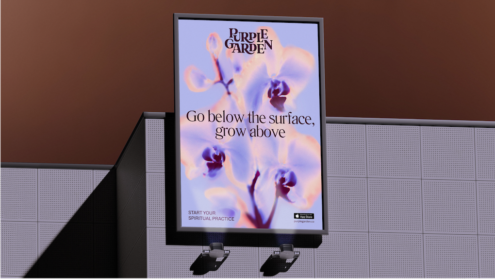
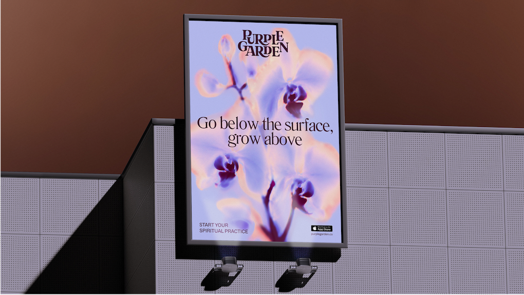
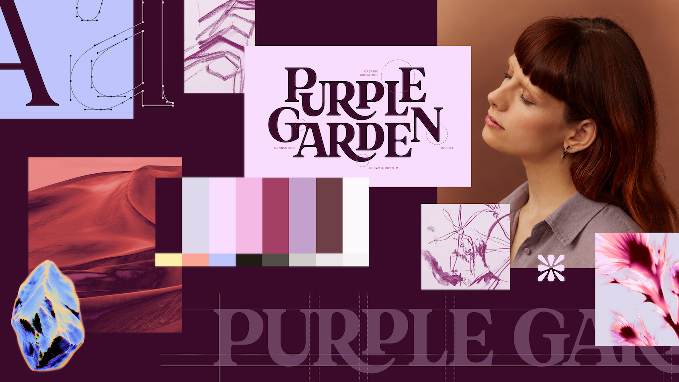
- The Wordmark: Featuring a custom combination of elegant serifs and curved junctures, the new wordmark appears to grow outward organically, mirroring the concept of living, continuous spiritual growth. The ligatures are intentionally crafted to mimic sprouting vines or living cellular structures.
- The Glyph: A digital-first, crystal-like glyph was developed to anchor the platform’s identity across mobile apps and web interfaces, positioning Purple Garden as an unshakeable source of "grounded guidance."
- Typography Selection: The agency paired Literatura Present with ABC Social, a dual-typeface strategy that successfully bridges a whimsical, organic aesthetic with razor-sharp, practical legibility required for digital user experiences.
Supporting Context & Metrics: Redefining an Entire Industry
The spiritual services and psychic reading sector is historically plagued by visual and verbal tropes. Platforms frequently lean into aggressive marketing tactics—characterized by urgent calls-to-action ("Book Fast," "Get Answers Now," "Act Immediately") and predictable, low-budget visual clichés involving glowing neon crystal balls, floating tarot cards, and flat, overly saturated purple hues.
Mother Design’s research into Purple Garden’s target demographic—primarily "seasoned seekers" who are deeply familiar with spiritual practices—revealed an appetite for elevated authenticity.
Palette and Imagery Metrics
To break away from category fatigue while retaining brand recognition, Mother Design expanded the traditional single-hue purple palette into a rich, earthy spectrum comprising seven distinct hues. This nuanced color scheme provides the depth and warmth necessary to stand out against the flat tones typical of competitors.
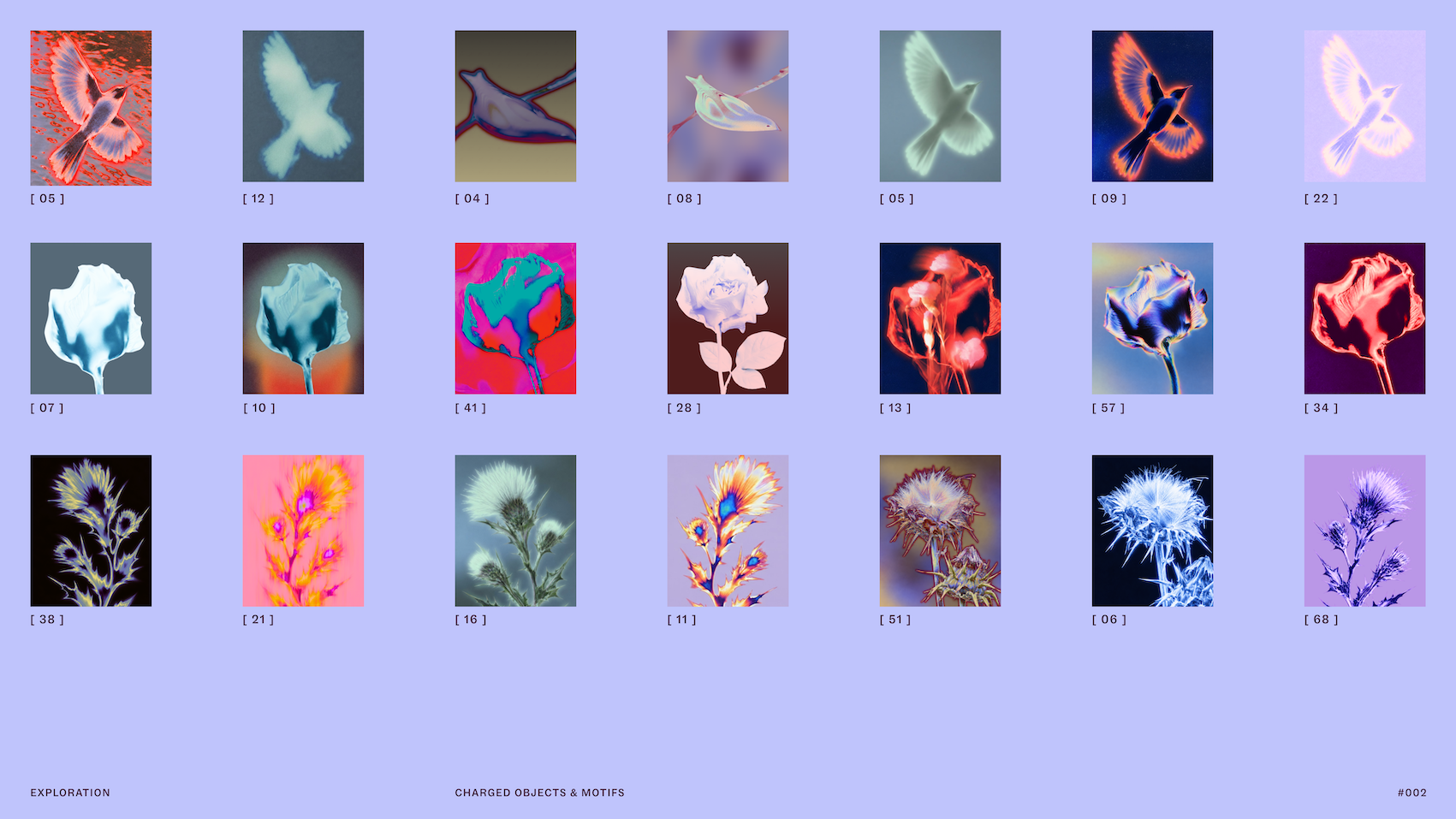
Furthermore, the brand’s photographic direction was completely overhauled. Rather than utilizing generic stock imagery of mystical artifacts, the team captured "charged objects" representing services like dream analysis and mediumship. These objects were treated with solarized glows and flame-like ripples, visually communicating the dynamic energy exchange that occurs between a spiritual practitioner and a client.
Official Statements & Industry Insights
Reflecting on the unique challenges of the project, Jo Tulej, Creative Director at Mother Design, offered profound insights into the intersection of spirituality and modern branding:
"Transferring something as intangible as psychic power into a brand identity was a chunky challenge that we wanted to get right. It had to begin with the audience… Purple Garden is aimed at people who have had spiritual readings and practices, and the business objective was to cement the brand’s place as the leader in the category."
Tulej noted the stark contrast between this project and other concurrent branding initiatives handled by the agency, such as their work on fellow psychic platform Keen:
"What has surprised me is how different the two product/brands now feel, and how divergently we’ve been able to explore and push their identities. Again, this all comes down to getting under the skin of the audiences and aims of the business in order to sharpen the creative ideas and design expression."
Speaking on the unorthodox kickoff process, Tulej emphasized the vital importance of protecting experimental design phases:
"For the Purple Garden process specifically, I was struck by how the initial séance experiment gave us a totally different way of starting a branding project. It was slow, unclear and required a lot of trust and to a certain extent, vulnerability, from our team. By protecting this time, and removing a traditional ‘KPI’ from the output, I believe it gave our client a much richer, robust output, sensitive to the category and its audience."
Addressing the delicate balance of brand messaging, Tulej highlighted the shift from panic-driven marketing to reflective engagement:

"Instead of urgency and pressure… we created a voice based around a duality: Active Contemplation, that can meet you where you are and either guide you forward or slow down for more reflective moments."
Future Outlook: The Evolution of "Living Practice"
The successful rollout of Purple Garden’s rebrand signals a broader shift in how digital wellness and alternative lifestyle platforms approach their brand identities. As consumers become increasingly sophisticated, superficial branding rooted in mysticism and high-pressure sales funnels is giving way to design systems built on psychological resonance, tactile craft, and intellectual depth.
By framing Purple Garden around the concept of a "Living Practice," Mother Design has future-proofed the platform. The identity is not a static logo mark; it is a living, breathing ecosystem designed to expand alongside its users. The interwoven letterforms, the solarized natural photography, and the dual-natured copywriting establish a flexible framework that can easily scale across emerging digital formats—from immersive mobile applications to augmented reality spiritual consultations.
Ultimately, Purple Garden’s transformation proves that when agencies are granted the "wild card" freedom to step outside traditional corporate methodologies, the resulting design can transcend mere commercial utility. By honoring the intangible and anchoring it in rigorous, empathetic craftsmanship, Mother Design has created a landmark rebrand that will likely influence design standards across the spiritual and wellness sectors for years to come.