
Rebrand Revisited is an investigative series examining the brand redesigns that deeply divided public opinion, exploring whether history has ultimately been kinder to them than the initial social media comment sections.
Executive Overview
In July 2014, home-sharing pioneer Airbnb unveiled a radical corporate rebrand that immediately triggered one of the largest digital firestorms in modern graphic design history. Developed in partnership with the London-based agency DesignStudio, the new corporate identity aimed to unite the global travel community under a singular, universal symbol: a coral-red emblem officially christened the "Bélo." Conceived to represent people, places, love, and a universal sense of belonging, the logo was intended to propel Airbnb from a quirky Silicon Valley startup into a polished, multinational hospitality titan.
Instead, the internet reacted with a relentless avalanche of mockery. Within hours of its launch, social media users, meme pages, and tabloid newspapers flooded the digital landscape with crude anatomical comparisons, pointing out that the Bélo bore an uncanny resemblance to genitalia, breasts, bottoms, and testicles. A dedicated Tumblr account cataloging the logo’s accidental resemblances went viral, while major news outlets openly questioned whether the company had signed off on a massive public relations disaster.
Yet, skipping forward more than a decade, the Bélo remains foundational to Airbnb’s visual identity. Far from caving to public pressure, retracting the design, or firing its creative leadership—a trap into which other high-profile brands have occasionally fallen—Airbnb stood firm. Today, the symbol is one of the most widely recognized and enduring corporate trademarks in the global travel sector.
This retrospective examines the origins of the infamous 2014 redesign, analyzes the anatomy of the internet’s backlash, reviews the strategic framework that protected the brand from folding, and explores how time ultimately vindicated a bold, forward-thinking piece of graphic design.
Detailed Chronology: From Air Mattresses to Global Hospitality
1. The Blue Years: The Modest Startup Origins (2008–2014)
When Airbnb was founded in San Francisco in 2008 by Brian Chesky, Joe Gebbia, and Nathan Blecharczyk, its value proposition was raw, unpolished, and disruptive. Born out of an urgent need to pay rent, the founders inflated three air mattresses in their living room and rented them out to attendees of a sold-out industrial design conference. What began as an unconventional, scrappy experiment quickly morphed into a legitimate alternative to traditional hotels.
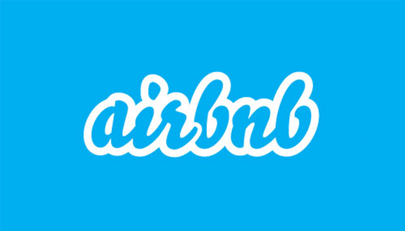
The company’s original visual identity matched its humble beginnings. Featuring a handwritten, bubbly blue wordmark outlined in white, the logo carried a quintessential late-2000s web-startup aesthetic. It was approachable, slightly playful, and undeniably friendly, but it fundamentally lacked the gravitas required for a rapidly scaling global platform. By the early 2010s, Airbnb was no longer just a quirky website where adventurous travelers could sleep on stranger’s couches; it was processing millions of bookings worldwide and directly threatening the legacy hotel industry. Its branding needed to grow up.
2. The Birth of the Bélo (July 2014)
Recognizing that its startup aesthetic was holding back its global ambitions, Airbnb enlisted London branding agency DesignStudio to spearhead a comprehensive visual overhaul. The brief was daunting: create a unifying symbol that could scale across digital platforms, transcend linguistic and cultural barriers, and encapsulate the emotional core of the business.
The research phase was exhaustive. DesignStudio’s team did not simply retreat to an agency boardroom; they traveled to 13 cities across the globe, stayed with 18 hosts spanning four distinct continents, and conducted in-depth interviews with more than 120 users, hosts, and employees.
On July 16, 2014, the fruits of this labor were revealed. The archaic blue bubble wordmark was entirely scrapped, replaced by a clean, modern sans-serif typeface paired with a bold, coral-red symbol: the Bélo.
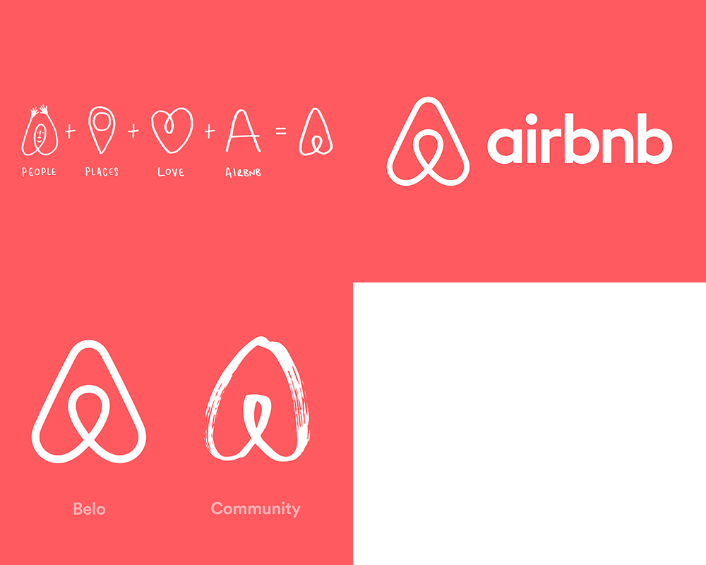
According to DesignStudio and Airbnb executives, the Bélo was a masterclass in geometric synthesis, designed to merge four distinct concepts into a single glyph:
- A Person: Representing the global community of travelers and hosts at the heart of the platform.
- A Place: Mirroring an inverted map pin to signify locations and destinations.
- A Heart: Symbolizing love, passion, and care.
- The Letter A: Serving as the foundational anchor for the "Airbnb" name.
Furthermore, Airbnb launched the "Create Airbnb" initiative, allowing users to customize the emblem with different colors and patterns, encouraging the global community to take ownership of the new mark.
The Internet’s Mind Enters the Gutter: The Backlash
Despite the months of rigorous qualitative research and strategic positioning behind it, the rollout of the Bélo immediately derailed in the court of public opinion.
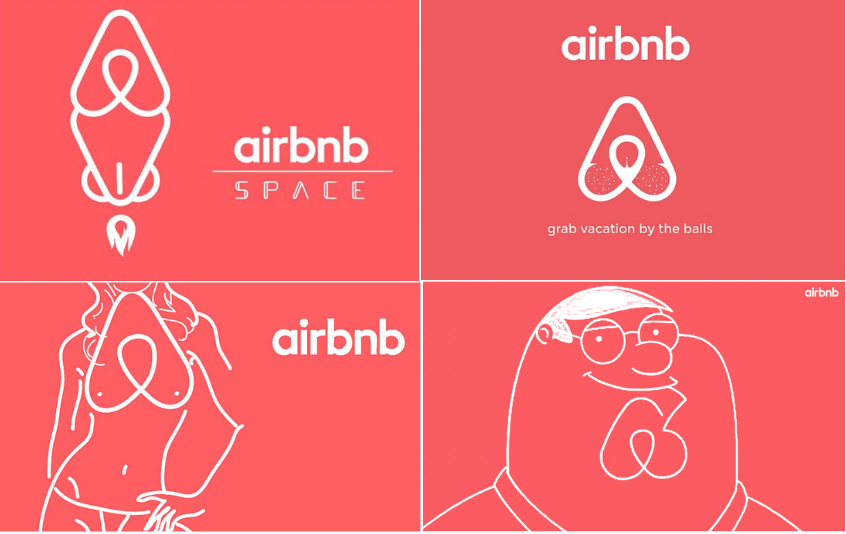
Within minutes of the launch, the internet’s collective imagination seized upon the logo’s smooth, rounded loops and bulbous base, interpreting it through a distinctly anatomical lens. Social media platforms—particularly Twitter (now X) and Tumblr—were instantly flooded with side-by-side comparisons of the logo with human genitalia, including vaginas, breasts, buttocks, and testicles.
A dedicated Tumblr blog titled Airbnb Logos sprang up overnight, collecting user-submitted parodies that reimagined the Bélo in increasingly absurd and obscene contexts. Major media outlets quickly picked up on the cultural phenomenon, abandoning design critique in favor of sensationalist headlines. The Guardian famously published a piece titled, "Is it balls, vagina, or both? Airbnb logo sparks internet parodies."
Compounding the visual controversy, intellectual property disputes surfaced almost immediately. Independent designers pointed out striking similarities between the newly minted Bélo and existing trademarks, most notably the logo of Silicon Valley software company Automation Anywhere. The accidental overlap threatened to entangle Airbnb in costly legal disputes. However, both companies managed the crisis swiftly and amicably, issuing a joint statement clarifying that the resemblance was entirely coincidental, and Automation Anywhere subsequently transitioned to an updated visual identity.
Surviving the Storm
In the face of relentless ridicule, both Airbnb and DesignStudio maintained a posture of calm resilience. Rather than panicking, issuing groveling corporate apologies, or hastily scrubbing the brand asset from their platforms—tactics frequently employed by legacy brands facing modern social media crises—the design team leaned into the discourse. James Greenfield of DesignStudio openly addressed the chaos, noting that the agency genuinely enjoyed the public conversation because, at the very least, it proved the brand was memorable enough to provoke an intense emotional response.
Supporting Context & Metrics: Why the Rebrand Succeeded
History has ultimately proven that the initial backlash was an acute symptom of "rebrand shock"—the psychological phenomenon where consumers instinctively reject any sudden visual change to a familiar brand, regardless of its objective design quality.
Beneath the early wave of juvenile memes, several key strategic factors ensured the Bélo’s long-term survival and ultimate triumph:
- Scalability Across Digital Interfaces: Unlike the original handwritten wordmark, which looked amateurish when scaled down, the Bélo was purpose-built for the mobile-first era. Its clean, vector-based geometry looks equally pristine as a microscopic favicon on a smartphone screen, an app icon, or blasted across a massive billboard in Times Square.
- Cultural and Linguistic Neutrality: By stripping away text-heavy branding in favor of a universal icon, Airbnb created a trademark that functions identically in Tokyo, New York, Paris, and São Paulo. The Bélo requires no translation.
- Resilience and Consistency: Airbnb’s executive leadership understood the value of design consistency. By refusing to bow to temporary social media turbulence, they preserved brand equity. Over the next decade, as the company expanded its business model—evolving from simple home rentals to curated luxury experiences and multi-service travel packages (such as the expansive 2025 app redesign)—the Bélo effortlessly adapted to each new business vertical without requiring further iterations.
Official Statements and Industry Reflections
Reflecting on the 2014 launch years later, design historians and branding experts frequently cite the Airbnb rebrand as a pivotal case study in modern corporate identity management.
When introducing the rebrand in 2014, Airbnb co-founder Joe Gebbia emphasized the emotional core of the project:
"A logo is an image, a sign, a token, an icon. It’s a placeholder for something deeper. For four months, we traveled the world. We lived with hosts. We talked to guests. We immersed ourselves in the community. What we realized was that Airbnb is not just about a place to sleep; it is about human connection and belonging."
DesignStudio’s collaborative approach underscored a vital lesson for contemporary agencies: effective branding must look beyond aesthetics and anchor itself in the lived experiences of the consumer base. While the lofty ambition of creating a "universal symbol of belonging" was occasionally mocked by cynical commentators as corporate overreach, the functional reality of the design spoke for itself. It gave the company an indestructible visual anchor.
Future Outlook: The Legacy of the Bélo
As we look toward the future of corporate design, the trajectory of Airbnb’s Bélo serves as both a cautionary tale and a blueprint for resilience.
In an era defined by hyper-accelerated digital cycles, short attention spans, and aggressive social media mobs, brands are increasingly terrified of offending or confusing their audiences. Recent high-profile missteps—such as corporate rebrands that were immediately walked back after minor public outcry—highlight a growing corporate insecurity.
Airbnb’s 2014 journey proves that true design innovation requires conviction. By weathering the initial storm of anatomical jokes and staying committed to a structurally sound, highly versatile brand asset, Airbnb transformed a PR nightmare into a masterclass in longevity. Today, the Bélo is no longer associated with the crude jests of its birth; instead, it stands shoulder-to-shoulder with the most iconic corporate symbols of the 21st century. For modern brands navigating the treacherous waters of a redesign, the lesson is clear: give your design time to breathe, trust the strategic framework, and remember that history is almost always kinder than the comment section.