
Executive Overview
In a significant departure from its established design language, Google is currently testing a radical interface overhaul for its flagship messaging application, Google Messages. The update, which is currently rolling out to select beta participants, fundamentally alters how users interact with their "pinned" conversations. By replacing the previous compact list format with a prominent, visually expansive row of icons, Google is pivoting toward an aesthetic that mirrors the design philosophy of Apple’s iMessage.
While the shift is intended to provide a cleaner, more accessible way to surface favorite contacts, it has sparked a polarized debate among power users. Critics argue that the new design sacrifices functional density for superficial aesthetics, effectively "burying" recent, non-pinned messages and introducing unnecessary clutter. As Google experiments with server-side rollouts, the tech giant finds itself at a crossroads: balancing the modern, visual expectations of the broader smartphone market against the efficiency requirements of its most loyal, high-volume users.
Detailed Chronology: A Change in the Fabric of Communication
The transition began quietly, with early sightings surfacing on the r/GoogleMessages subreddit. Reports indicated that users on the beta version (build 20261030_00_RC00) suddenly encountered a revamped home screen. Unlike previous minor updates that focused on bug fixes or minor color adjustments, this change is structural.
The Shift to Visual Priority
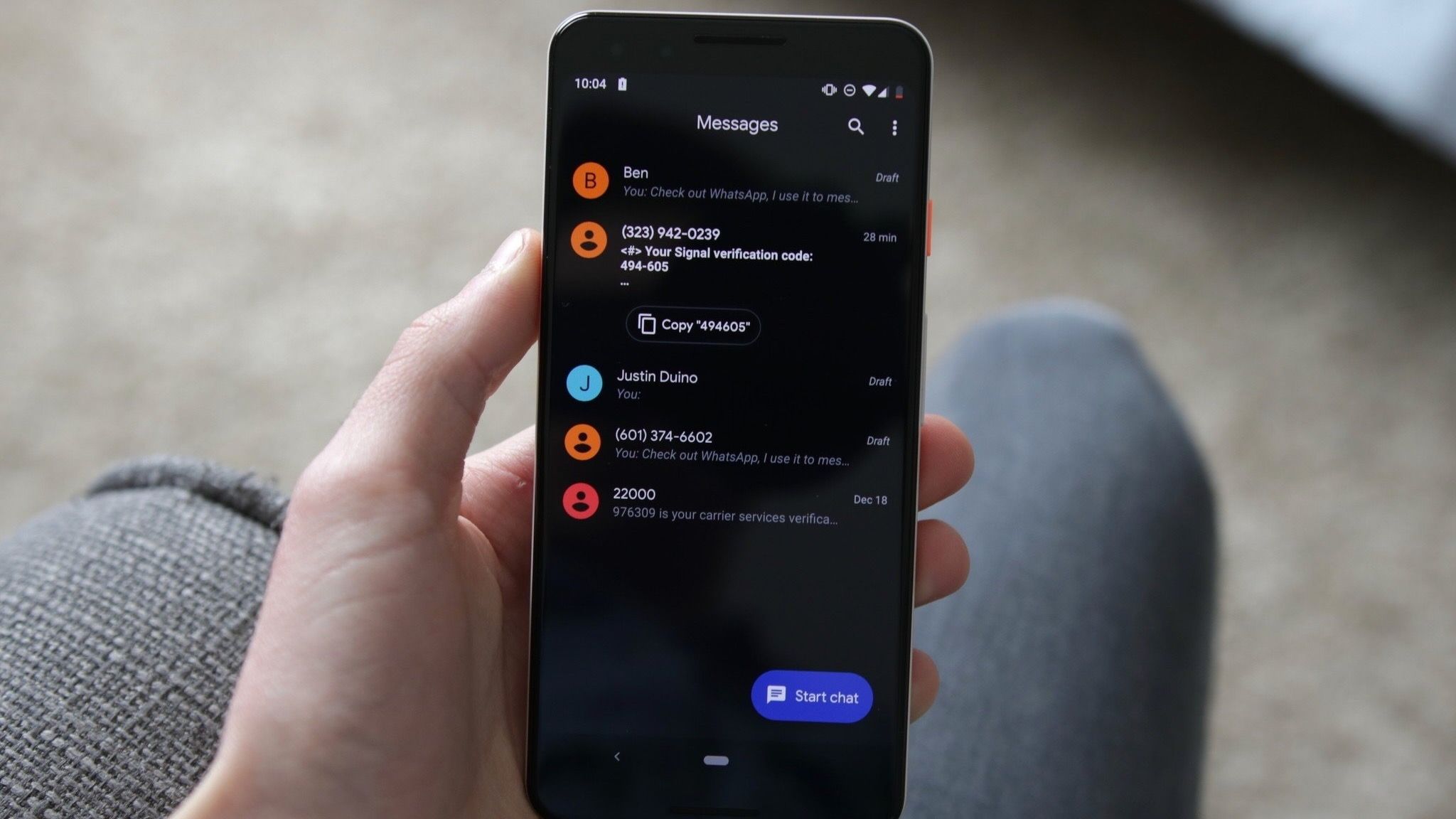
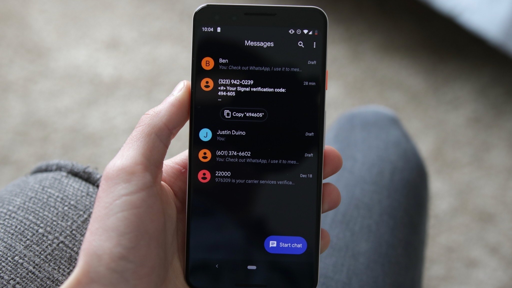
Historically, Google Messages has leaned into a utilitarian, list-based architecture. Pinned conversations were subtle, marked by small indicators that allowed the user to maximize their screen real estate. The new design shifts this entirely, moving pinned chats to a dedicated, high-visibility "carousel" or header section above the primary inbox.
This transformation utilizes significantly larger contact portraits, making the app feel more "personal" but also more intrusive. For those accustomed to seeing five or six active threads at a glance, the new layout reduces that visibility, requiring users to scroll further to access the latest incoming messages.
Server-Side Experimentation
The rollout strategy employed by Google is characteristic of its "server-side switch" methodology. Rather than forcing a global Play Store update, Google is toggling the interface on and off for specific user accounts. This allows the company to monitor engagement metrics, crash reports, and user feedback in real-time. This explains why a user on a Pixel 9 Pro might see the new UI, while another user on an identical device—running the same software version—remains on the legacy layout.
Supporting Context & Metrics: The "Clutter" Conundrum
The move toward larger, more visual elements is a recurring theme in modern mobile UI/UX design. By mimicking the aesthetic of Apple’s iOS, Google is arguably attempting to lower the barrier to entry for users transitioning from the iPhone ecosystem. However, in doing so, they have triggered a debate regarding "information density."
The Space-to-Utility Ratio
For the average user, who perhaps pins one or two contacts, the change is negligible or even aesthetically pleasing. However, for power users who maintain the maximum limit of pinned conversations (up to 20), the impact is substantial.
- The "Empty Slot" Issue: Early testers have pointed out an awkward "empty pin" placeholder that appears when fewer than the maximum number of chats are pinned. This creates a visual gap that critics describe as "dead space," further encroaching on the screen area meant for dynamic communication.
- Scrolling Friction: Every pixel taken up by a pinned icon is a pixel stolen from the inbox. If the header consumes 20–30% of the screen, the user effectively loses that much visibility over their active, unpinned conversation threads, increasing the "friction" of daily communication.
The Search Experience Overhaul
Beyond the pinned chats, Google is also testing a re-engineered search experience. The traditional search bar—often a static, reliable fixture—is being replaced or augmented by a floating action button (FAB) that toggles between a magnifying glass and a pill-shaped search field based on scroll behavior. This experimental shift suggests that Google is attempting to create a more "dynamic" interface that retreats when not in use, though early feedback suggests that this inconsistency in UI behavior can be disorienting.
Official Statements and Industry Perspective
While Google has not released a formal press statement regarding the specific design intent behind this update, company policy typically dictates that such changes are part of a broader push toward "Material You" consistency and cross-platform familiarity.
Industry analysts suggest that Google is under immense pressure to make the Android messaging experience feel as polished and premium as its primary competitor. In the messaging space, "premium" is often synonymous with "spacious" and "visual." By adopting larger avatars and cleaner headers, Google is aligning with contemporary design trends that prioritize the "human" element of communication over the "data" element.
However, the lack of a "compact" mode is a notable omission. If Google intends to keep this design, user advocates argue that a toggle—allowing users to switch between the new, expanded view and a classic, data-dense list—would be the ultimate compromise.
The Technical Challenges: Animations and Performance
Beyond the visual controversy, the implementation has faced technical hurdles. Several beta testers have reported "choppy" animations when navigating between the pinned header and the scrolling message list. In the world of mobile software, frame drops are often perceived as a sign of an unoptimized, "heavy" application.
Furthermore, the inconsistency in how these elements render across different device screen sizes (from standard Pixel devices to larger foldables) suggests that the underlying code for this new UI is still in a state of flux. The variation in user experience is high, with some reporting that the interface is locked to a specific orientation, while others report erratic behavior when rotating their devices.
Future Outlook: Where Does Google Messages Go From Here?
As Google continues to integrate its AI-powered features, such as Gemini, into the Messages ecosystem, the interface will inevitably become more crowded. The question is how the company plans to manage this growing complexity.
The Need for Customization
The most likely path forward is for Google to introduce "Preferences" within the app settings. If the company ignores the backlash, they risk alienating the very users who provide the most valuable feedback via the beta program. If they provide a "Compact vs. Expanded" toggle, they satisfy both the design-conscious audience and the productivity-focused power users.
The Role of AI Integration
We should expect to see the "Search" button evolve. Given the push for Gemini integration, it is highly probable that the floating search button will eventually become a gateway to an AI-powered message assistant. This would allow users to search not just for text, but for concepts, summaries, or specific media across their entire message history.
Final Verdict
The ongoing redesign of Google Messages is a microcosm of the tension between form and function in the modern tech era. While the new, iOS-inspired layout brings a sense of modern refinement, it does so at the cost of the efficiency that once defined the Android experience. Whether this becomes the new standard or is relegated to an "experimental" footnote will depend entirely on how Google weighs the feedback from its beta community in the coming months.
For now, the app remains in a state of transition—an evolving canvas where the struggle for the "perfect" messaging experience continues to play out one update at a time. Users would be wise to continue providing feedback through the internal channels, as Google has shown, in the past, that it is willing to pivot when the weight of user sentiment becomes undeniable.